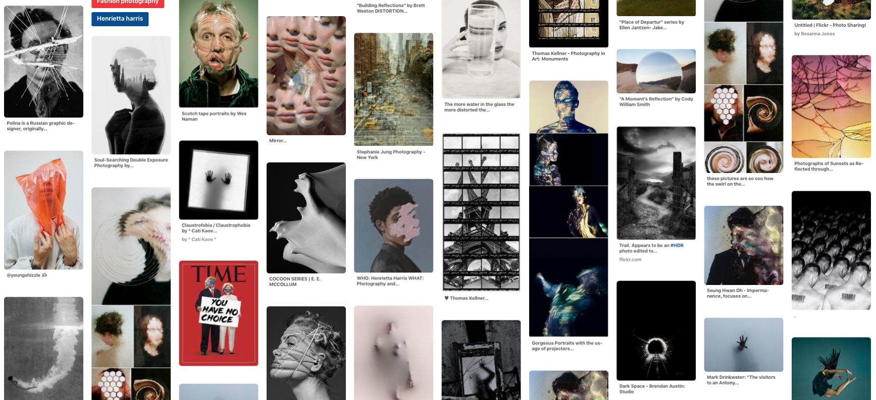
Initial research
task 1: movement
For this task I focused on how changing the shutter speed could change the outcome of the images and capture movement in different ways. With a fast shutter speed the subject is frozen in time, trapped in a still frame. With a longer shutter speed they are blurred and seem to be free rather than constrained.
1.fast shutter speed
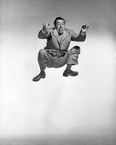
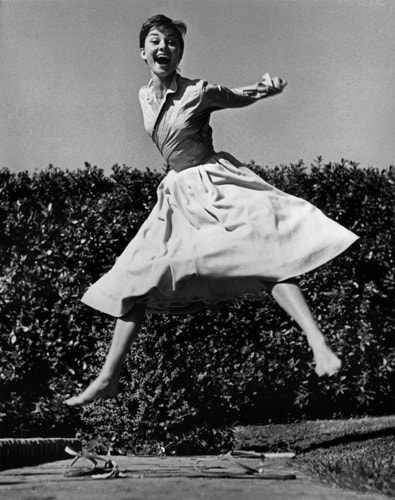
Philippe Halsmann
|
|
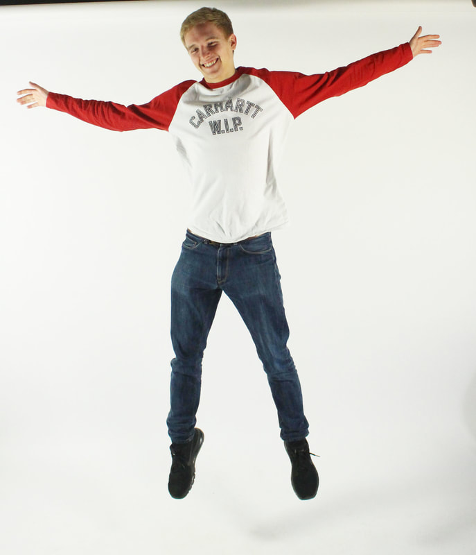
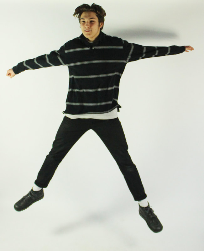
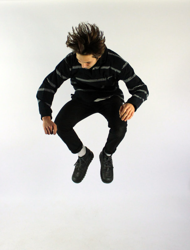
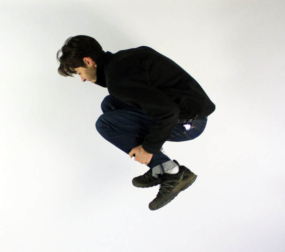
Philippe Halsman's 'Jump' series focused on how people and their body expressed themselves when they jump. They seem to let go of any constraints that a normal portrait photograph would have, as their expressions and poses are very natural. He said he wanted to see people reveal 'their ambition..., their self importance or their insecurity.' He believed that this allowed to show a different side to the person the public thought they knew, and got rid of the 'celebrity' image and made the viewer focus on how they are just human.
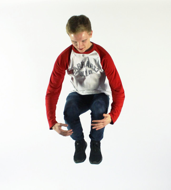
For this response I had people stand in front of a white background and made sure when they jumped they would be in the centre of the frame. Having the white background isolates them from their surroundings, they are stuck in that moment. You can see how the body is free by being able to express themselves however they want when they jump as they concentrate on jumping they can't control their expressions. I noticed how much the subjects enjoyed the physicality of the exercise and I think that is captured in the images too.
For this response I had people stand in front of a white background and made sure when they jumped they would be in the centre of the frame. Having the white background isolates them from their surroundings, they are stuck in that moment. You can see how the body is free by being able to express themselves however they want when they jump as they concentrate on jumping they can't control their expressions. I noticed how much the subjects enjoyed the physicality of the exercise and I think that is captured in the images too.
|
|
|
|
|
|
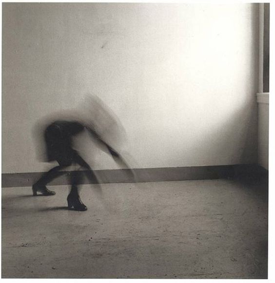
robert longo
|
|
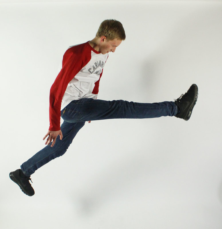
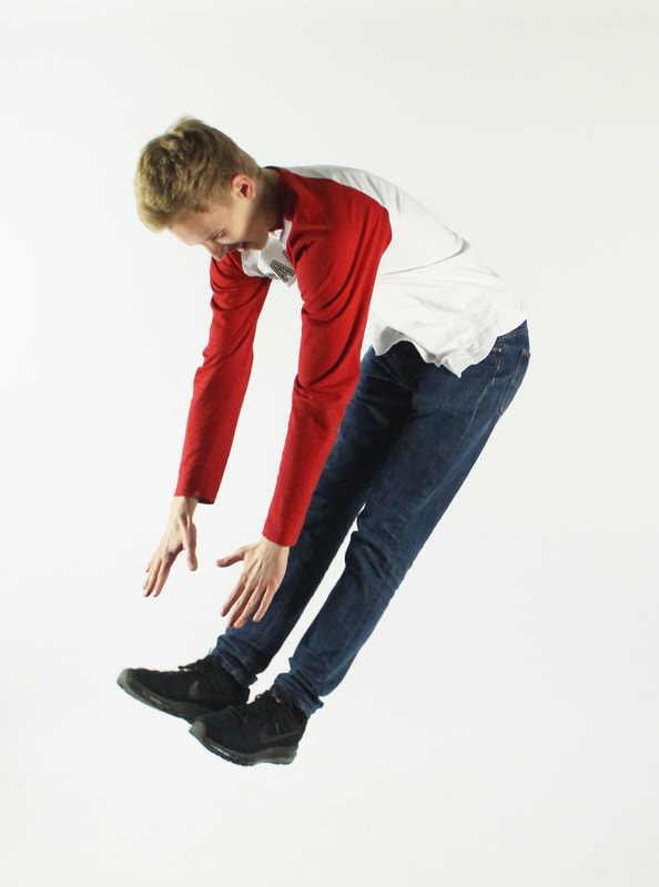
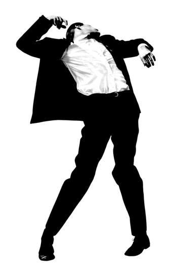
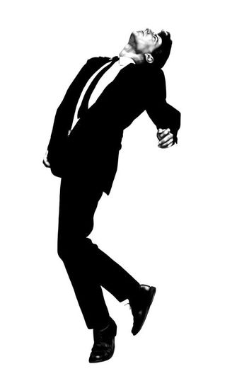
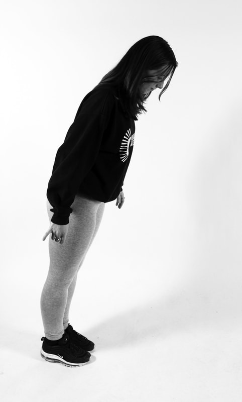
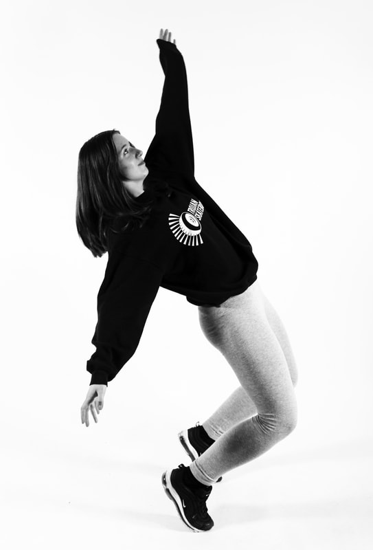
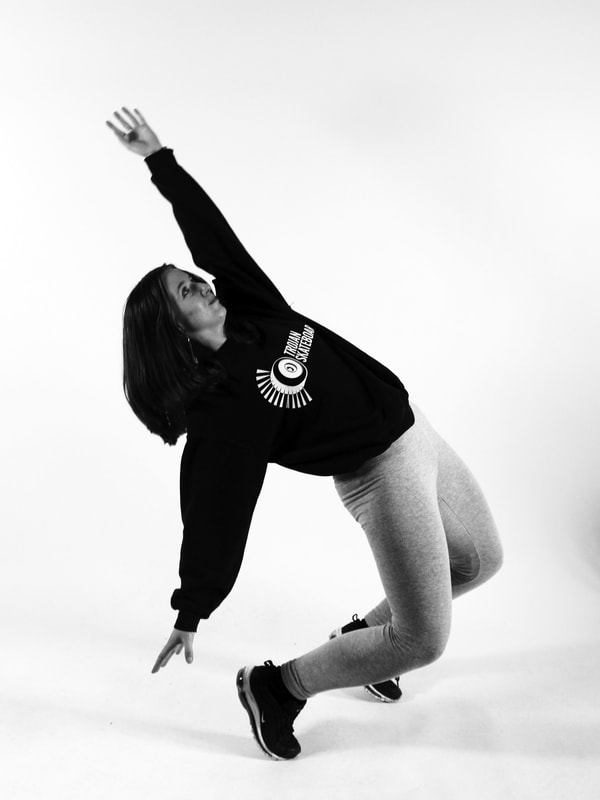
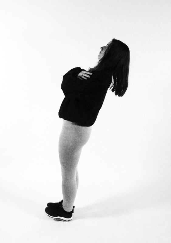
Robert Longo's 'Men in the Cities' series composes the figures as trapped in unusual movements and positions. Even though the movements are very dynamic, the bodies seem to be frozen in time due to the white background and lack of shadows.
I like the poses in these images, which remind me of modern dance movements and are very expressive. In these two images the man's head is thrown back, almost as if he has been hit, he looks awkward and uncomfortable and that's what it feels like to view them too.
In my response I asked people to let themselves fall and I shot the moment they fell, thus enforcing the idea of them being captured in time and trapped in that moment of letting go.
|
|
|
|
2. slow shutter speed
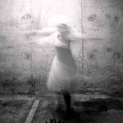
francesca woodman
|
|
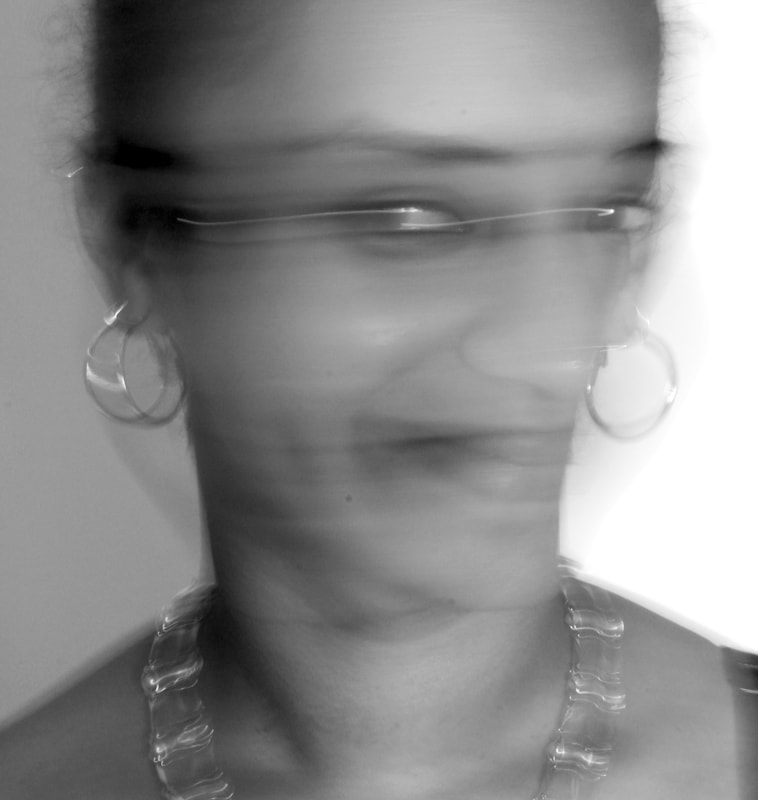
Francesca Woodman used herself as a subject of her eerie portraits. She used long shutter speeds to create a blur effect on the body as it was moving. Many people thought that these photographs were her way of expressing herself; she felt trapped and these photographs were her way of being free and escaping from the pain she felt. Her photographs were also in black and white which emphasised the distance from reality and the fact she was trapped in this dark place and wanted to be free.
For my response I focused on portraits and creating the same blur effect. I used a white background to so the viewer focuses on the blurred effect. I wanted to use both black and white and colour to see what difference that would make to strength of the image and intent. In the black and white images the blur of the face is more subtle as the grey tones blend in well with the neck and shoulders.
The colour images - especially the one on the left - I think are stronger images. I have captured more of a sense of movement and in the first image the face is caught facing two different directions: it is as if the subject wants to be free and leave the frame. I think this one is the most successful, but I also think the third black and white image and final colour image work very well too.
I like the woman's expression in the third black and white image, you wondered what she has spotted out of the frame, her mind is elsewhere while posing for the photograph. In the final colour image the image has a very pleasing shape and symmetry and a strong colour green to anchor it at the bottom but the face has been obliterated by the movement, trying to shake out of the image.
|
|
|
|
|
|
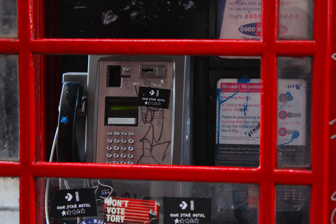
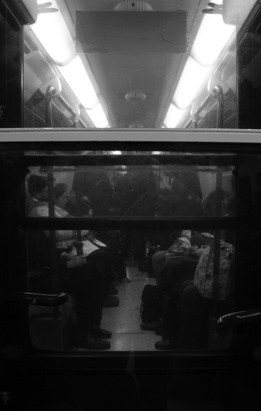
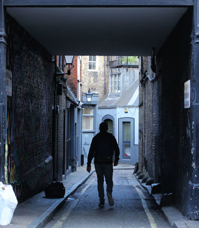
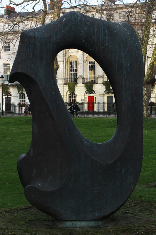
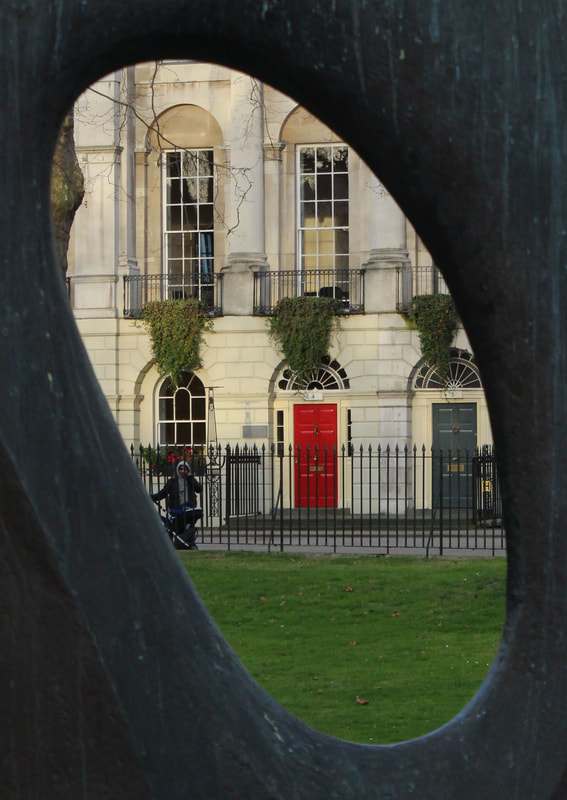
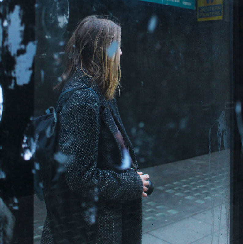
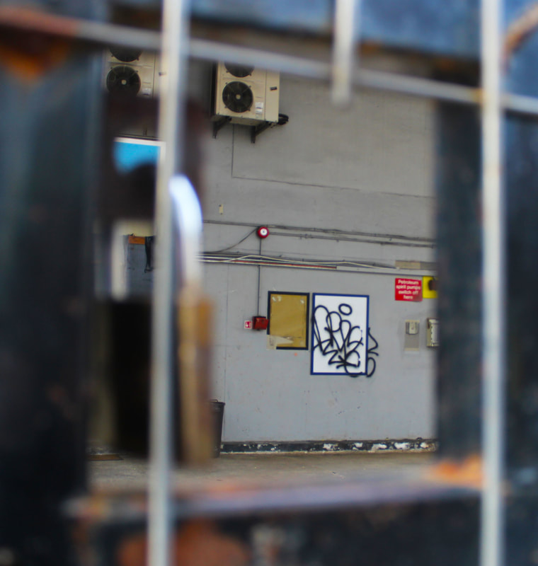
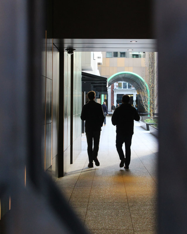
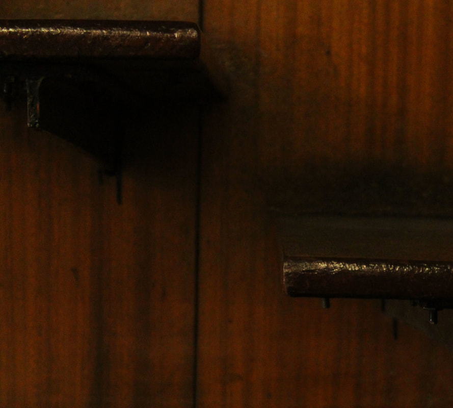
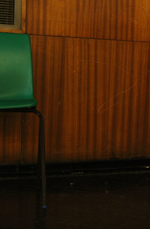
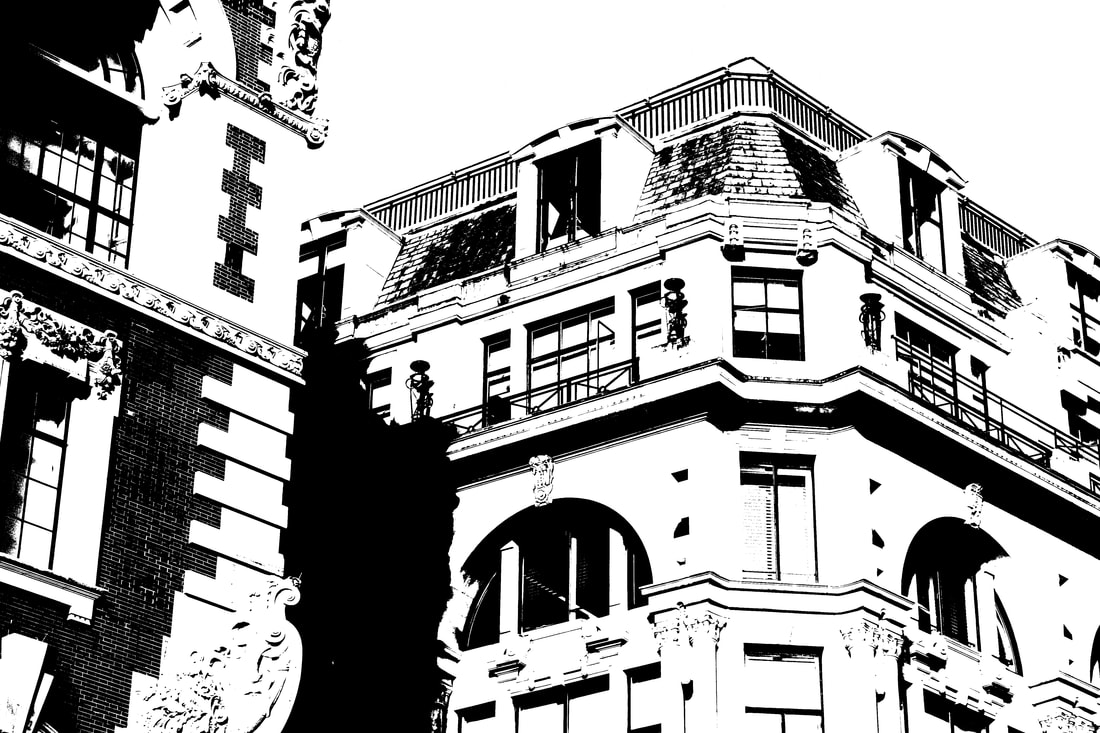
half term homework - framing
Using the limits that frames provide I travelled around Central London to find frames in everyday life. Using these frames limited what I, as a photographer, could take. I had to really focus on the subject of my photos as the frames were fixed in place so there wasn't much freedom.
|
|
|
|
|
|

|
|
task 2: pushing the limits of photography
The second task focused on how we could push the limits of photography. We are usually told to focus on a certain set of rules when taking photographs: making sure the photograph is composed well, in focus, the right exposure settings etc. This task is challenging those rules to have more freedom in the photographs we take, or by using unusual settings to limit what is seen and what we can take.
focus
|
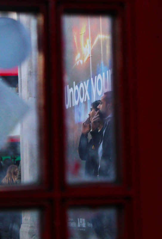
We usually expect photographs to be in focus so this part of the task was to take photographs that were out of focus or focus on unusual sections of images. When an image is not in focus the subject is usually unrecognisable; it gives a sense of discomfort to the viewer as it's not something they are used to.
In using this technique you can concentrate on the colours and shading of images and the framing and composition of elements. 
|
|
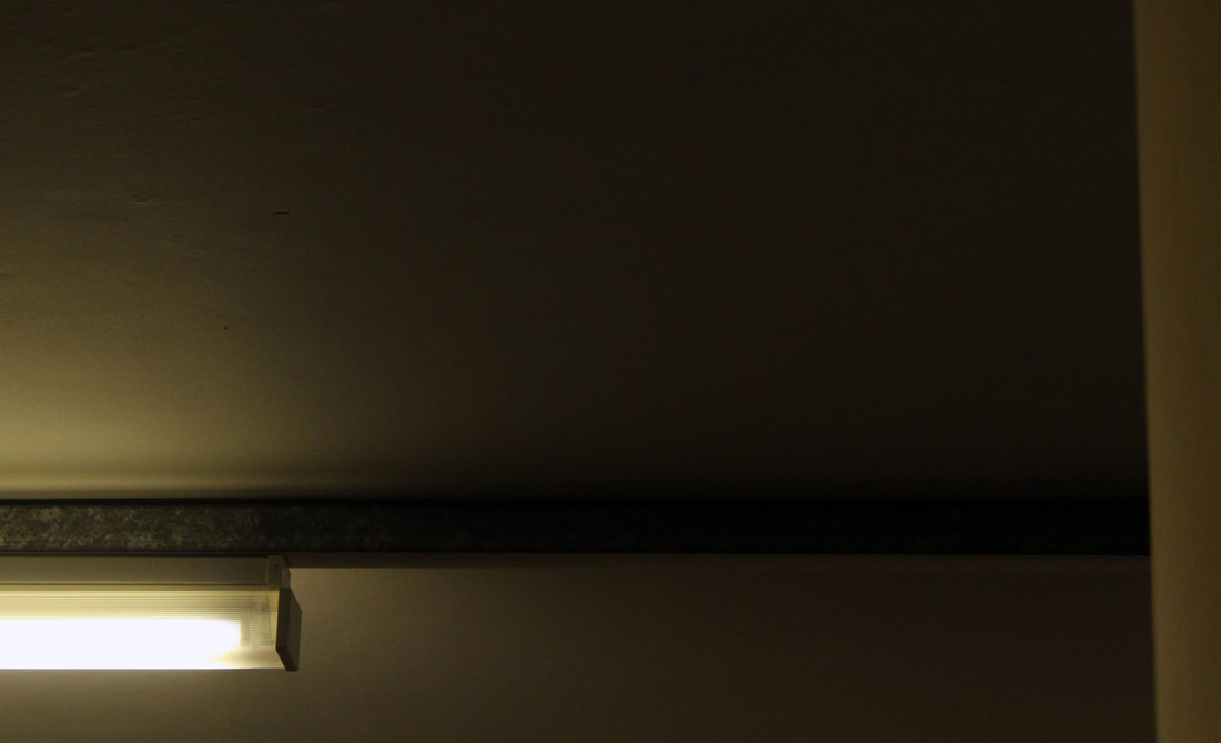
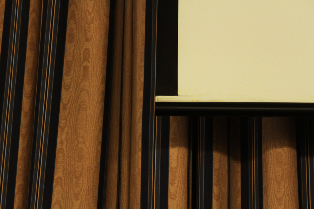
composition
|
Usually in photographs it is expected there will be a subject or focal point for the viewer to concentrate on. However when the focal point is out of shot like in these photographs it limits what the viewer can see and can be disorienting, disconcerting or unsatisfying.
I find the images below are challenging to view as they are not beautiful or satisfyingly framed, deliberately. 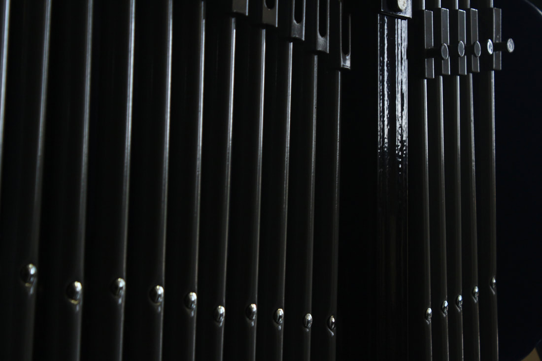
|
|
|
|
|
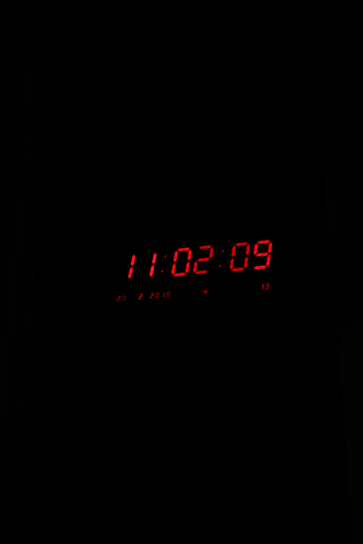
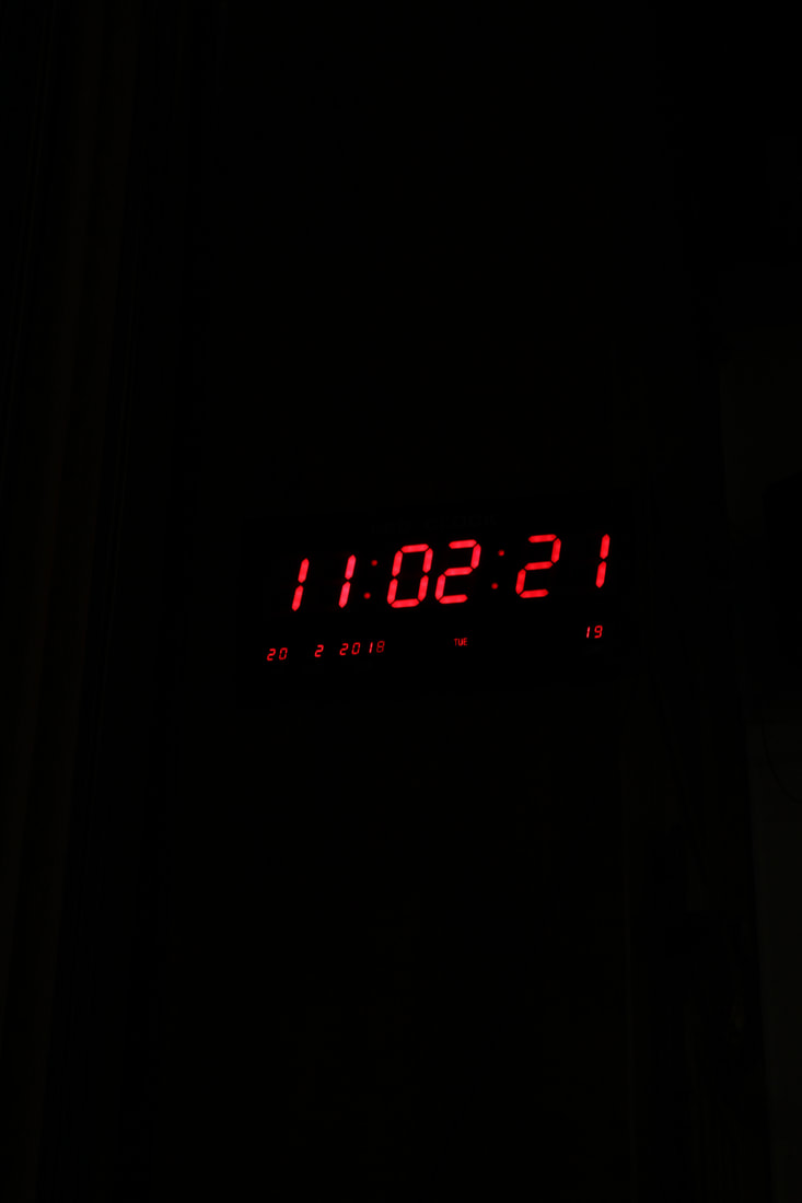
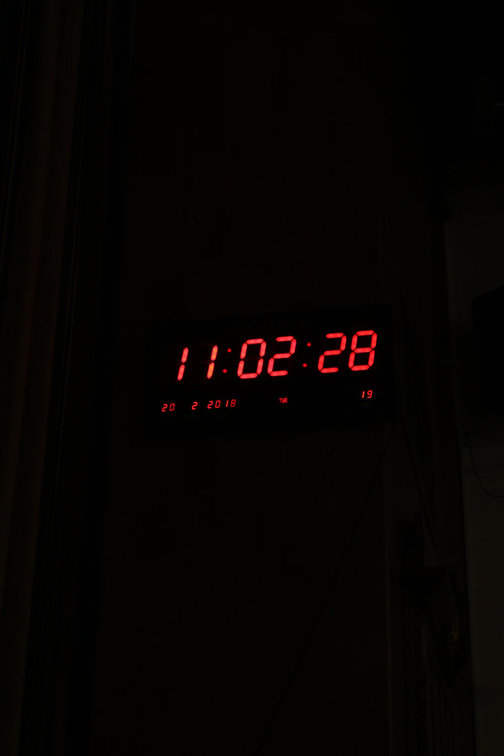
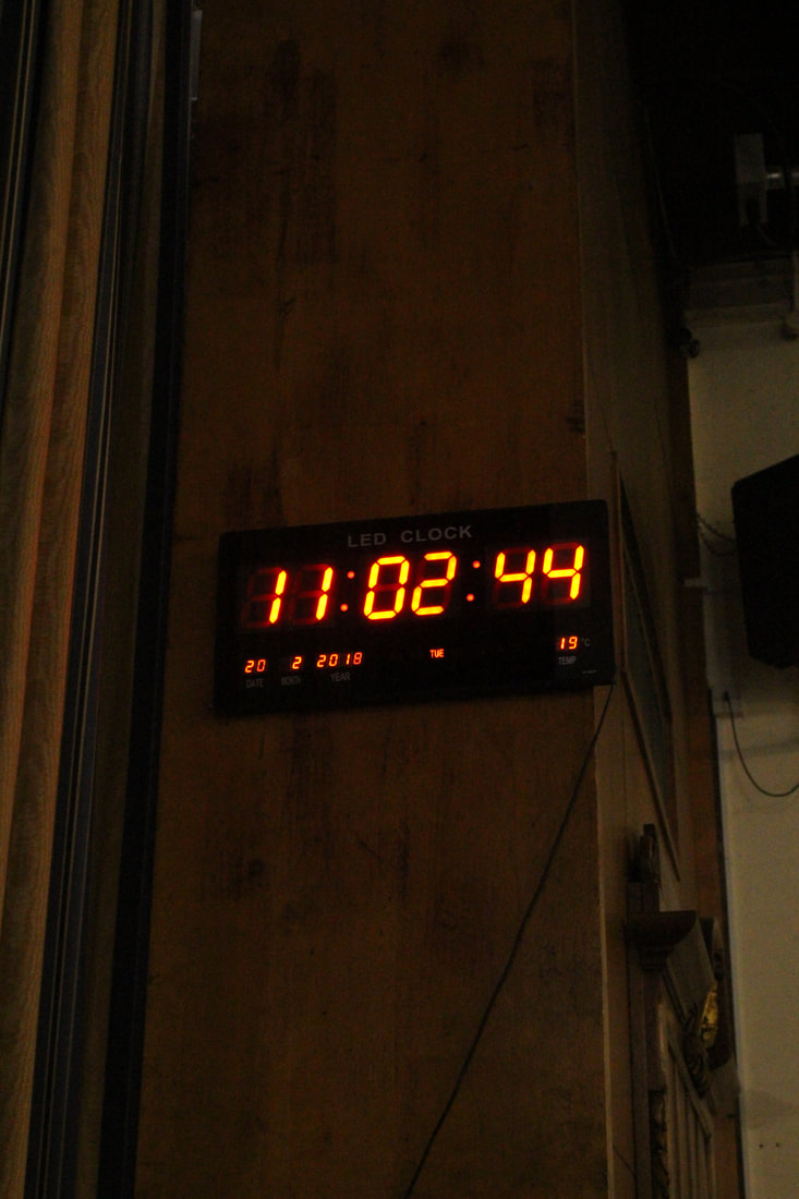
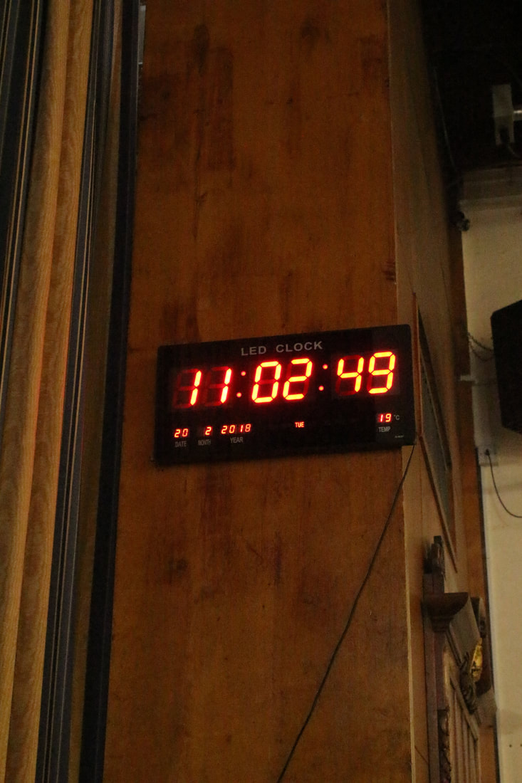
exposure
I experimented with what changing the exposure on my camera would do by changing the iso and taking photographs at each iso and comparing them. The higher and lower iso limits what the viewer is able to see but also makes them focus on the only thing in the frame for example with my response the lower iso actually made the clock stand out more so light wasn't limited by the low iso.


Post production
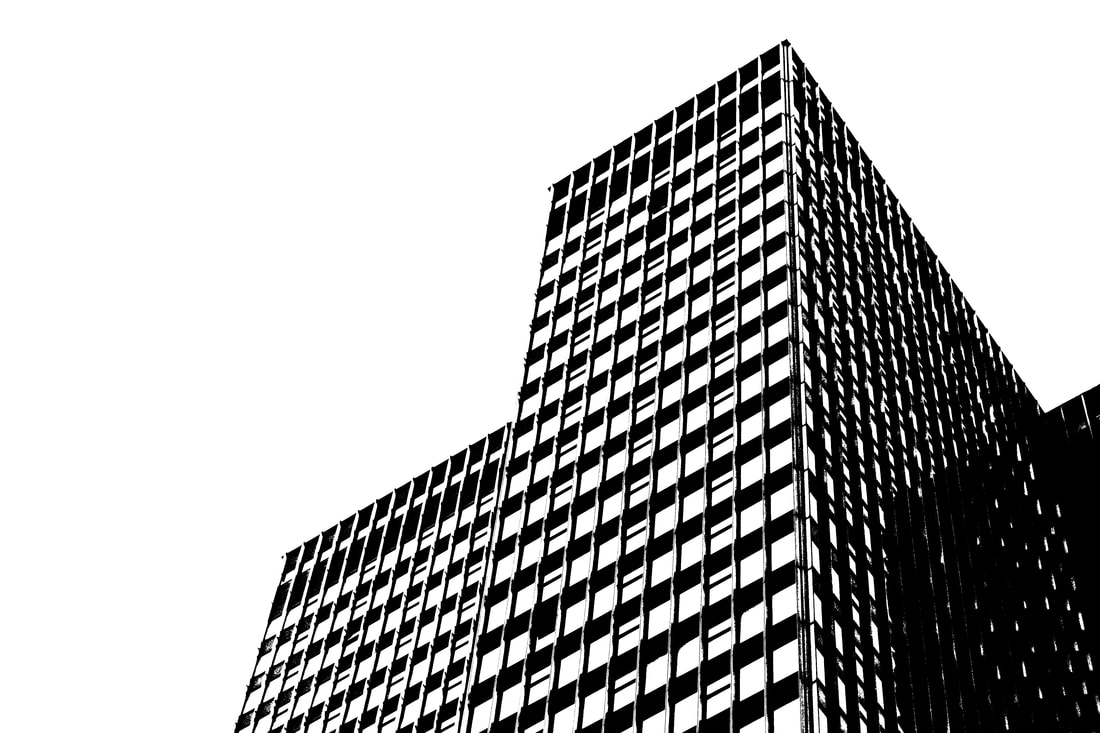
Moving on from exposure I also experimented with threshold in photoshop. This effect, like changing the iso, limits what is actually in the image. In my images the threshold removed the background and the 'noise' in the images. They start to look like drawn illustrations and the graphical style highlights pleasing shapes and patterns.
|
|
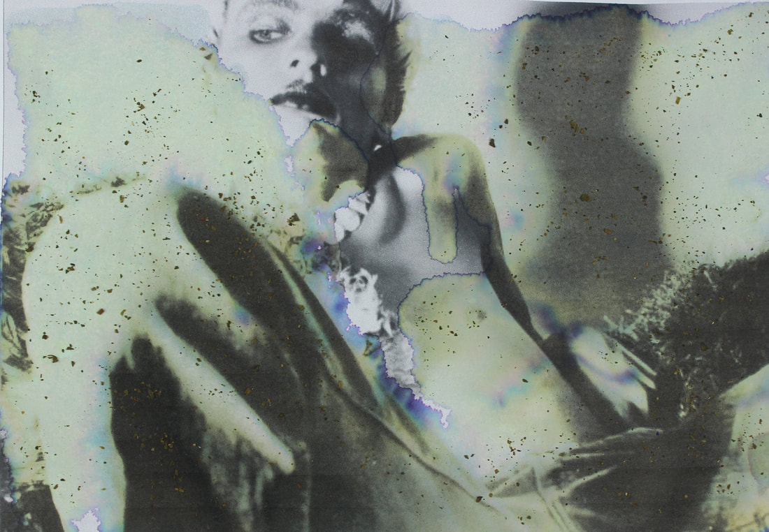
damage
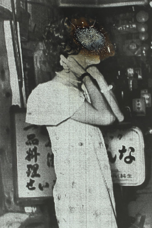
With this task I used a lot of different techniques to change images after they were printed or developed. We usually treat negatives and photographs carefully so no damage is done so by burning, bleaching and painting the images we are breaking free from the constraints that usually hold us back.
The images are startling to look at and intriguing for the viewer I think it raises questions about why and how they were damaged. But if viewed just as a piece of art I think the colours and patterns created are exciting and it is a useful way to add texture, layers and meaning to images.
The images are startling to look at and intriguing for the viewer I think it raises questions about why and how they were damaged. But if viewed just as a piece of art I think the colours and patterns created are exciting and it is a useful way to add texture, layers and meaning to images.
tea
|
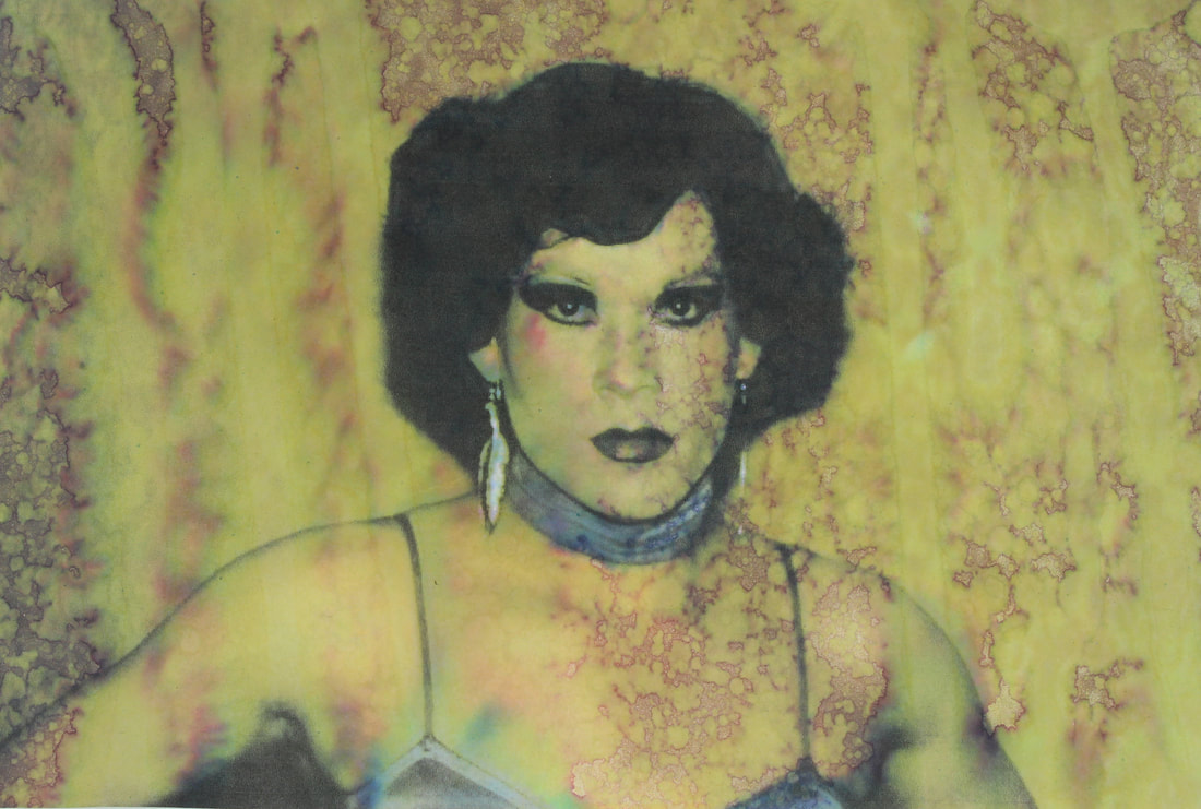
bleach and yellow dye
|
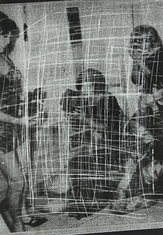
scratching
|
burn
|
bleach
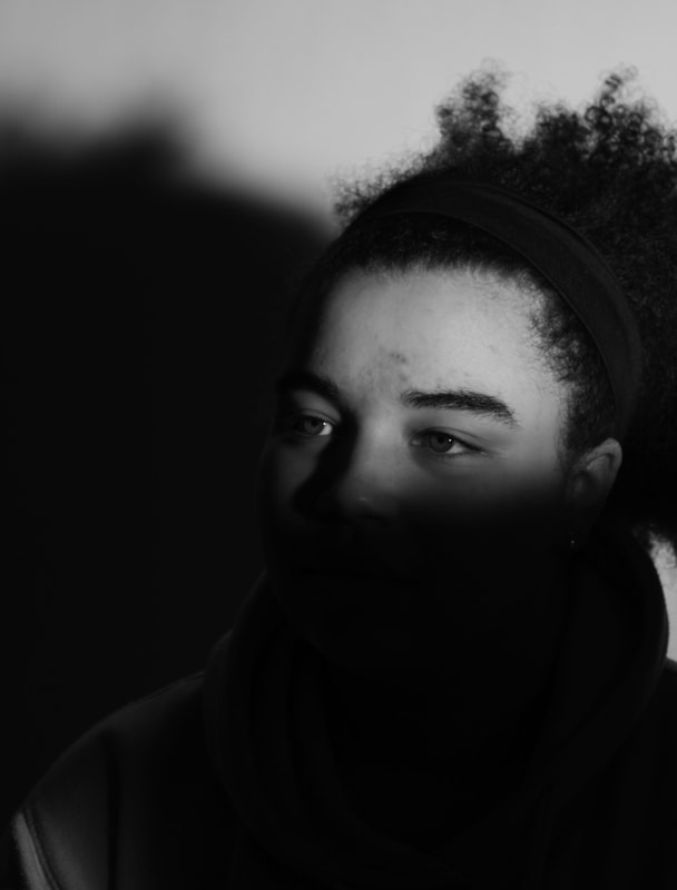
task 3: limiting space
outside
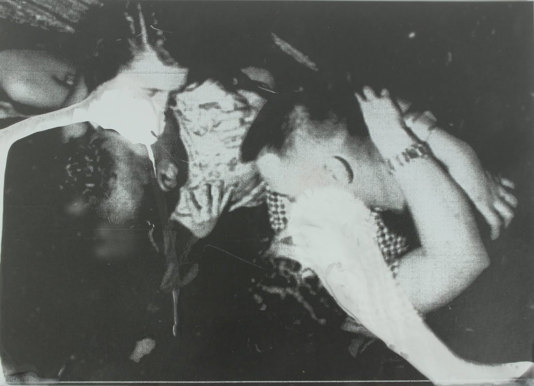
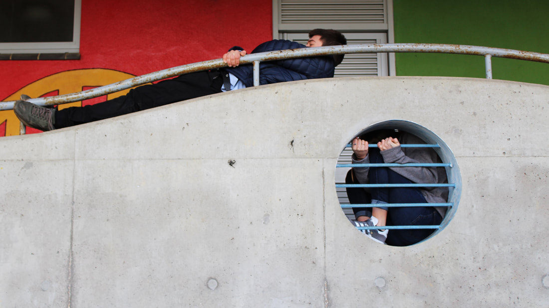
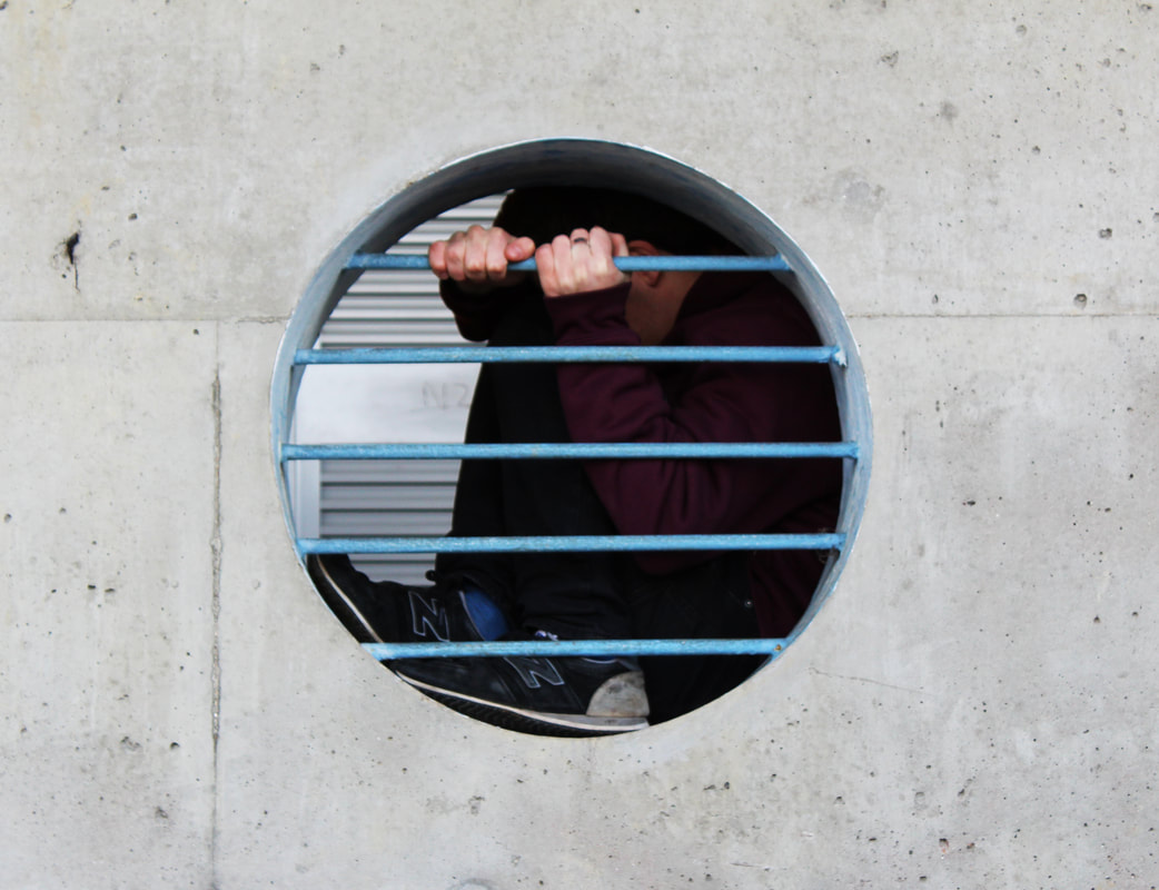
For this task we explored our immediate surroundings to find areas where you wouldn't usually find people. For this part both limitations and freedom are in effect. The space that the people were in was very limited, but there was also a sense of freedom as they found places to put themselves where they would not usually go, or notice.
However, I notice an extra element is that by not showing their faces it looks as if they have been abandoned there, and not quite human as they are in such unusual spaces.
However, I notice an extra element is that by not showing their faces it looks as if they have been abandoned there, and not quite human as they are in such unusual spaces.
|
|
|
|
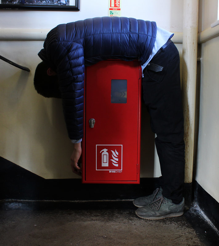
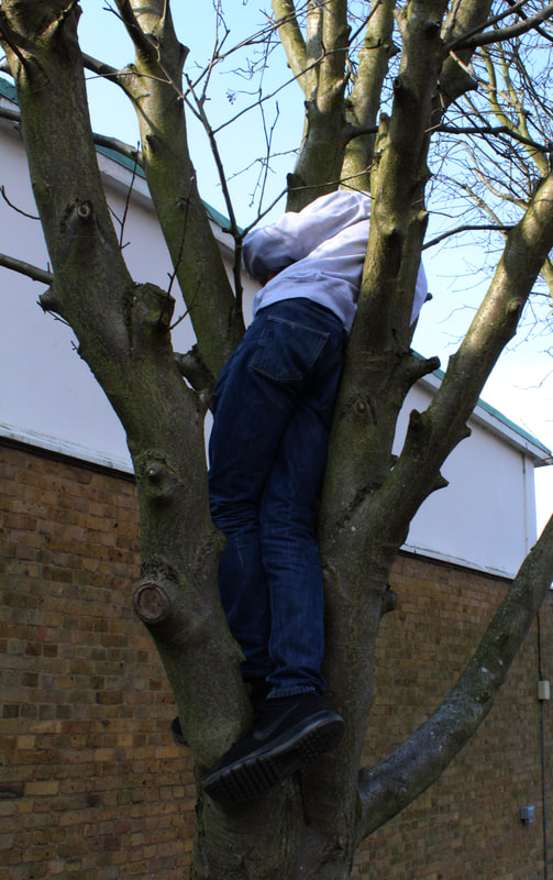
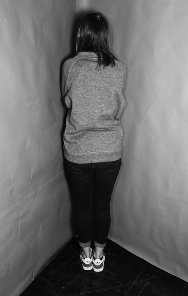
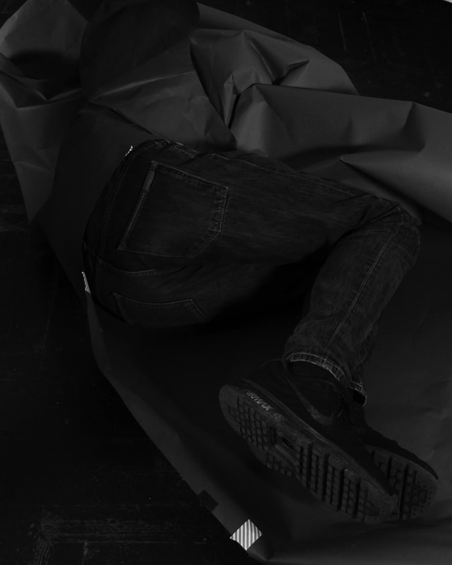
in the studio
For this task we used space to limit the subject of our photographs. People were told to squeeze into a corner of the studio making the images seem cramped and claustrophobic. Once again a key element seems to be the obscuring of the faces, which adds an element of sadness and of limiting expression.

|
|
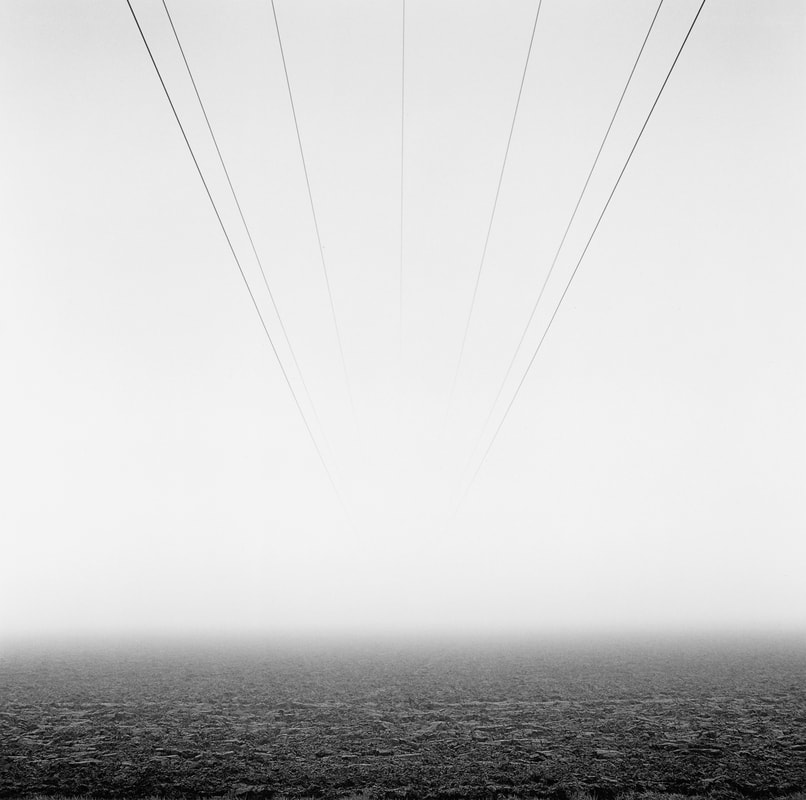
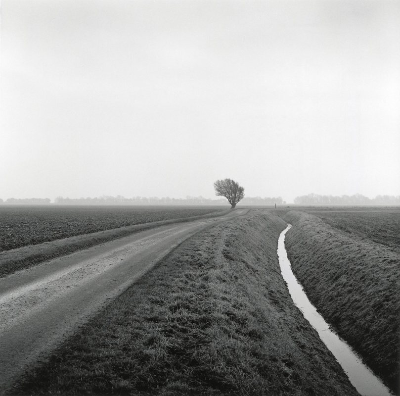
exhibition visit: Poetry of Place: Paul Hart's
Landscapes
Paul Hart is a British photographer whose work is made through a black and white analogue process. He mostly focuses on the humans relationship with the landscape, fixating on one region and exploring human intervention, the damage to natural order and showing its self-preservation.
This exhibition includes work from three of his series: 'Truncated', 'Farmed', and 'Drained'. The relationship between these works is freedom and limitations. He photographs the landscapes that seem open and free from restrictions, whilst highlighting the limits that we, as humans, impose on nature which prevent the landscapes from being truly free, such as the roads and other infrastructure.
This exhibition includes work from three of his series: 'Truncated', 'Farmed', and 'Drained'. The relationship between these works is freedom and limitations. He photographs the landscapes that seem open and free from restrictions, whilst highlighting the limits that we, as humans, impose on nature which prevent the landscapes from being truly free, such as the roads and other infrastructure.
|
|
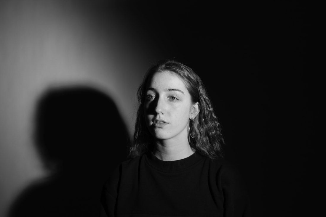
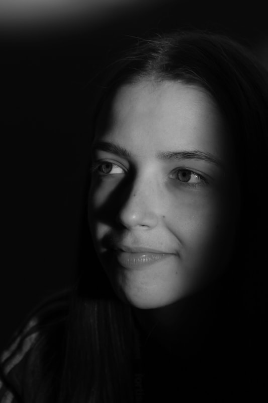
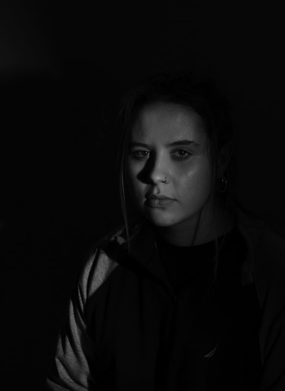
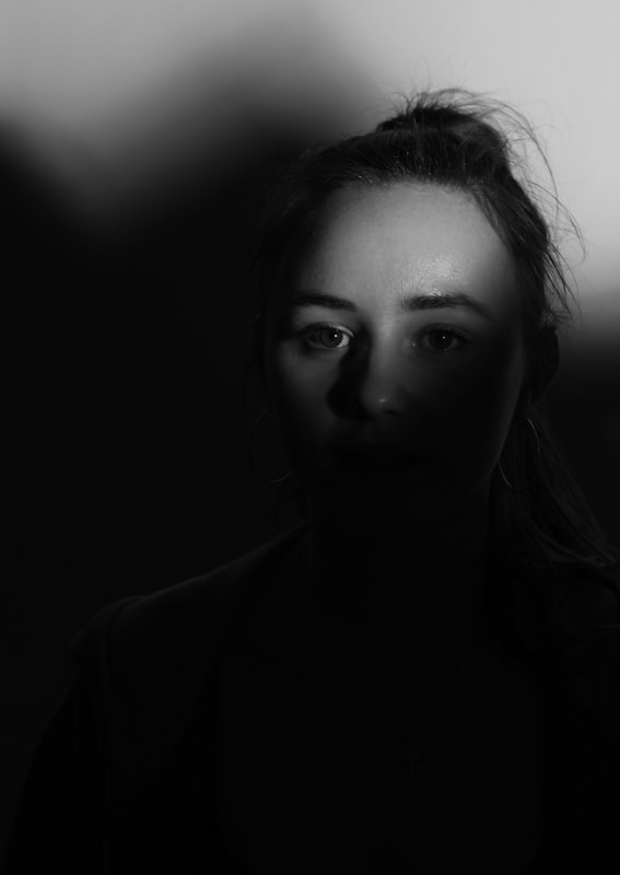
strand 1 - light/shadows
For my first strand I wanted to explore the way that light and shadows can limit the way we see and view photographs. I used a black background and shone a stage light at them. I used a piece of card to cover parts of the light to create shadows that limit what the viewer can see. I found that these images were very successful, especially the first and third image.
In the first image I like the strong shadow her head and shoulders cast on the wall, while the subject gazes to beyond the frame. Her mouth is resting open so she seems relaxed. By obscuring any other ornament in the frame by the deep shadow behind her and her dark clothing, and lighting her face from the right side, I think she creates a strong presence in the frame.
In the third image the image is still sharp even though in shadow and we can concentrate more on the expression of the subject. I also like the framing and composition of this photograph. I think although the styling and lighting of the subject is limiting some factors, the effect is to intensify the mood of the image and her serious expression.
|
|
|
|
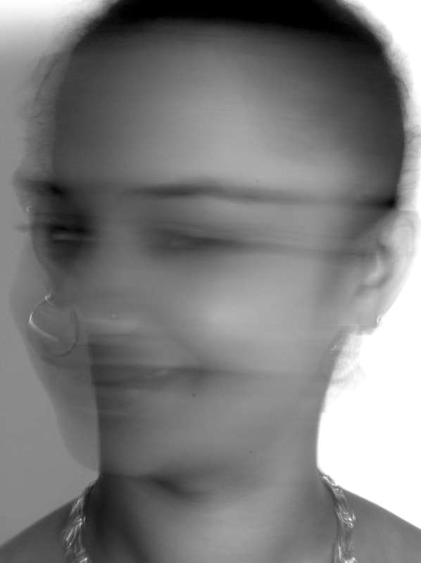
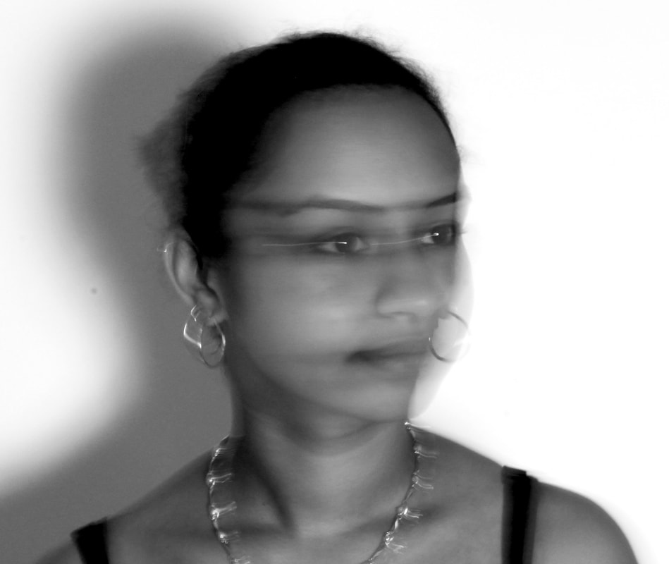
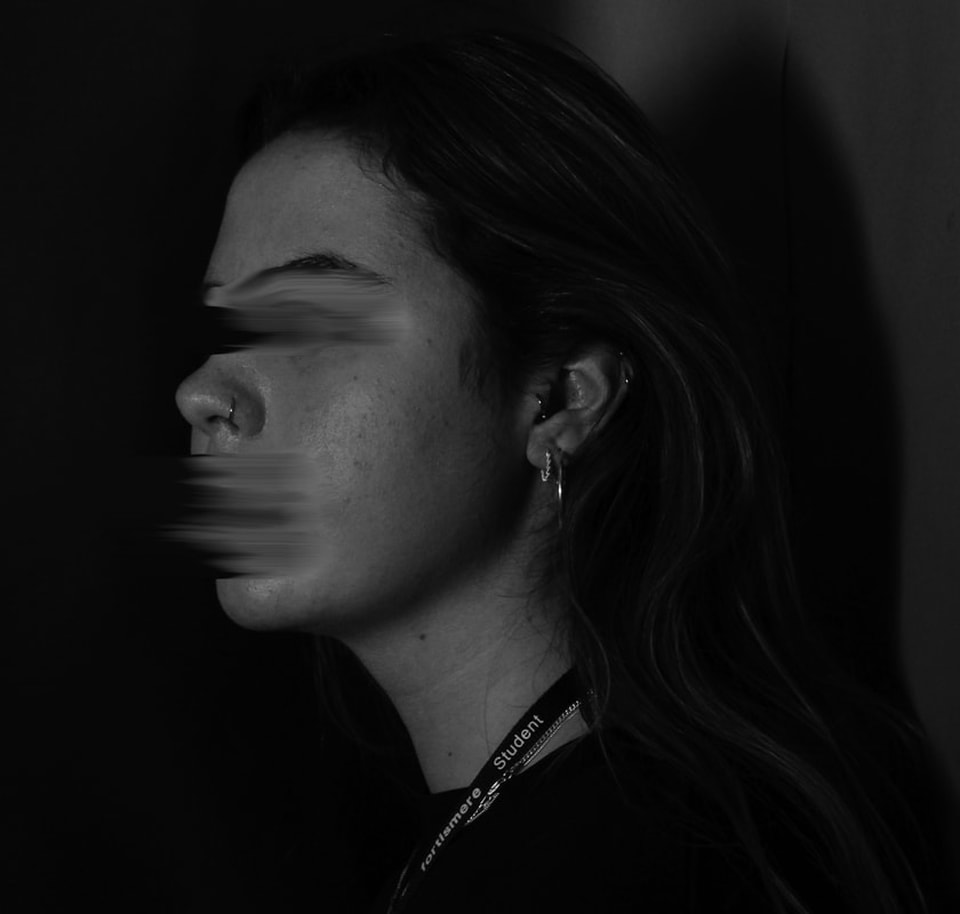
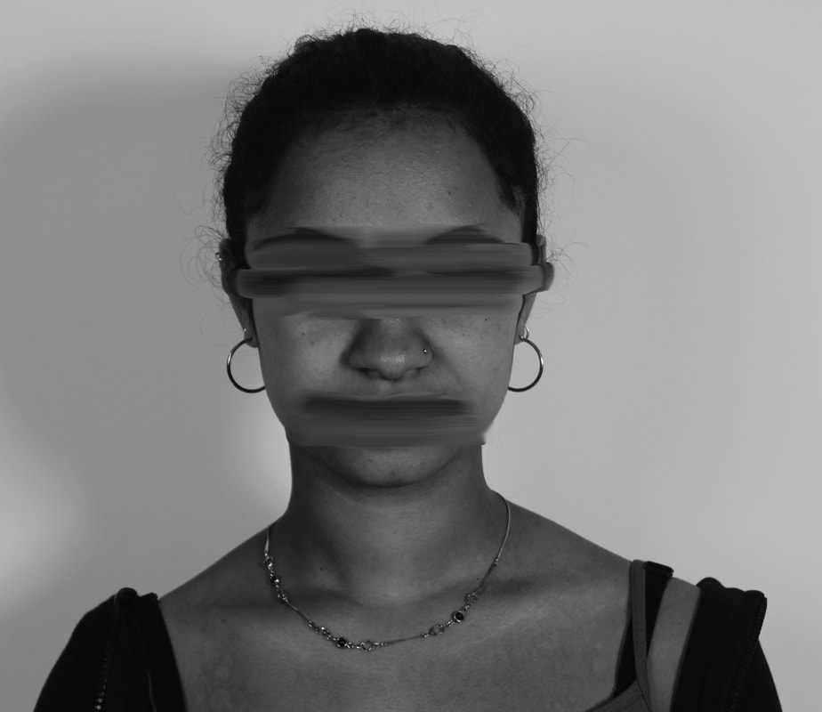
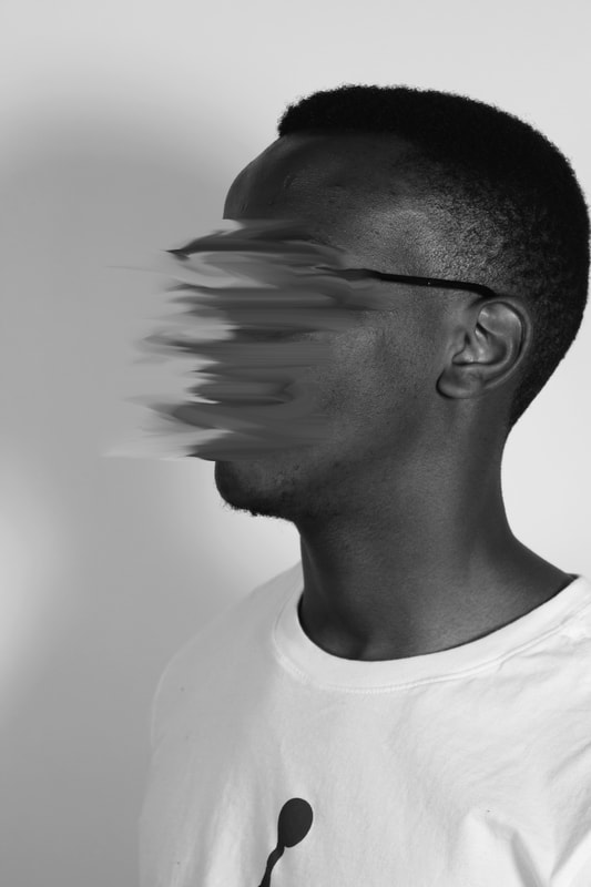
Strand 2 - blur
For my second strand I wanted to explore the idea of limiting someone's freedom using techniques on Photoshop. I used the smudge tool to blur parts of the face and made all the images black and white. The effect is disturbing as I chose to blur the faces, especially eyes, mouth which play such an important part in expressing ourselves. This could be interpreted as illustrating restrictions on freedom of expression or someone who is having difficulty expressing their feelings and emotions.
I think the third image is very successful as I think the framing and composition is particularly good and the smudging is quite dynamic with the face being smudged in one direction and it looks at high speed. I think it could be interpreted as that person being very expressive - or the opposite: their words being obscured or obliterated.
I think the third image is very successful as I think the framing and composition is particularly good and the smudging is quite dynamic with the face being smudged in one direction and it looks at high speed. I think it could be interpreted as that person being very expressive - or the opposite: their words being obscured or obliterated.
|
|
developments
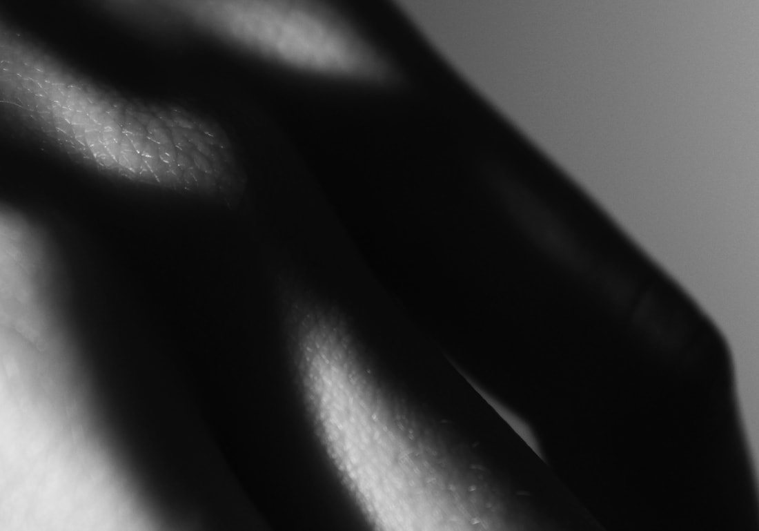
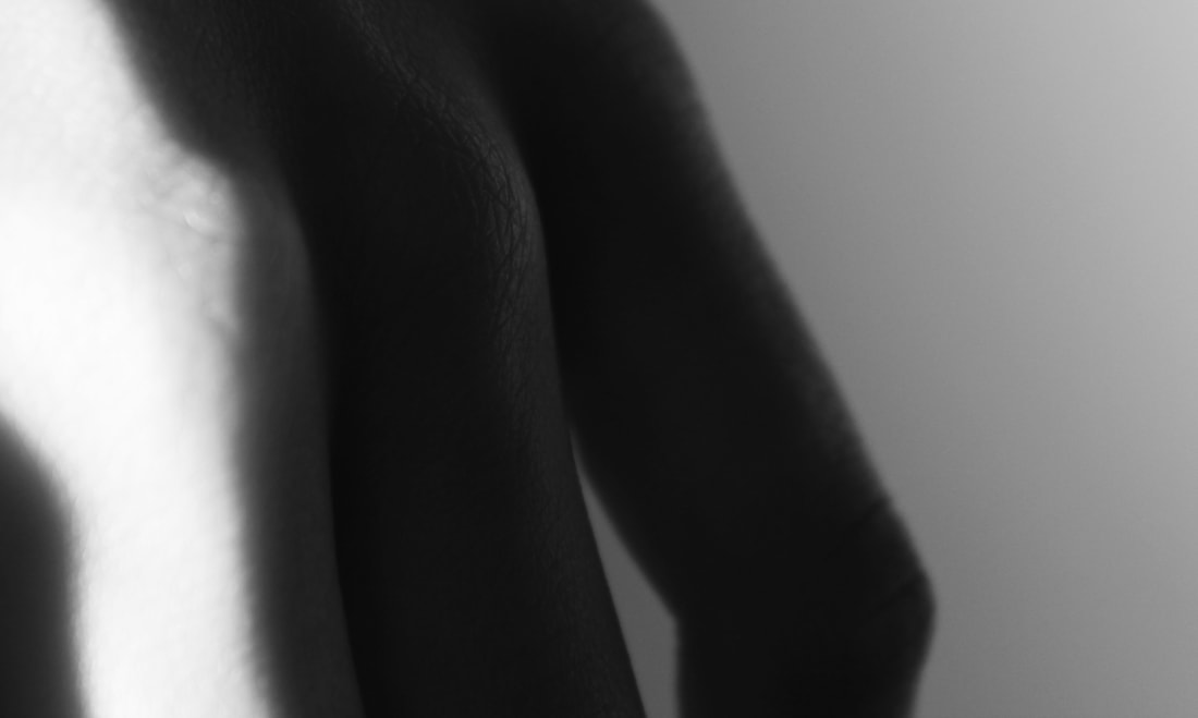
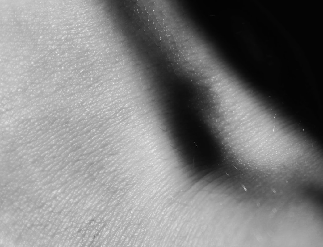
strand development 1
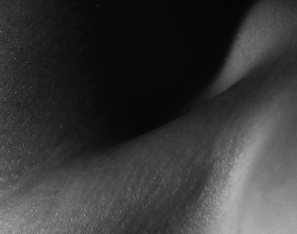
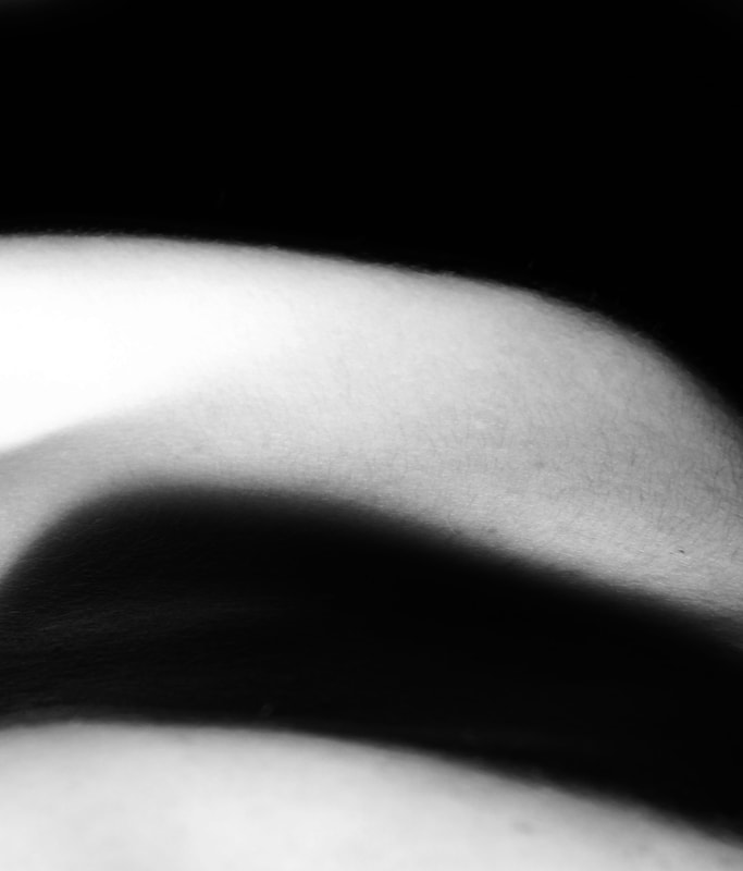
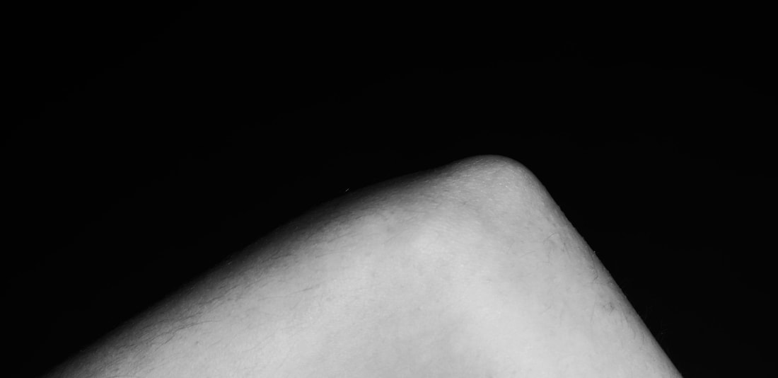
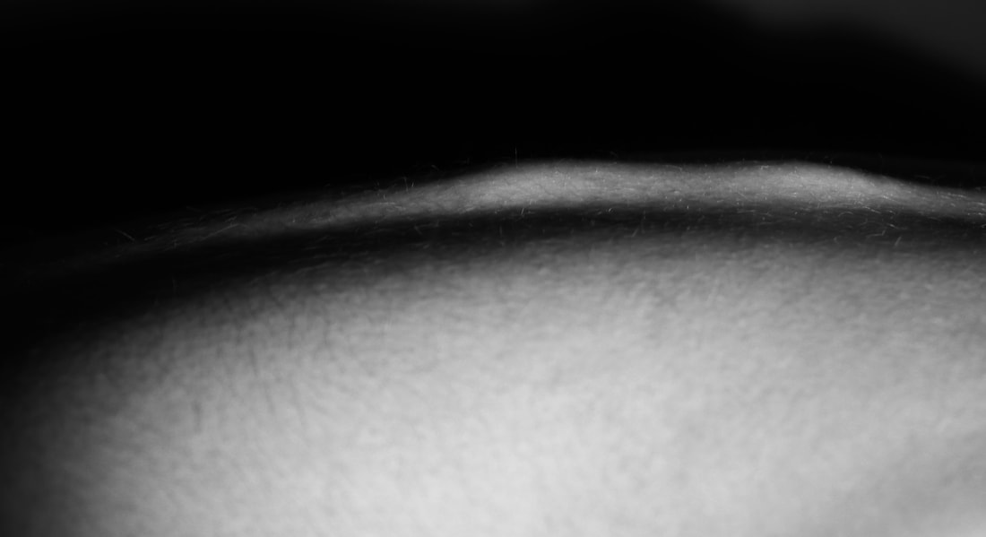
For my first development I decided to continue with my first strand using lights and shadows to limit what the viewer can see. This time I focused in on certain body parts and tried to make them more abstract so that they are less recognisable. The shadows that were created through the studio lights obscured some parts of the image, making some of the body parts more abstract.
I think the third, fourth and fifth images below are the most successful as they are sharp and have the beautiful skin texture exposed in close up and highlighted by the lighting. I like how they are on the verge of being abstract but are still identifiable as a part of the human body allowing the viewer to spend time guessing which part of the body it illustrates.
I think the third, fourth and fifth images below are the most successful as they are sharp and have the beautiful skin texture exposed in close up and highlighted by the lighting. I like how they are on the verge of being abstract but are still identifiable as a part of the human body allowing the viewer to spend time guessing which part of the body it illustrates.
|
|
|
|
|
|
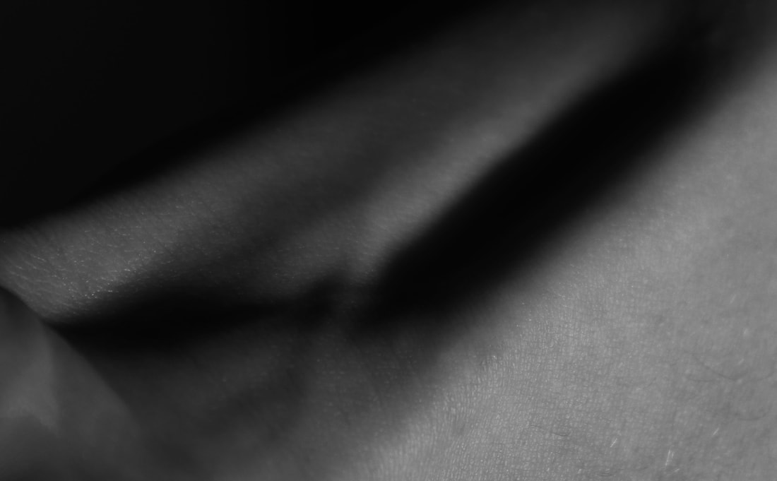
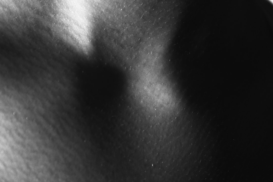
strand development 2
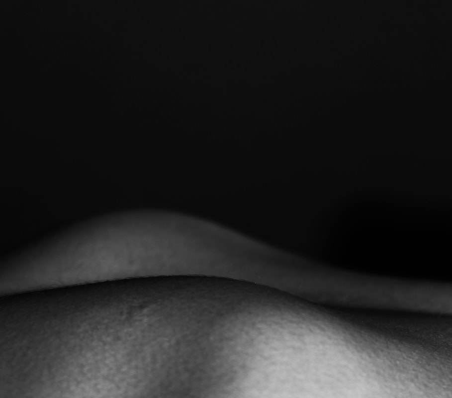
For my second development I wanted to use more obscure body parts to make the images even more abstract and unrecognisable. The ribs and the shoulder blades seem to look like landscapes as the curves of the bones look like hills.
I really like these images as I think they work artistically as well as technically, by controlling the light and shade well and because they have become very abstract, with some good texture from the close up of the skin surfaces.
I really like these images as I think they work artistically as well as technically, by controlling the light and shade well and because they have become very abstract, with some good texture from the close up of the skin surfaces.
|
|
|
|
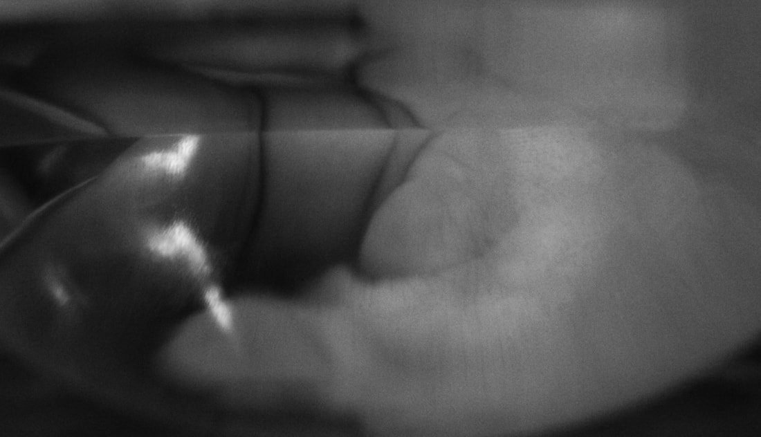
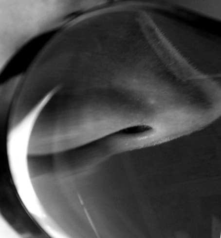
andre kertesz - distortion
André Kertész was a Hungarian born photographer who moved to Paris. He created a series in the 1930s called 'Distortions' where he photographed bodies reflected in amusement arcade joke mirrors that distorted the body. He also distorted the subject by photographing it through water and glass. This series originated from an assignment for a magazine 'Le Sourire' and was intended to be humorous but also became quite surreal and experimental.
Kertesz said "One can give what explanations one wishes of this work; all I can say is that making them was very exciting, very amusing."
Kertesz said "One can give what explanations one wishes of this work; all I can say is that making them was very exciting, very amusing."
development 3
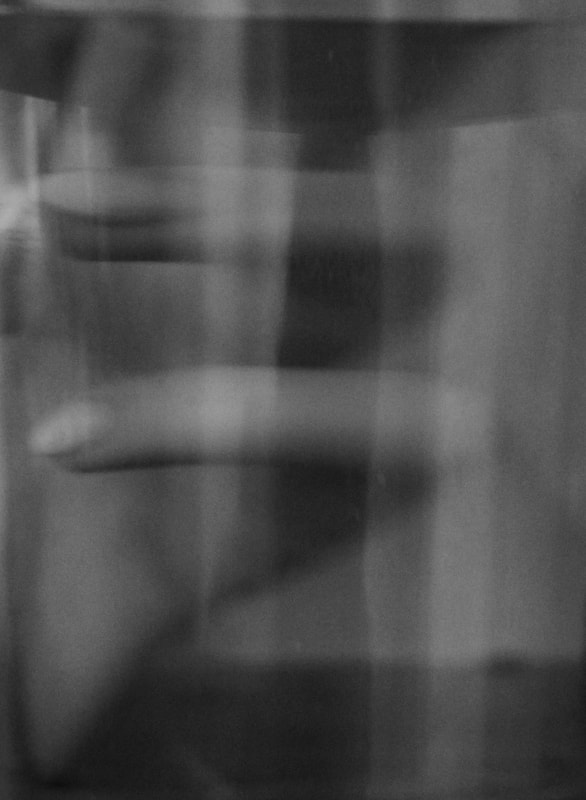
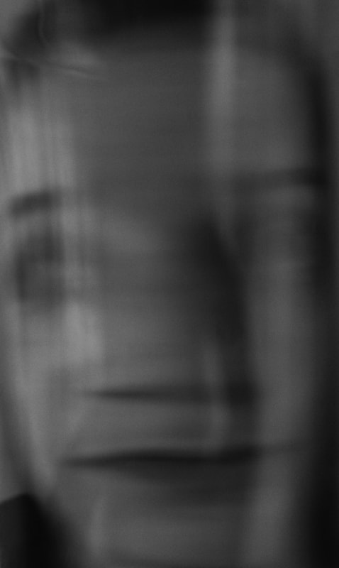
For my third development I used the distortion idea that Kertesz used for his work and use and glass and water to distort body parts and faces. The distortions in my images work quite well as the body parts are becoming unrecognisable. Because of the glass the images seem quite hazy and it's like they are trying to be covered up and blurred so they are even more abstract. I think the first and last images below are the most successful and interesting to view.
|
|
|
|
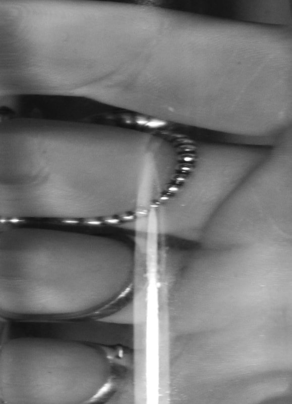
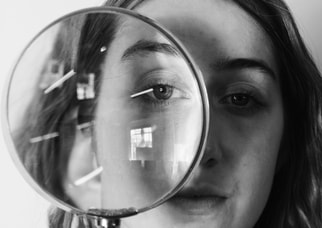
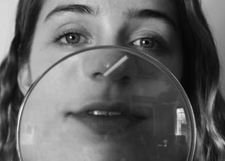
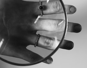
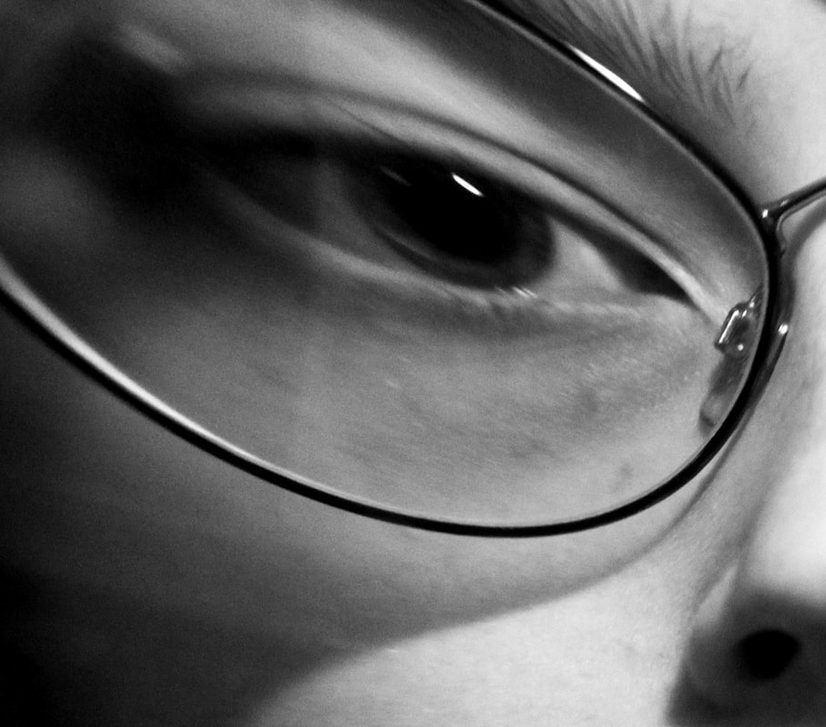
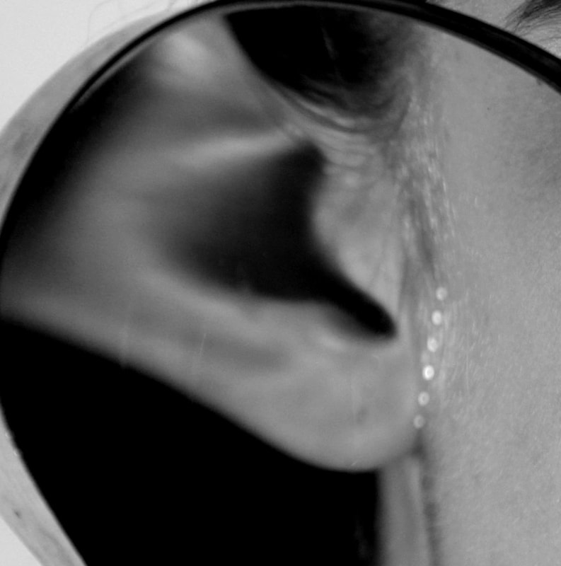
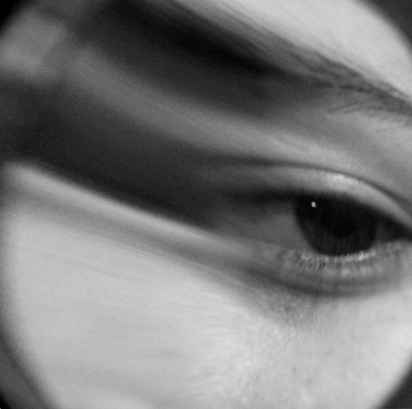
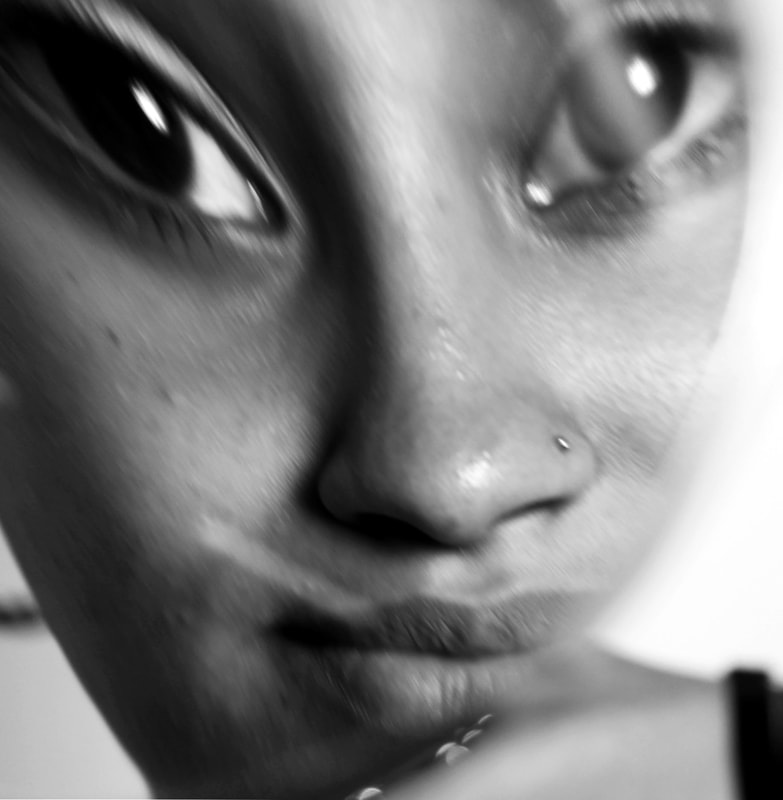
development 4
For my next development I used the idea of distortion again and used mirrors and glass to distort body parts and faces. I like the tones of greys in the black and white photography here, and the sharp white highlights from the reflections. The viewer is drawn to eyes as a focal point and I have concentrated on having the subject directly looking at the viewer, while distorting the image.
I like the round frame of the magnifying glass in particular and the extra layer it adds to the images, while the distortions create some extra interest to examine. The magnified areas in the final image limits what you can view while at the same time making more of that area available to examine more closely.
I like the round frame of the magnifying glass in particular and the extra layer it adds to the images, while the distortions create some extra interest to examine. The magnified areas in the final image limits what you can view while at the same time making more of that area available to examine more closely.
|
|
|
|
|
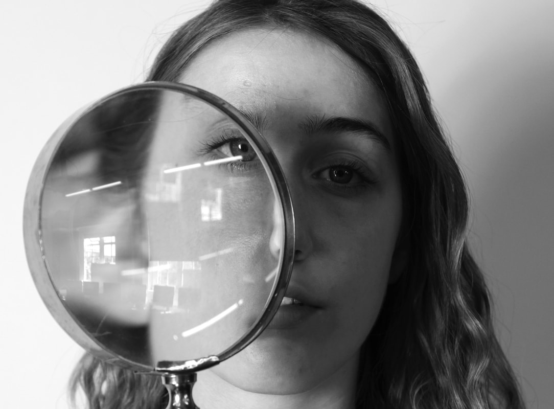
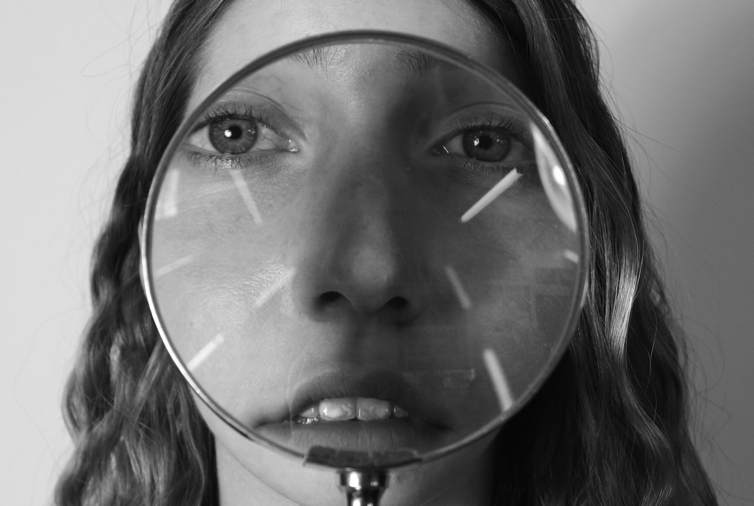
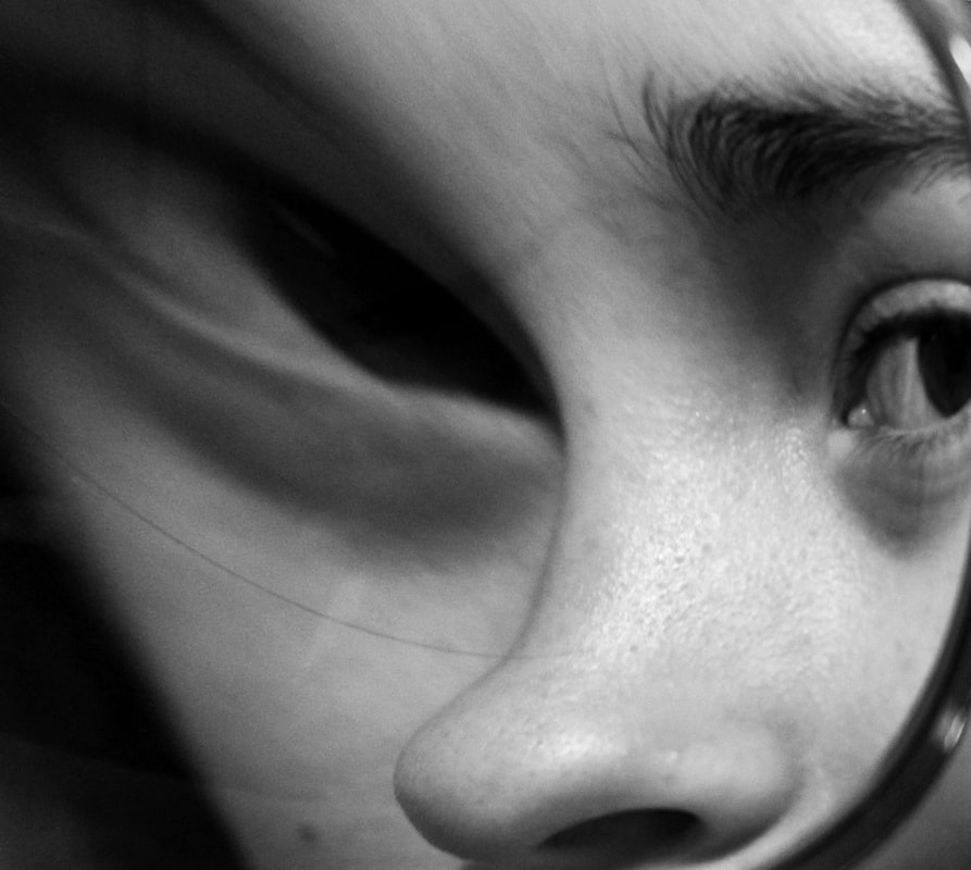
final piece
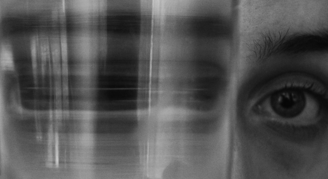
Moving on from my last development I took the idea of distortion to another level. Using the magnifying glass from the development before, I used new angles and perspectives to alter what the viewer sees. I then cropped the images and used the warp effect on Photoshop to stretch the images even more in different directions. This allowed the images to become more abstract limiting what the viewer is able to see and distinguish.
The images are clearly of faces but I think they are sufficiently unsettling due to the limited view of them but also because in many the subject is looking directly at the viewer. As they are in extreme close up too it forces you to return their stare and wonder what they are thinking. I think the first, second and sixth images are the most successful because of this element. Eyes really are the most important feature in my recent work.
By restricting and limiting the framing, lighting, colour and/or positioning of subjects I have explored how much can still be conveyed through the elements remaining, such as their poses, their gaze and their expressions whether manipulated or not. Through distorting images in my final piece I have tried to bring these elements together.
|
|
|
|
|
|
