Urban environments
Overview
Moving on from my curatorship task, I decided to continue with the theme of my second 'room': man's impact on the environment. One of the main features of this are urban environments such as cities. In my photography I have been exploring the many ways humans change their environment, predominantly through buildings and infrastructure. My journey home every day takes me from a big city through the green belt to the suburbs, so the contrasts of city landscape and green landscape is in front of me every day. When visiting the USA I also traveled from semi-rural areas through to the city.
The world is becoming more urbanised every year with more than 50% of the population now living in cities with the built environment constantly changing and increasing in size. The architecture of buildings has to constantly change and evolve to accommodate the increasing population - as does the infrastructure such as transport and utility services.
I was looking for a way to illustrate what keeps a city constantly changing, from actual building works, to the juxtaposition of the old and the new, and what we have created to support these large cities. Having focused on ironwork in particular this led me to photograph railway stations and pylons. I have focused on buildings, railway lines, buildings and industrial areas and in my final piece for this unit, electricity pylons.
DEVELOPMENT 1
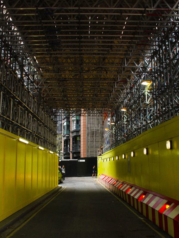
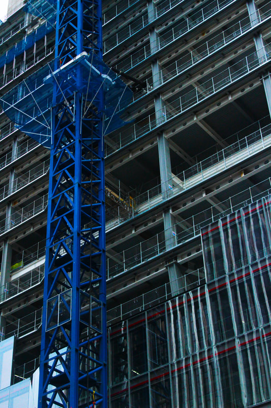
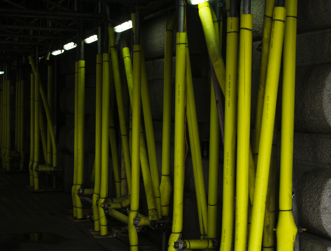
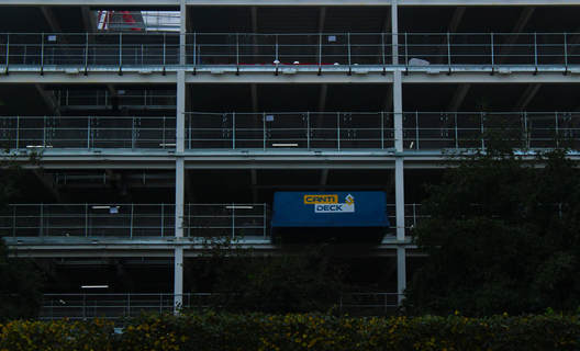
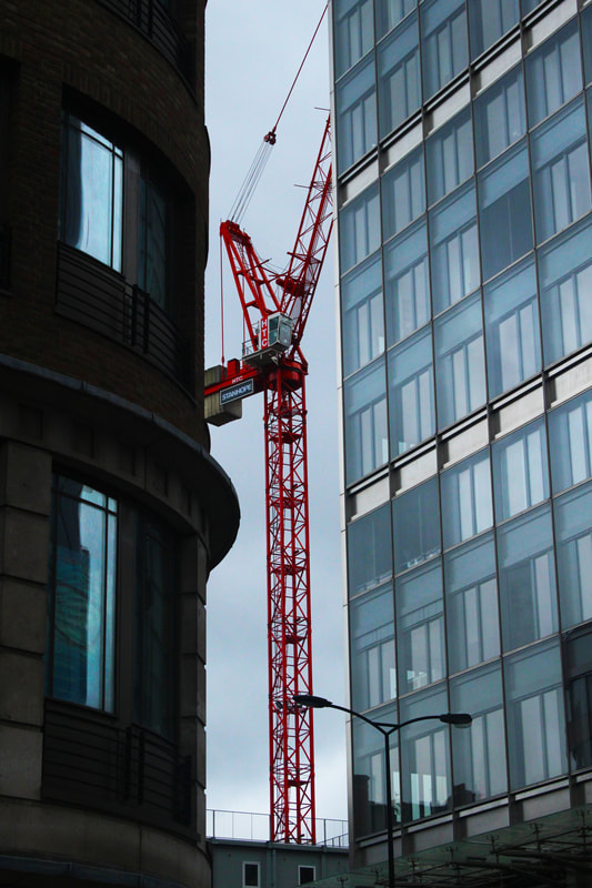
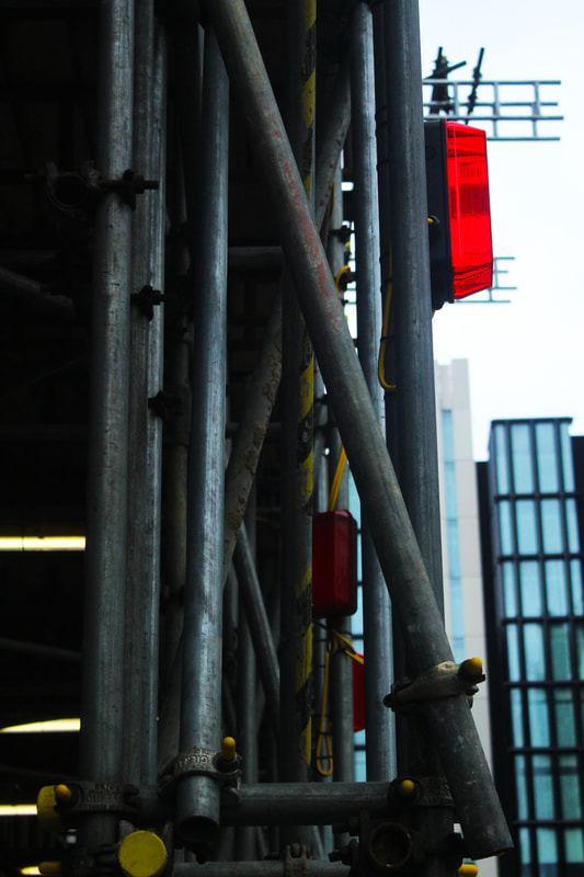
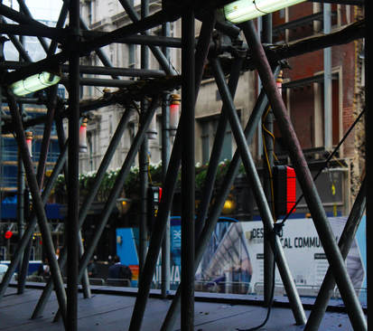
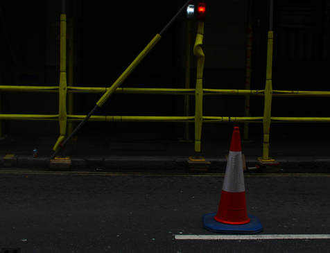
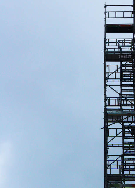
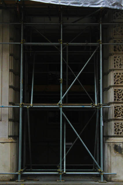
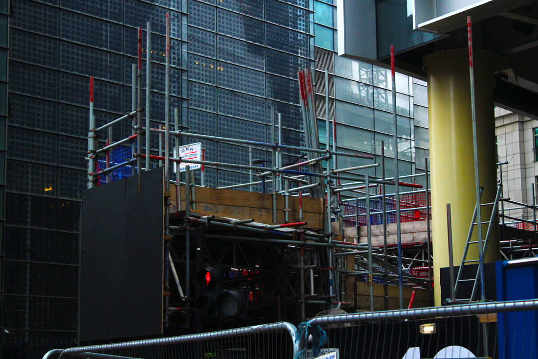
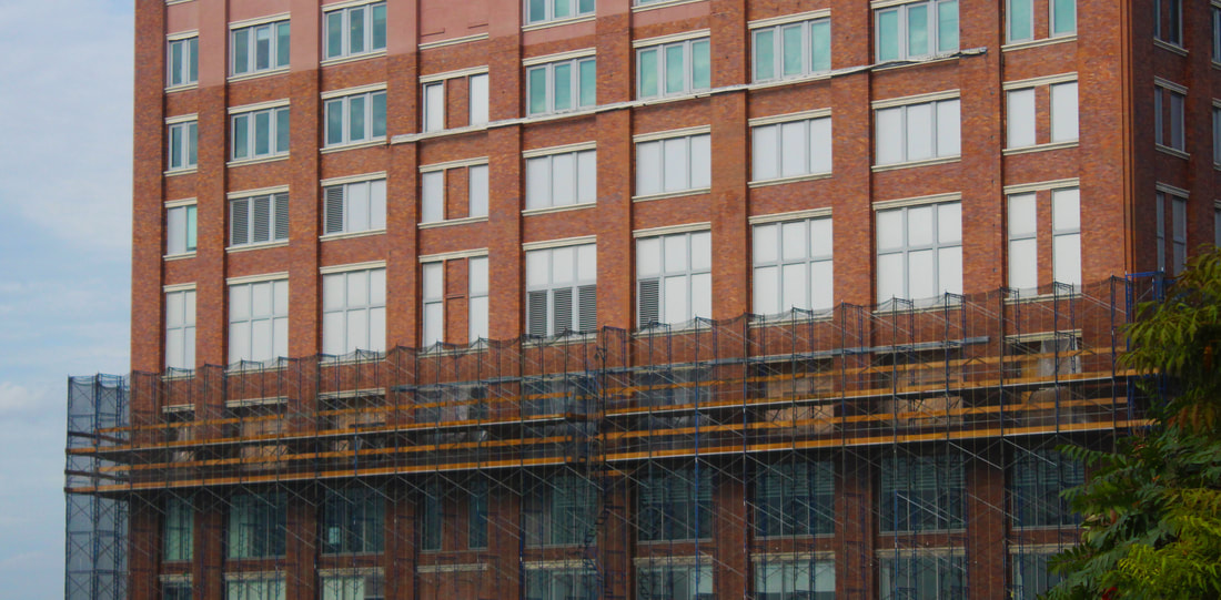
Focusing on 'Urban Environments', I traveled to Moorgate to take these photographs of construction work for my brief. In London, there is constant redevelopment taking place with cranes a permanent feature of the skyline. They tower over buildings alongside miles of metal scaffolding wrapped around the structures. In my photographs I wanted to explore how these imposing structures overwhelm an area and whether the images reveal something positive or negative.
|
|
In these images I think I captured the sheer volume of the scaffolding, giving buildings an additional skin, obliterating the original building. I really like the visual effect of the criss-crossing of the metal rods. The patterns they make are intricate and repetitive and I find it has its own beauty.
The closer I photographed the buildings the more I could admire the scaffolding's engineering feat and it added more texture to the image. The building works also included the three primary colours, red, yellow and blue which I tried to make a feature of my images as it helps to draw the eye to the details and adds interest.
The closer I photographed the buildings the more I could admire the scaffolding's engineering feat and it added more texture to the image. The building works also included the three primary colours, red, yellow and blue which I tried to make a feature of my images as it helps to draw the eye to the details and adds interest.
|
|
|
|
|
|
|
|
|
|
DEVELOPMENT 2
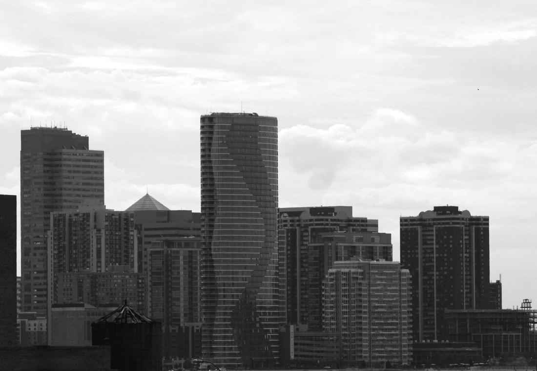
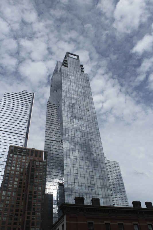
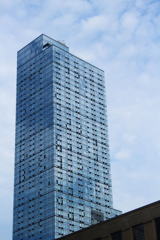
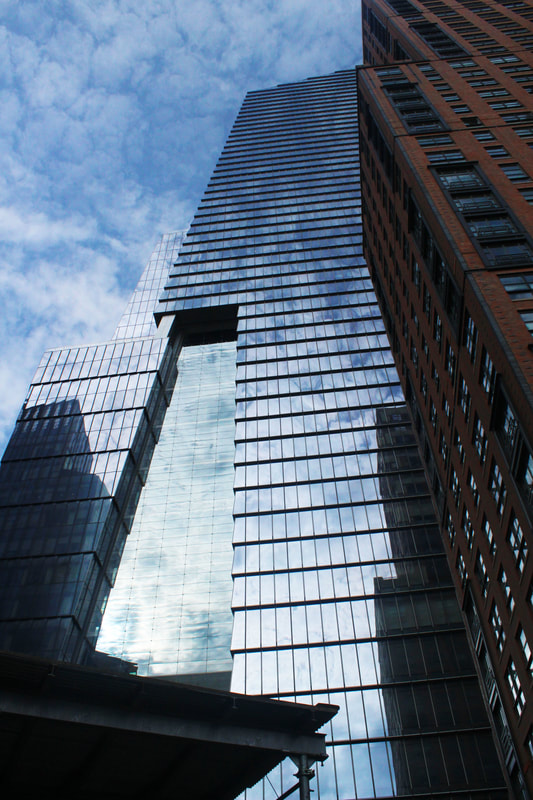
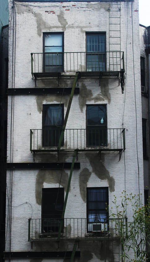
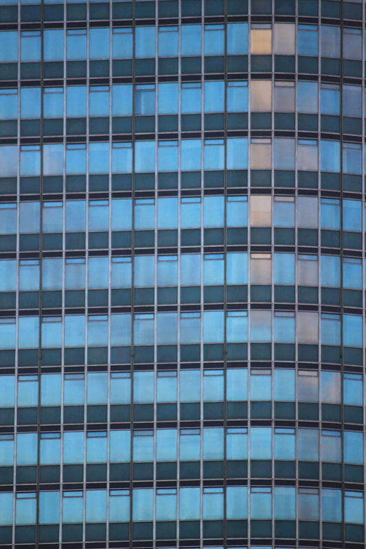
I visited New York City where humans have vastly impacted the environment with their development of skyscrapers dominating the streets. I focused on four main aspects: Looking Across, Looking Up, Face On and Zoomed In.
Within these four aspects I wanted to explore the different angles and perspectives of buildings, so I walked along the High Line, as it could bring me closer to the buildings without the roads and traffic obstructing views, as it is one story higher than street level. There were a wide variety of styles of architecture from glass to red brick, gleaming skyscrapers to solid, intricately designed brick buildings half the height.
Within these four aspects I wanted to explore the different angles and perspectives of buildings, so I walked along the High Line, as it could bring me closer to the buildings without the roads and traffic obstructing views, as it is one story higher than street level. There were a wide variety of styles of architecture from glass to red brick, gleaming skyscrapers to solid, intricately designed brick buildings half the height.
Looking across
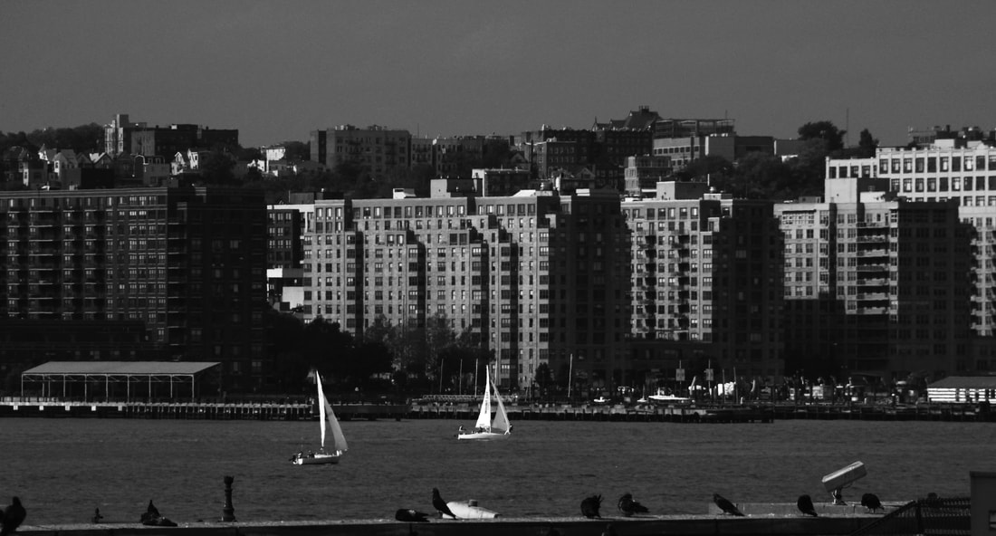
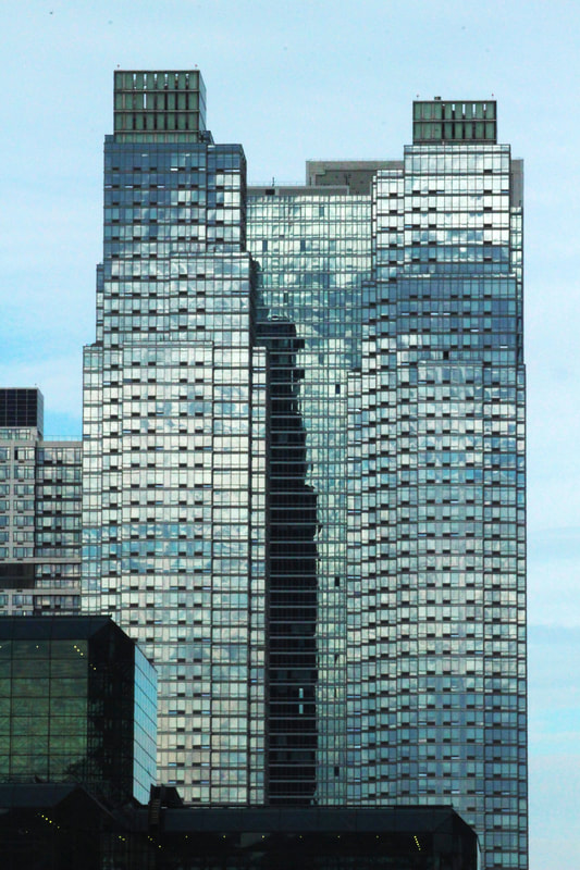
For the 'Looking Across' section I was by the Hudson River. I chose to make these photographs black and white, as the absence of colour helps to highlight the boats' sails, and the buildings, that are lit by the sun in the first photo.
In the second photograph, using my zoom lens I was able to get a good closer shot of the buildings opposite me across the river. I was trying to remove any indications of scale so the viewer can't tell how big or small the buildings actually are, although that is hard when they are obviously large city buildings. The result reminds me of some Michael Wolf images.
In the second photograph, using my zoom lens I was able to get a good closer shot of the buildings opposite me across the river. I was trying to remove any indications of scale so the viewer can't tell how big or small the buildings actually are, although that is hard when they are obviously large city buildings. The result reminds me of some Michael Wolf images.
looking up
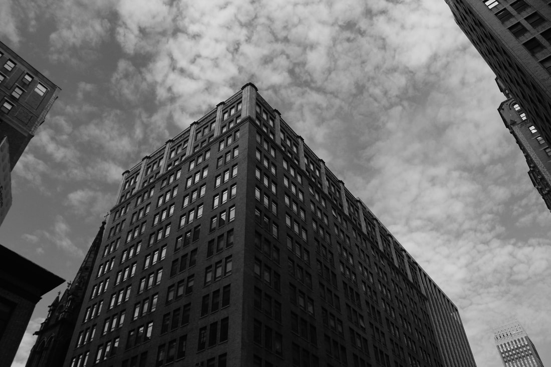
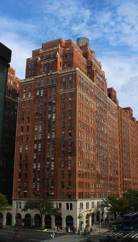
For the 'Looking Up' section, I took photographs of tall buildings - I was still in New York walking along the High Line - at a sharp angle and looking up, to emphasise how imposing they are in a city, towering over people and dominating the environment. It was most successful when I could capture them at the corner of the buildings, giving more planes and angles for greater interest and I think the scattered, mottled clouds really add further texture.
|
|
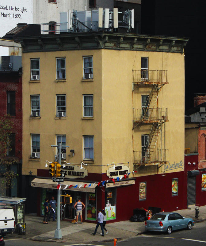
face on
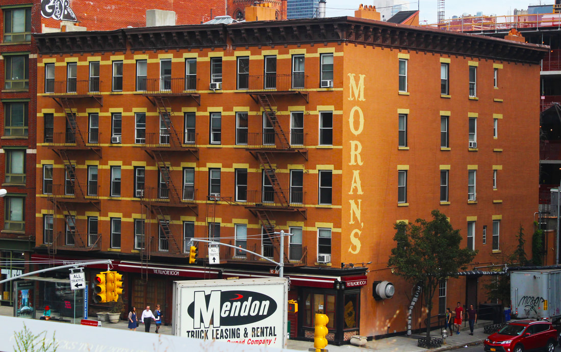
Being on the High Line also enabled me to take photographs of buildings without distorting them as I was directly in front of them. The first and second images worked especially well as I was able to capture the whole of the building. Doing that made the buildings and surroundings seem like a toy town as they are dwarfed by the other buildings around and because of my shots being made from the first storey height.
I increased the contrast, vibrance and saturation in all of the photographs to make the buildings stand out even more. The colours of the buildings in the first two photographs seem to make them look even more unreal and even 'fake'. Some of the colours are very appealing such as the orange of Moran's below and the contrast of the building in yellow and red, and another the green of the fire escape against the red brick.
In the sixth image below there is a cluster of buildings where I have tried to illustrate how layered the buildings are and include the newer glass boxes with the faded and peeling facades of the older, shorter buildings.
|
|
zoomed in
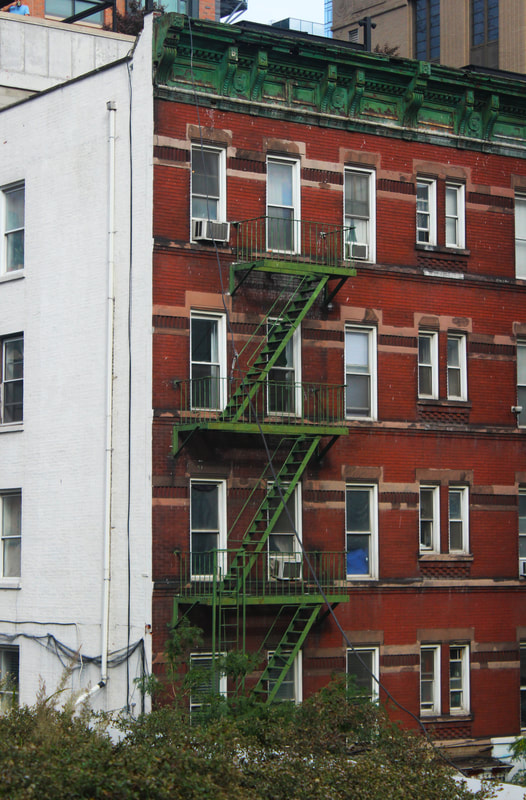
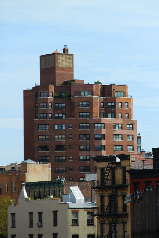
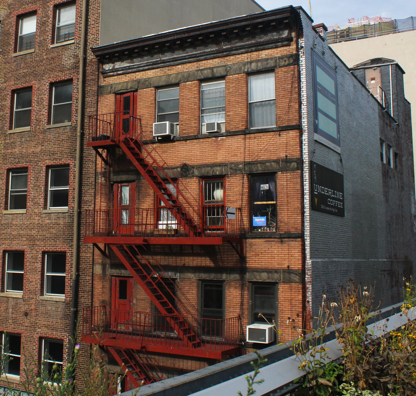
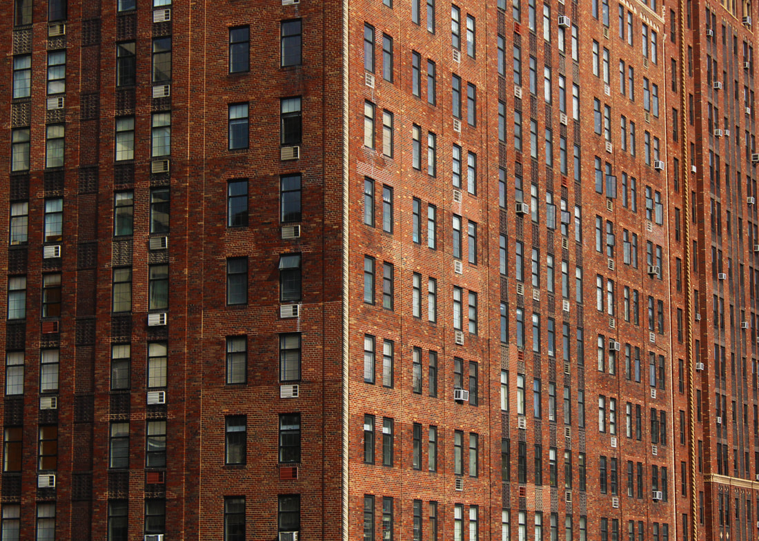
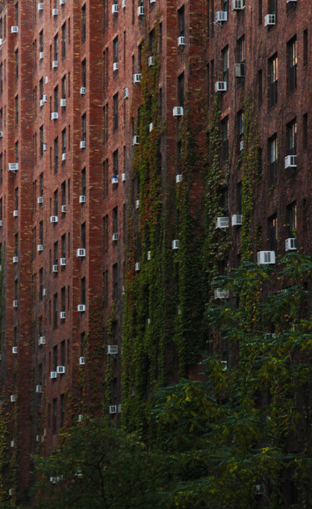
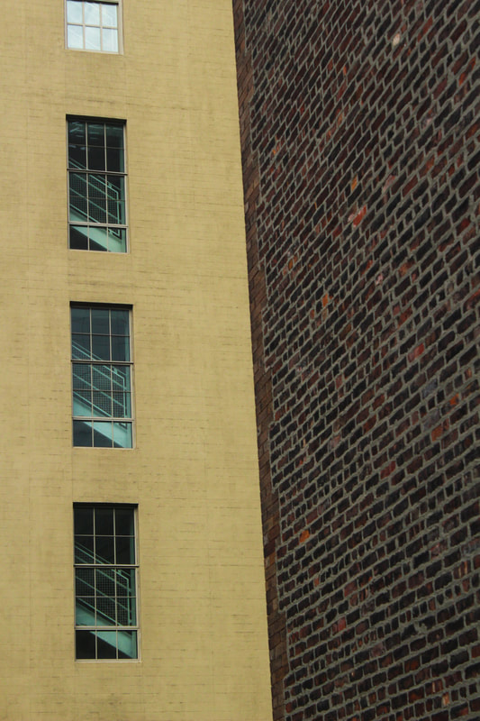
There is a very interesting variety of buildings on the mile and a half walk along the High Line. You can see the backs of buildings with the iconic New York fire escapes and air conditioning units, apartments and offices, plus the highly polished glass buildings.
I decided to zoom in on some buildings where I found colours or patterns of interest. I spotted the contrast of the yellow building at a right angle with the red brick wall of another building, plus the diagonal stairway in the windows. As I could get fairly close from the High Line walkway, the resulting contrast and unsettling angle of the brown bricks is a very pleasing composition, partly because it fills the frame with two large planes. I am particularly drawn to the images where I have flattened the view, so they become more like graphic art.
I also like the image of the building where nature is fighting back, by covering the bricks in creeping ivy. It shows that even though humans can impact on the environment, nature can still find its way back.
|
|
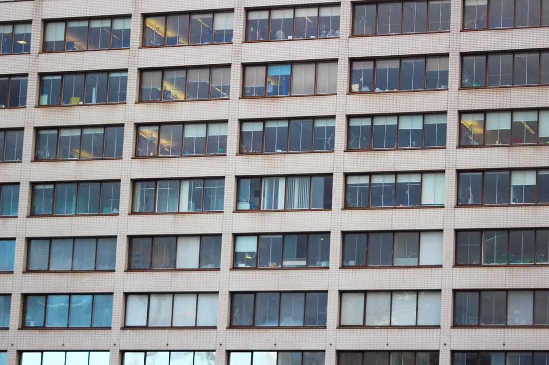
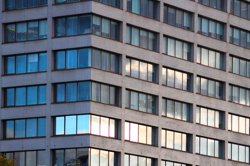
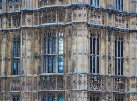
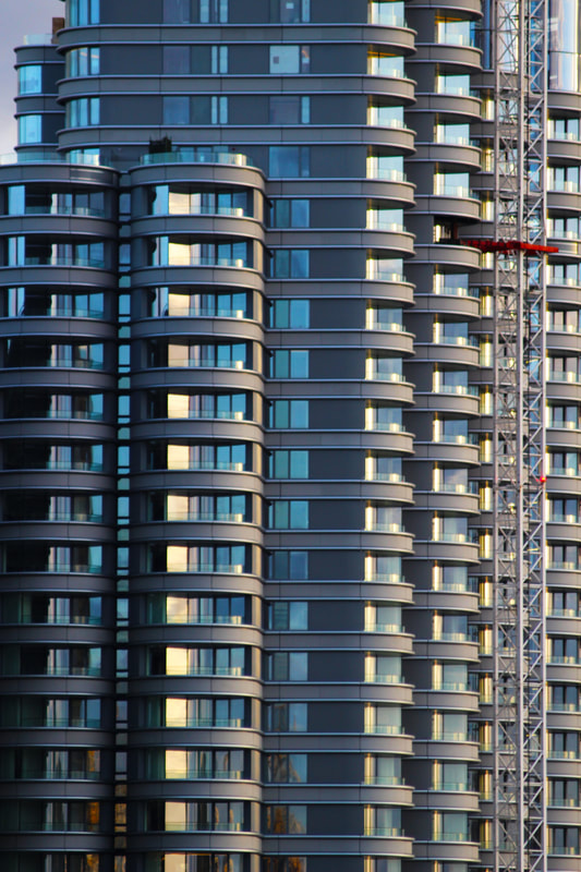
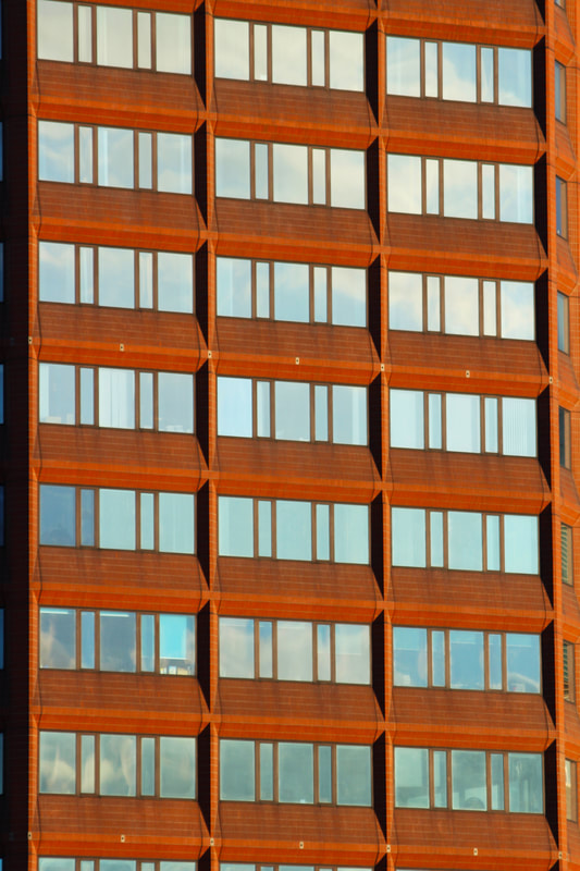
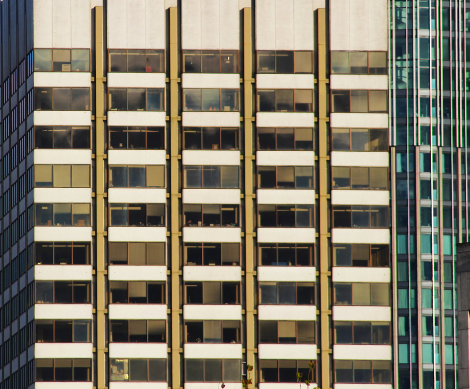
DEVELOPMENT 3
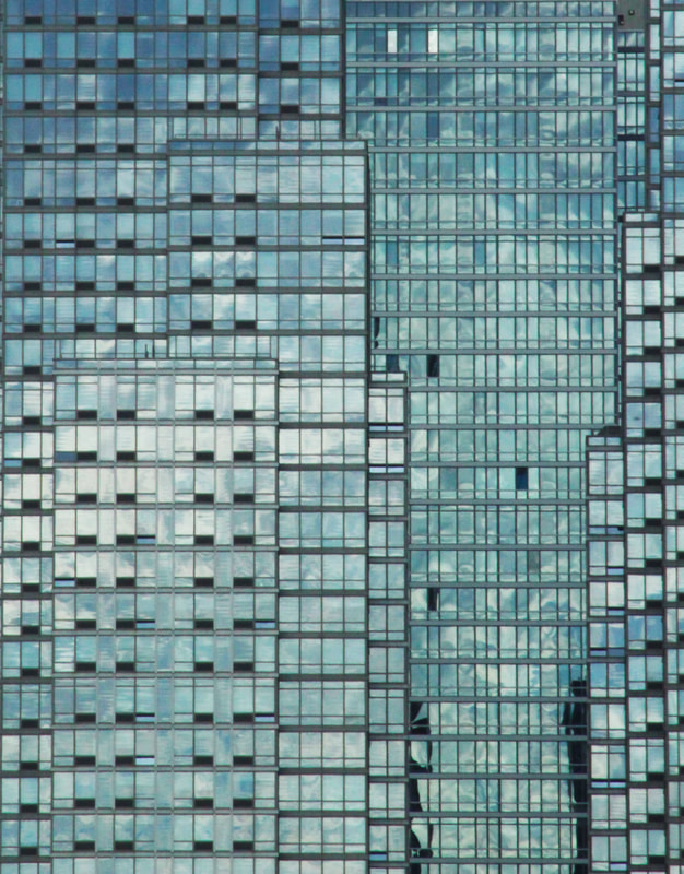
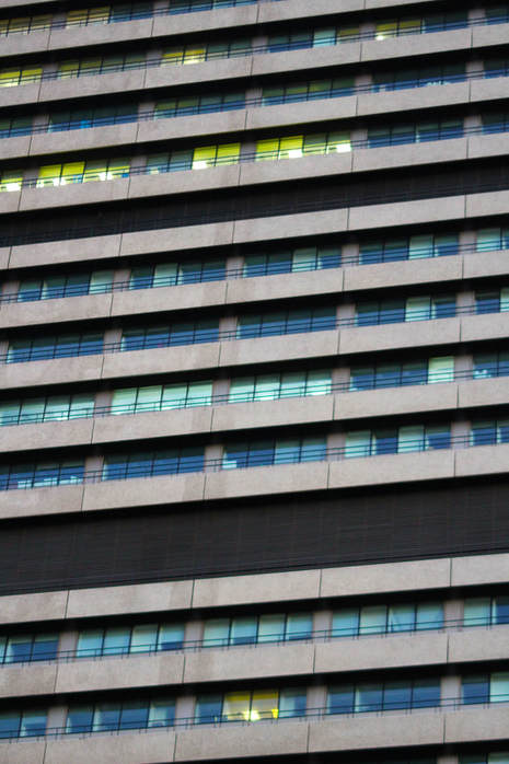
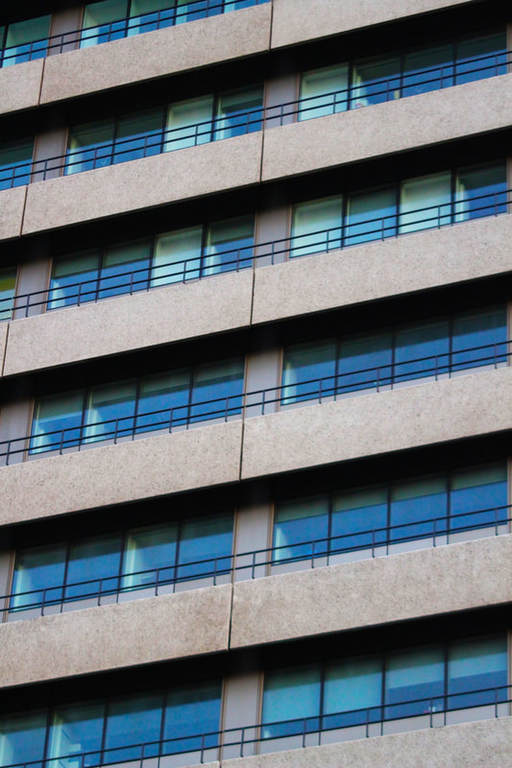
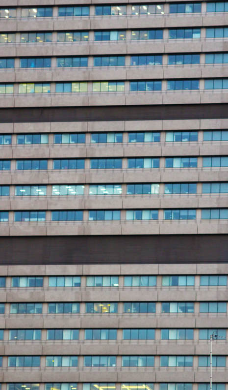
In this development I continued with my 'Zoomed In' response and developed it further. I took photographs of buildings in London that I saw had repetitive patterns and colours, with strong horizontal or vertical lines. I cropped out the parts of the building that would give away the scale or the angles at which they were taken. This allowed me to create a set of aesthetically pleasing, abstract images. I think my images show the variety in the urban environment in London well from photographing office buildings, the shard and the Houses of Parliament.
|
|
|
|
|
|
|
|
DEVELOPMENT 4
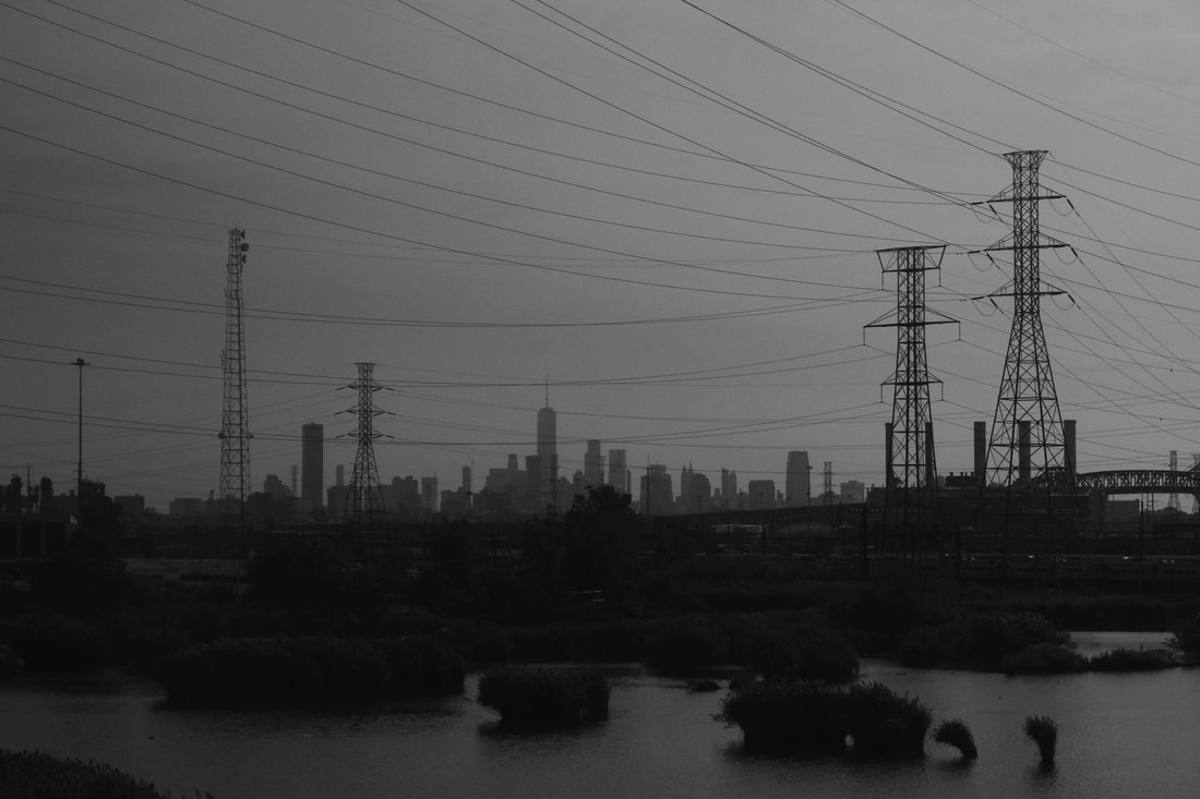
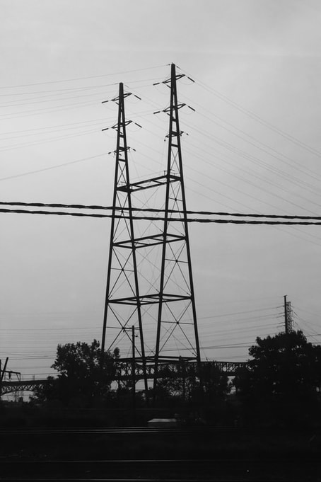
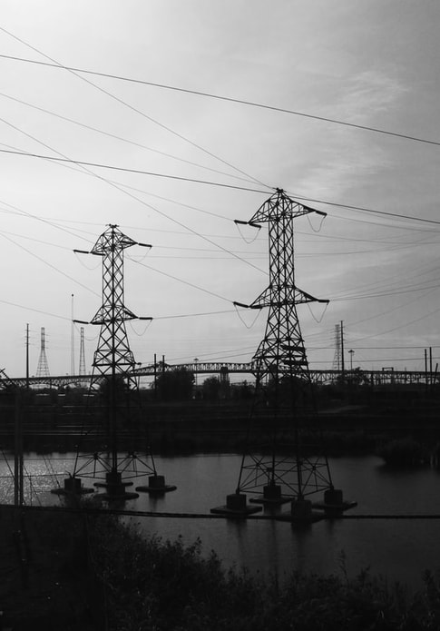
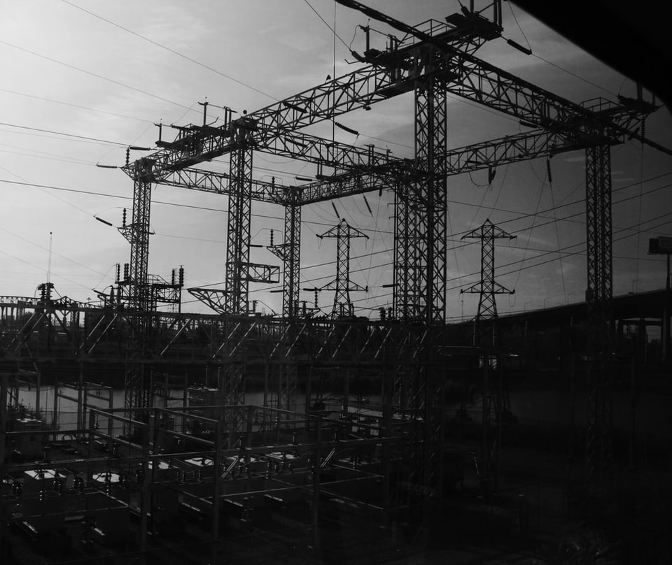
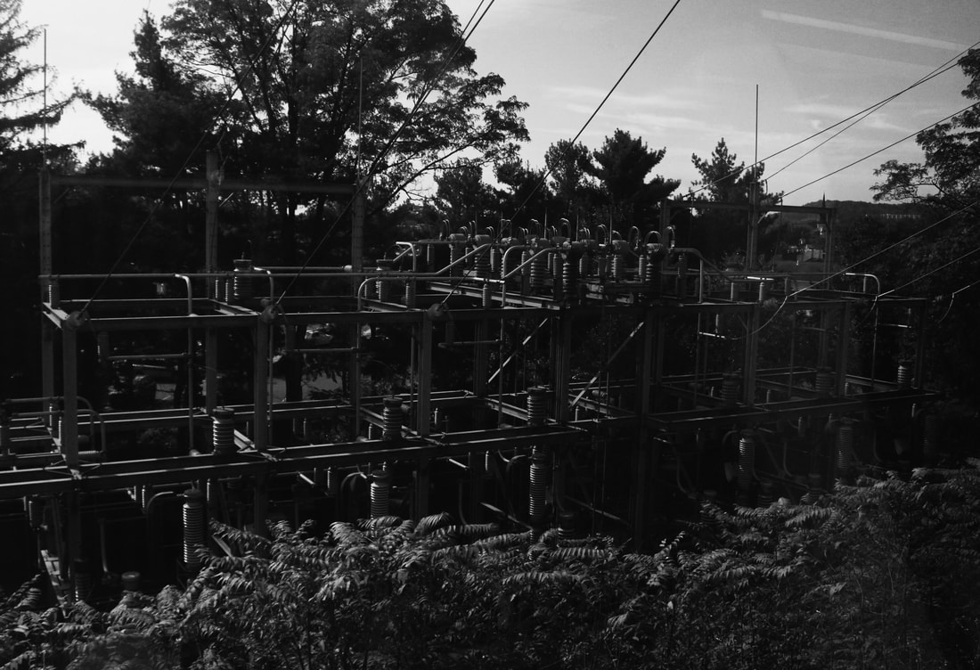
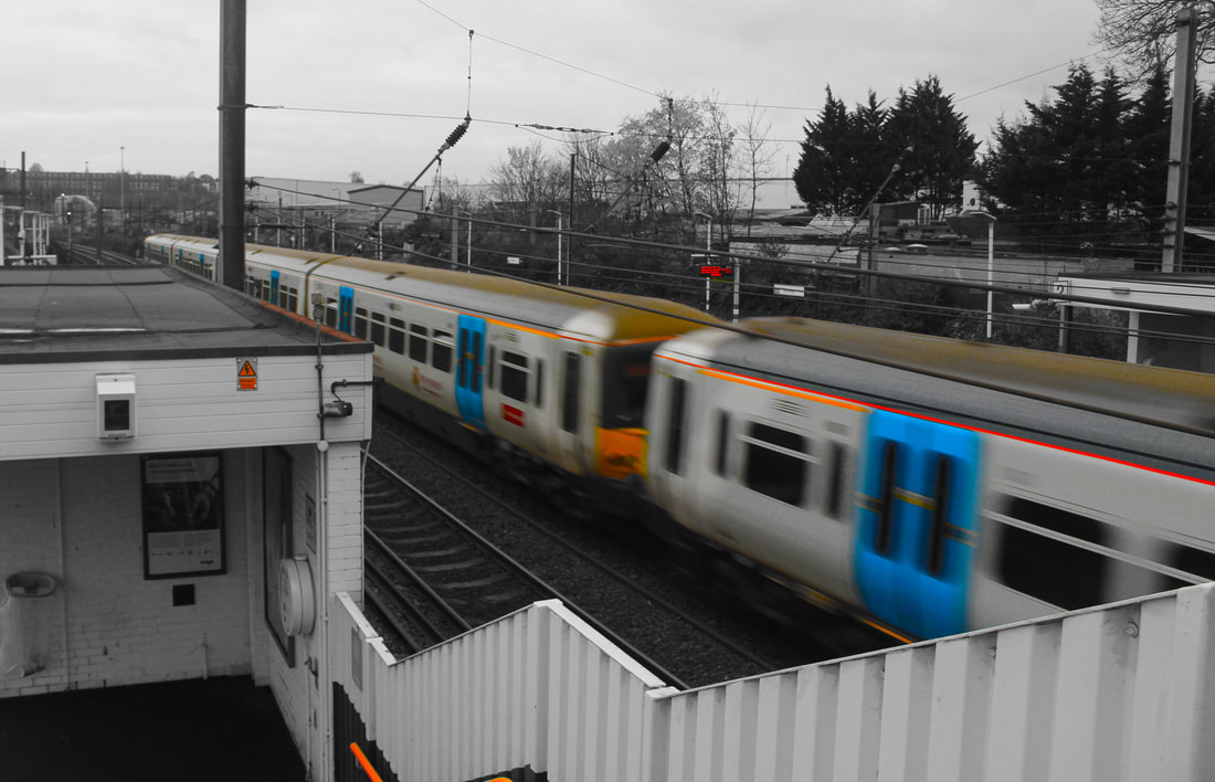
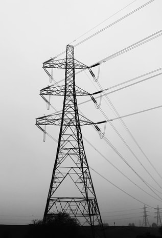
Moving on from buildings, I wanted to see what else I could photograph under the theme 'man's impact on the environment'. Structures such as pylons or train stations are another way that humanity has impacted the environment. These intricate structures tower over everything in their path and the wires connecting them seem to go on forever. They are an essential part of infrastructure and often passed and ignored. In the USA on journeys into Manhattan by train, we passed some heavily industrialised areas, which ended up with a mass of electricity stations and pylons on the edge of the Hudson Bay so these shots were taken on that journey.
Using black and white but not high contrast seems to give them a hue which feels like they were taken in the 1940s, with the heavily shaded areas and mix of grey tones. In the image below the long sweeping power lines thread across the sky breaking up the expanse and leading the eye to the pylons. This leaves the New York skyline unusually as a secondary background scene, with the dark watery foreground landscape to anchor the image more as an industrial landscape, rather than a cityscape.
The final two images appear to be electricity sub stations with a heavy and imposing structure. The first is a 'field' of pylons, the second a sub station springing up alongside the railtrack and the trackside trees and fronds.
|
|
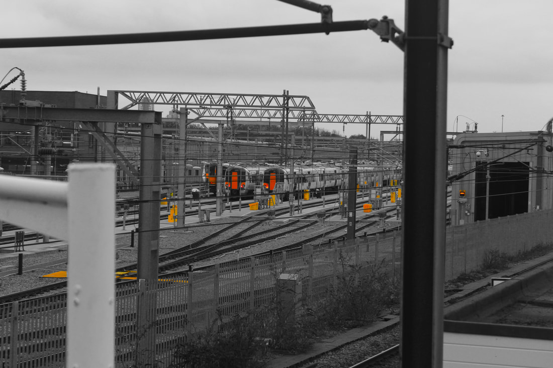
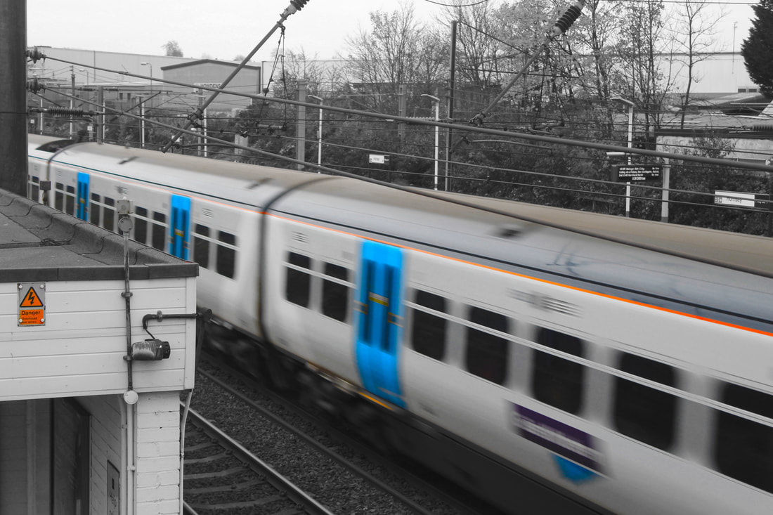
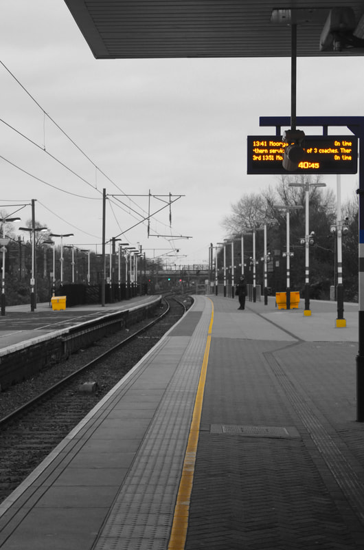
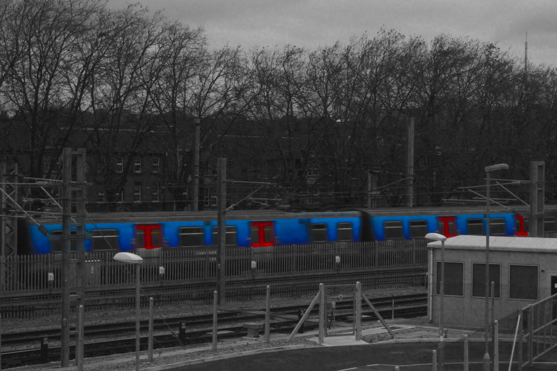
DEVELOPMENT 5
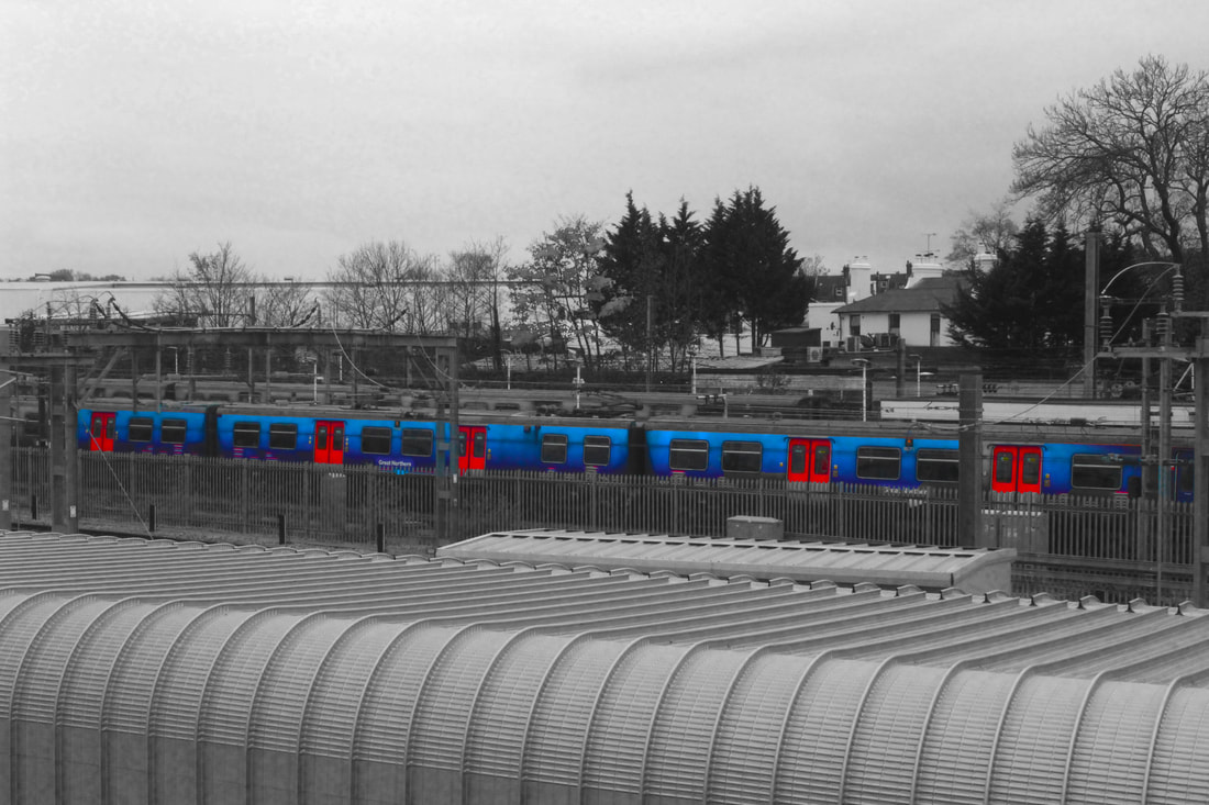
For this response I went to Hornsey and Finsbury Park train stations. In the images below, instead of making the whole image black and white like my last response, I selected the part of the image I wanted to be in colour and increased the saturation and vibrance. I then selected the inverse and made the rest of the image black and white. In these images I wanted to show another side to urban environments that included a twist. By highlighting the main colour I think I made the quiet, empty environment I was in come to life.
|
|
DEVELOPMENT 6
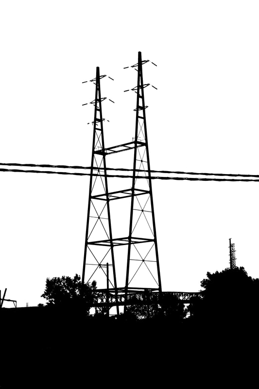
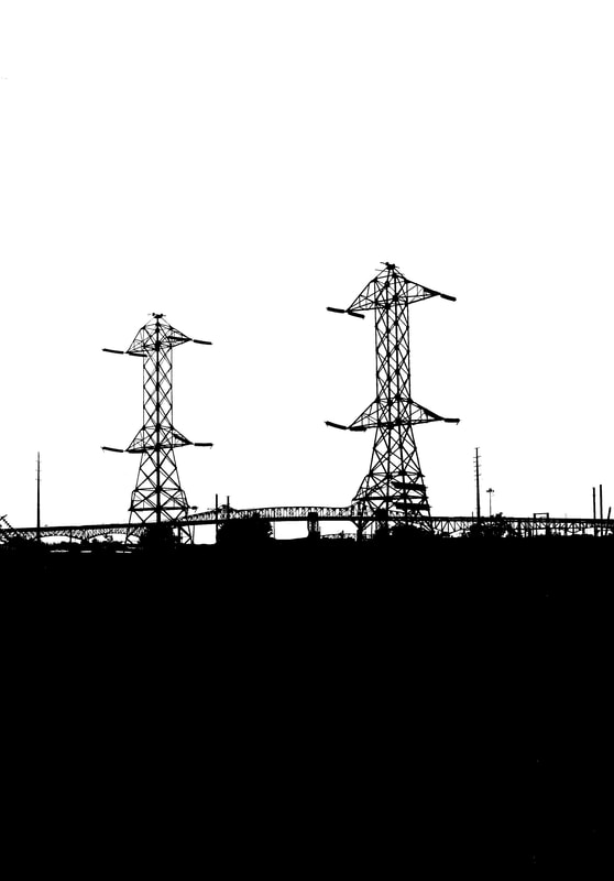
In this response I continued with the metal structures I took in development 4. I experimented with the threshold and highly increased the contrast. This gave the images the look of a graphic poster celebrating industrial structures. Pylons span both urban and rural landscapes and everything in between and once observed, I now see them everywhere. I came to realise these were the perfect subject for my next development away from photographing buildings
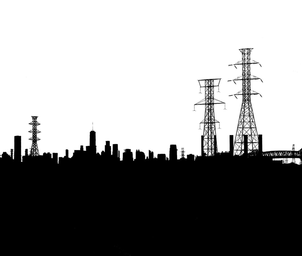
I particularly like the third image below where the New Jersey pylons dominate the Manhattan skyline from this angle, and the buildings and pylons are presented in a very flat plane, with anything else in total black silhouette. By heavily increasing the contrast in these, I removed the shade that gave detail and perspective - and scale is harder to interpret, making it appear a little surreal. You don't usually see pylons dwarfing the famous cityscape. The intricate bridge captured in the far right of the frame adds some unexpected interest in the corner.
I particularly like the third image below where the New Jersey pylons dominate the Manhattan skyline from this angle, and the buildings and pylons are presented in a very flat plane, with anything else in total black silhouette. By heavily increasing the contrast in these, I removed the shade that gave detail and perspective - and scale is harder to interpret, making it appear a little surreal. You don't usually see pylons dwarfing the famous cityscape. The intricate bridge captured in the far right of the frame adds some unexpected interest in the corner.
|
|
DEVELOPMENT 7
Uwe langmann
|
|
Uwe Langmann is a German fine art photographer, born in 1985. His 'Lines' series was a joint work with Katja Gragert created in 2016 to 2017. He has mainly worked in black and white and creates extremely minimalist images in isolated landscapes.
He began his career making short films and documentaries in 2007, one of which was shown in the Cannes Film Festival in 2009. He started a project to make a feature film by scouting for locations and taking many shots of stark landscapes. Although the film never was financed, he found people loved his location shots. Because of this, in 2010 he decided to focus purely on photography. He has exhibited frequently since 2011 in the USA, Germany, France, Austria and Holland.
Uwe has said "Photography is 'writing with light' and this plays a major role in my works". He does not manipulate his photographs, he uses a long exposure and so captures the isolated man-made structures in bare landscapes and in high contrast.
In an interview with Bregenz in 2012 (published on YouTube) he says he is interested in "what humans put into these landscapes and how this is creating a new kind of aesthetic". He acknowledges the rapid acceleration of change in the world and especially how this is impacting on nature. He says of his technique, "I try to slow the time down with those long time exposures, which seems a bit of a paradox to me to use more time to later achieve a kind of deceleration or stagnation of time". His images do give a sense of stillness and timelessness due to his limiting what is admitted into the frame and it being monochrome, so no distractions.
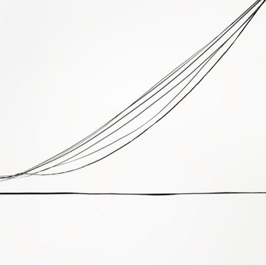
In my work on Pylons I have been inspired by the simplicity of Langmann's black and white images and, like him, am also looking at how humans have imposed structures on a landscape and what kind of imagery can be created with that. I moved away from focusing on buildings to looking at other infrastructure and iron work. I photographed railway lines and industrial iron works including electricity pylons.
I felt the lines running from the pylons looked elegant in the way they hang in an arc, rather than being tightly strung, and the intricate criss-cross design was reminiscent of the scaffolding close-ups I had photographed previously. I decided to photograph the pylons together but then to zoom in on parts of the structure to emphasise the patterns of the iron work. By photographing them in close-up it forces myself and the viewer to have a more intimate knowledge of the structures and how they are made. It also becomes a slightly more abstract image so highlighting the pattern rather that what the object actually is.
He began his career making short films and documentaries in 2007, one of which was shown in the Cannes Film Festival in 2009. He started a project to make a feature film by scouting for locations and taking many shots of stark landscapes. Although the film never was financed, he found people loved his location shots. Because of this, in 2010 he decided to focus purely on photography. He has exhibited frequently since 2011 in the USA, Germany, France, Austria and Holland.
Uwe has said "Photography is 'writing with light' and this plays a major role in my works". He does not manipulate his photographs, he uses a long exposure and so captures the isolated man-made structures in bare landscapes and in high contrast.
In an interview with Bregenz in 2012 (published on YouTube) he says he is interested in "what humans put into these landscapes and how this is creating a new kind of aesthetic". He acknowledges the rapid acceleration of change in the world and especially how this is impacting on nature. He says of his technique, "I try to slow the time down with those long time exposures, which seems a bit of a paradox to me to use more time to later achieve a kind of deceleration or stagnation of time". His images do give a sense of stillness and timelessness due to his limiting what is admitted into the frame and it being monochrome, so no distractions.
In my work on Pylons I have been inspired by the simplicity of Langmann's black and white images and, like him, am also looking at how humans have imposed structures on a landscape and what kind of imagery can be created with that. I moved away from focusing on buildings to looking at other infrastructure and iron work. I photographed railway lines and industrial iron works including electricity pylons.
I felt the lines running from the pylons looked elegant in the way they hang in an arc, rather than being tightly strung, and the intricate criss-cross design was reminiscent of the scaffolding close-ups I had photographed previously. I decided to photograph the pylons together but then to zoom in on parts of the structure to emphasise the patterns of the iron work. By photographing them in close-up it forces myself and the viewer to have a more intimate knowledge of the structures and how they are made. It also becomes a slightly more abstract image so highlighting the pattern rather that what the object actually is.
my response
In my work on Pylons I have been inspired by the simplicity of Langmann's black and white images and, like him, am also looking at how humans have imposed structures on a landscape and what kind of imagery can be created with that. I moved away from focusing on buildings to looking at other infrastructure and iron work. I photographed railway lines and industrial iron works including electricity pylons.
I felt the lines running from the pylons looked elegant in the way they hang in an arc, rather than being tightly strung, and the intricate criss-cross design was reminiscent of the scaffolding close-ups I had photographed previously. I decided to photograph the pylons together but then to zoom in on parts of the structure to emphasise the patterns of the iron work. By photographing them in close-up it forces myself and the viewer to have a more intimate knowledge of the structures and how they are made. It also becomes a slightly more abstract image so highlighting the pattern rather that what the object actually is.
Once I started scouting for good locations in London to photograph pylons where I could get access, I discovered the best place was an industrial estate, just off a busy road in London, next to a canal and some warehouses, where I could get very close to a couple of pylons but which were still fenced off to the public. I wanted to combine the responses from my 4th and 6th developments by taking minimalistic photos of metal structures and trying to find similar structures as in the New York photos.
I like these close ups as they effectively show how the pylons are constructed and brings to the foreground their interesting forms and the features where the lines connect to other parts. The lines travel in many directions in parallel to each other.
DEVELOPMENT 8
For my next development I used the images from my last development and printed them and stuck them onto a wooden board. I then hammered pins into the board and joined the nails together with thread. I don't think this response was very successful as the wood underneath the photos is too distracting and the thread doesn't show up as much as I would have liked.
|
|
development 9
Debbie smyth
Debbie Smyth is a textile artist who works with textile in flat and 3D. She has exhibited frequently since graduating in 2007 and started her own practice in 2009. Apart from her group and solo exhibitions she also creates large-scale commissioned artwork for public, commercial and domestic spaces. She has created work for big brands such as Addidas, Red Cross, the New York Times and Hermes and regularly appears in interior design magazines such as Elle Decoration and Inside Out. For her graduation piece she used pins and thread to create 'Crafted Pylons'. All her work features pin and thread which she describes as 'drawing with thread'. She has taken an old technique ad made it contemporary.
Sometimes these works are created by 'linear' threads i.e the threads create a singular outline of a subject, scene or object - mostly black thread on white background but sometimes in bright colours. The other technique she uses is what she calls her 'shaded' works. This involves using messy, frayed threading to create a mass of shading around the subject, leaving the shape of the subject indicated by the blank white space left in the middle of this thread, rather than outlining it with distinct single lines.
I really like her shaded work, as the frayed and tangled thread creates movement and a particularly frenetic energy around the subject, but I also like the very beautiful large, linear installation depicting hundreds of flight paths, created for the IQ Shoreditch head office.
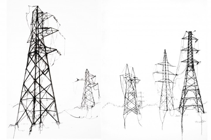
I found her 'Pins and Thread' work through searching on 'pylons'. She approached it from a different route from mine, starting with thread and using it like a pencil to outline the structures. These pylons are presented in blank landscape, in perspective, with darker thread/more strands used in the foreground pylons and lighter/fewer strands for the smaller pylons to imply distance. She has left stray strands floating from the pylons to achieve the look of a pencil sketch.
Sometimes these works are created by 'linear' threads i.e the threads create a singular outline of a subject, scene or object - mostly black thread on white background but sometimes in bright colours. The other technique she uses is what she calls her 'shaded' works. This involves using messy, frayed threading to create a mass of shading around the subject, leaving the shape of the subject indicated by the blank white space left in the middle of this thread, rather than outlining it with distinct single lines.
I really like her shaded work, as the frayed and tangled thread creates movement and a particularly frenetic energy around the subject, but I also like the very beautiful large, linear installation depicting hundreds of flight paths, created for the IQ Shoreditch head office.
I found her 'Pins and Thread' work through searching on 'pylons'. She approached it from a different route from mine, starting with thread and using it like a pencil to outline the structures. These pylons are presented in blank landscape, in perspective, with darker thread/more strands used in the foreground pylons and lighter/fewer strands for the smaller pylons to imply distance. She has left stray strands floating from the pylons to achieve the look of a pencil sketch.
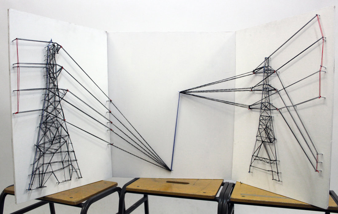
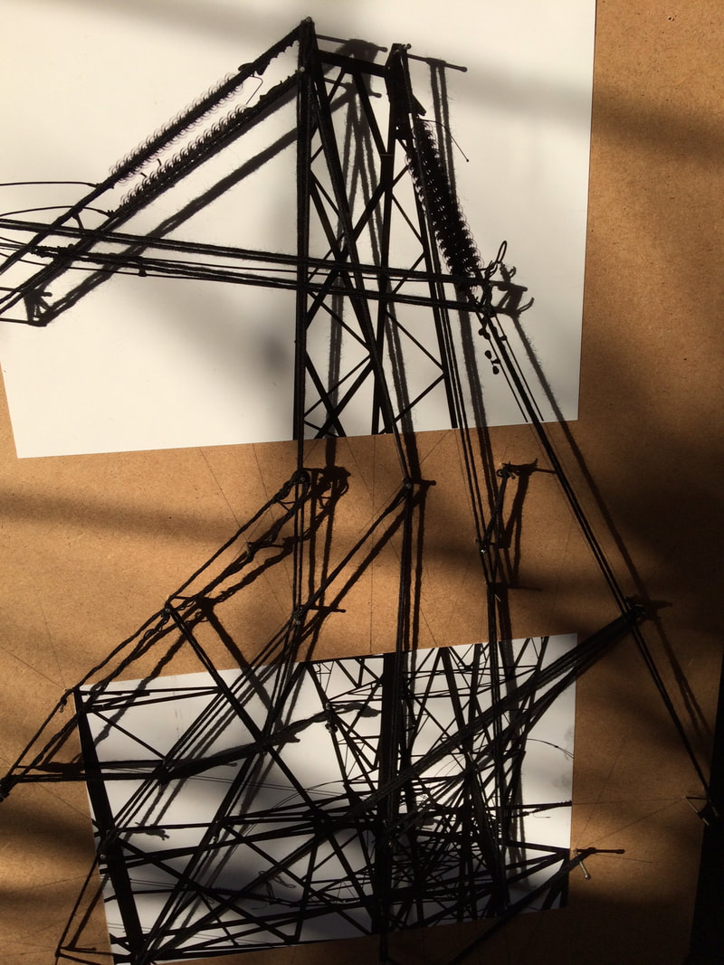
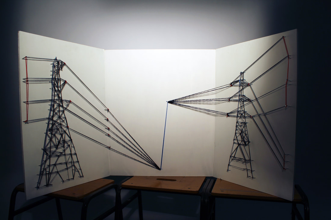
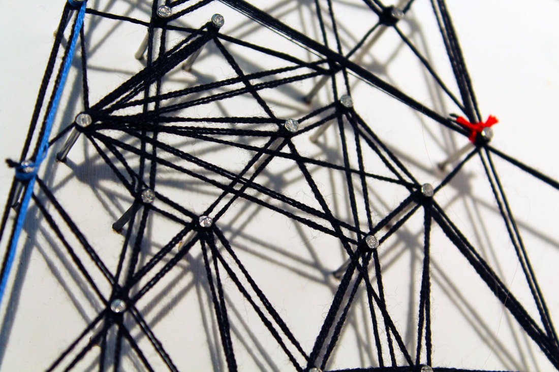
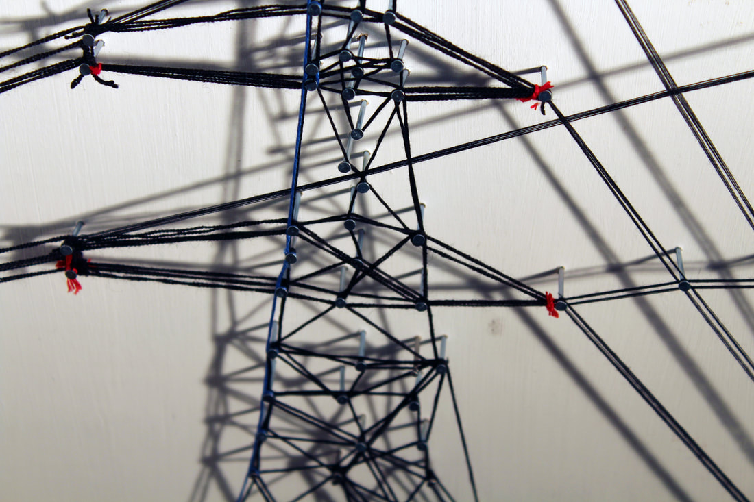
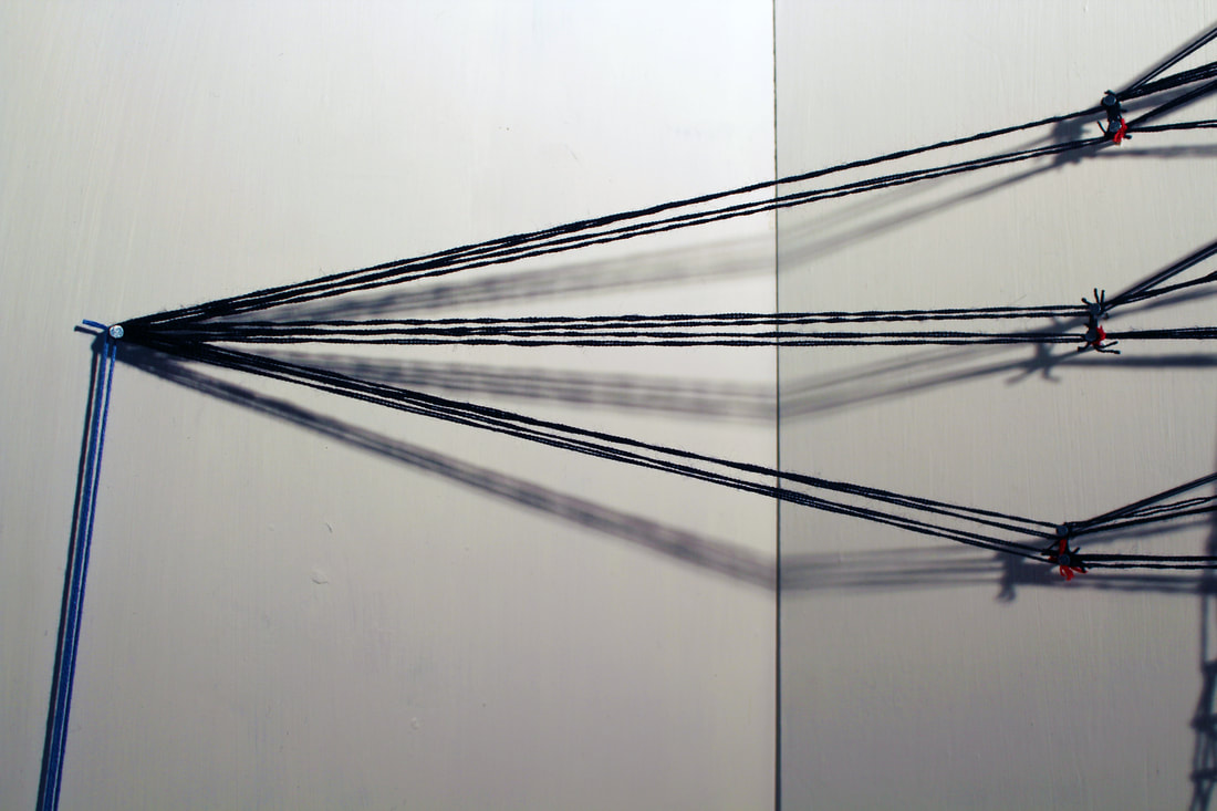
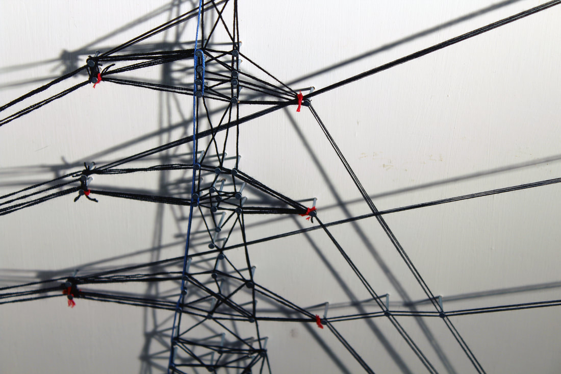
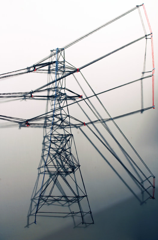
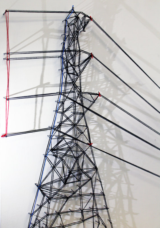
final piece
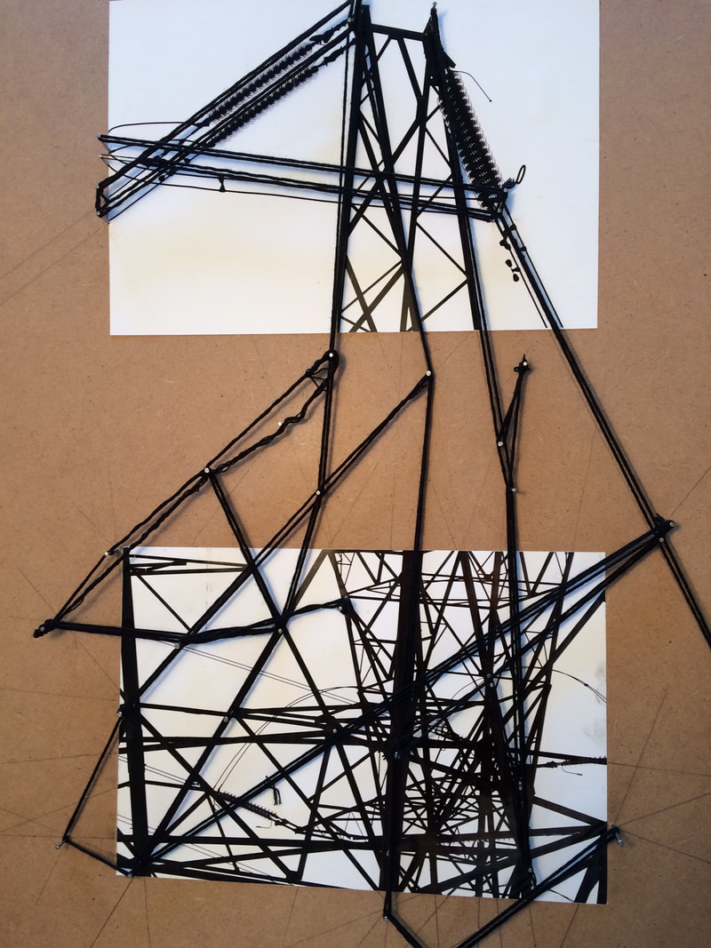
For my final piece I have brought together some different elements of all the developments. I chose to transpose my images to 3D and traces the pylons and their wire lines with thread, influenced at this point more by Debbie Smyth, except I wanted to make mine more abstract than the 'drawing with thread' sketches Debbie Smyth made.
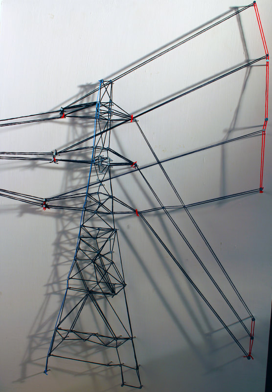
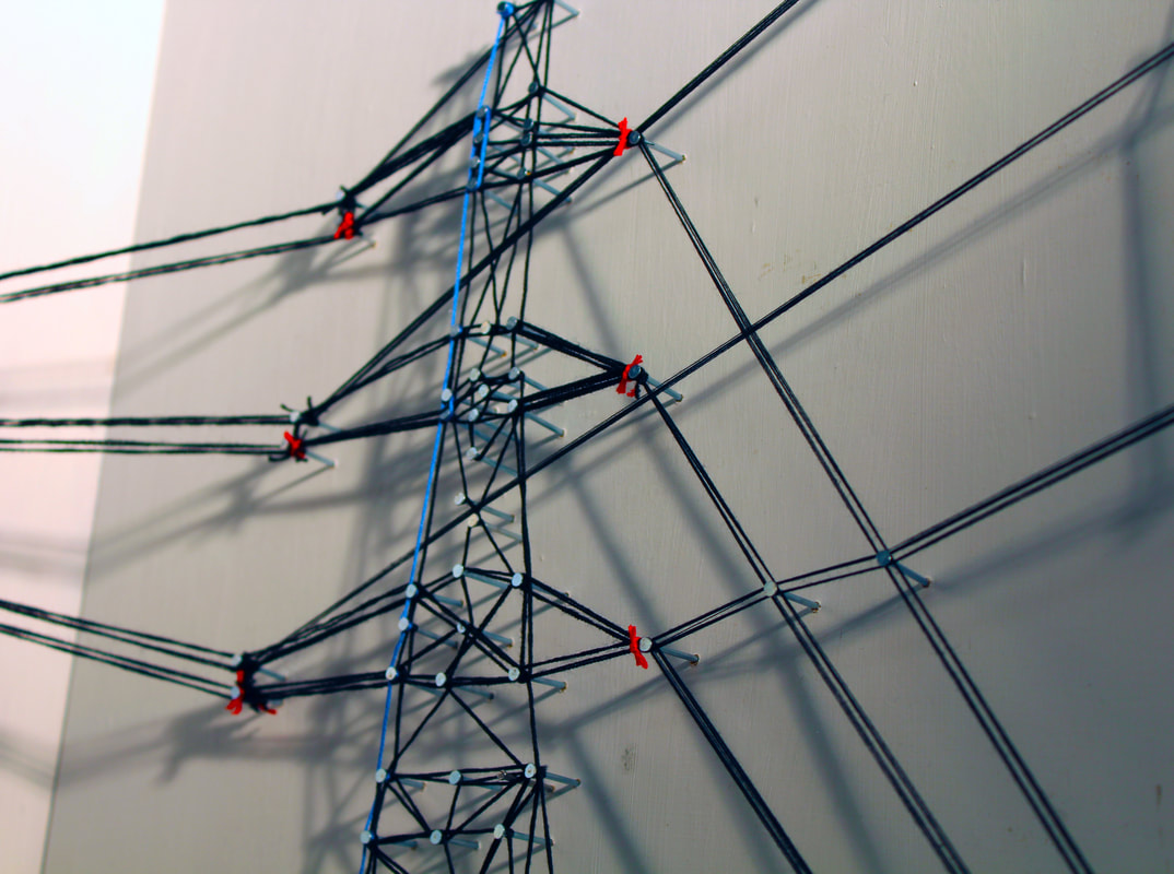
I used the images I had taken for my 8th development and printed them out A3 size. I then painted 3 pieces of wood white and placed the two images in top of two of the wood pieces. I drilled small holes in the main 'joints' of the pylons and then hammered pins into them after taking the printed photograph off. I then wrapped thread around the pins and threaded it around to form the shape of two pylons.
It was a very satisfying but hard process to wrap the threads. I marked out the outline of my pylons with pins first then double threaded around the pins. I wanted to highlight the lines, as well as the structures holding them. I chose to add a little coloured thread to my creation using small knots of red to indicate live electricity at the junctions, and a little blue to highlight one side of each pylon, adding some further perspective and visual interest. I then anchored and joined the two halves in the middle. I chose to keep the background white and to light the pieces from an angle to create further lines as shadows.
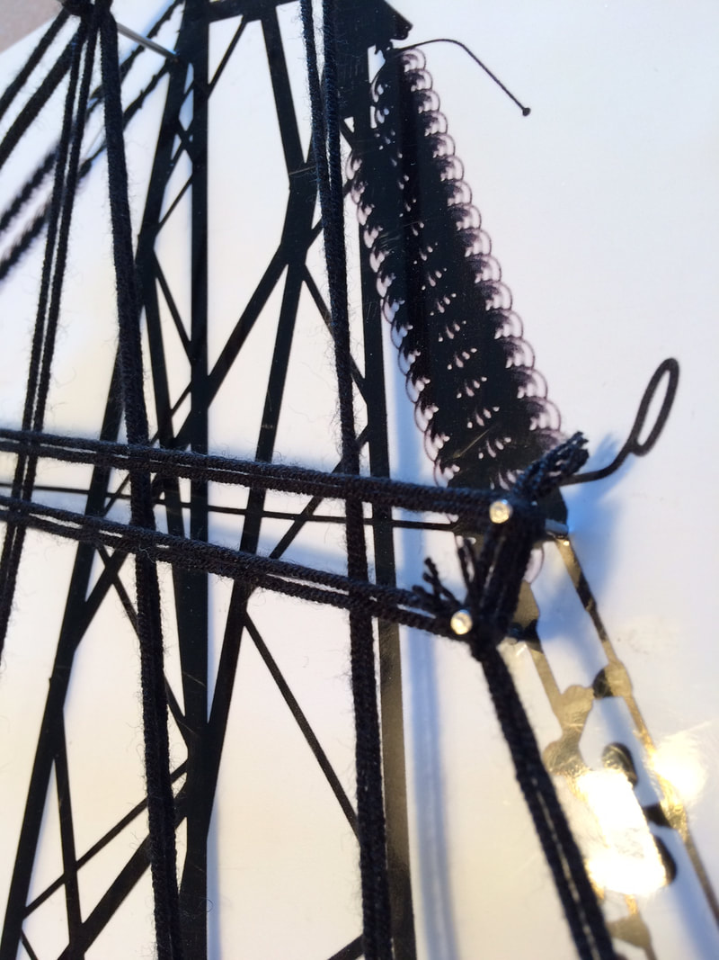
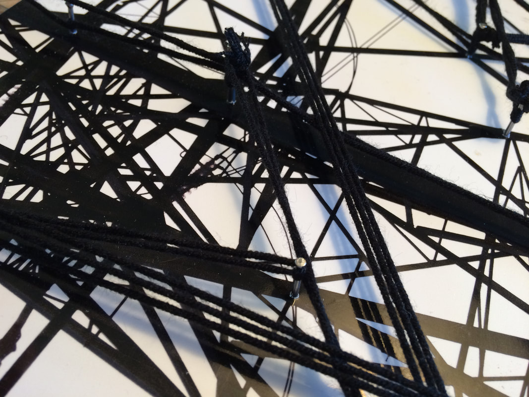
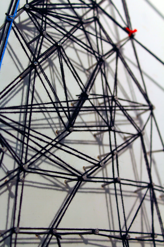
I then photographed parts of this artwork in close-up to create another layer to the development. I like how the pylons in these threaded close-ups have become once more removed from the first original documentary images. I was surprised at how well the middle section works as an abstract image if viewed without the pylons, particularly having the one blue thread running down and connecting the black triangles.
I used the images I had taken for my 8th development and printed them out A3 size. I then painted 3 pieces of wood white and placed the two images in top of two of the wood pieces. I drilled small holes in the main 'joints' of the pylons and then hammered pins into them after taking the printed photograph off. I then wrapped thread around the pins and threaded it around to form the shape of two pylons.
It was a very satisfying but hard process to wrap the threads. I marked out the outline of my pylons with pins first then double threaded around the pins. I wanted to highlight the lines, as well as the structures holding them. I chose to add a little coloured thread to my creation using small knots of red to indicate live electricity at the junctions, and a little blue to highlight one side of each pylon, adding some further perspective and visual interest. I then anchored and joined the two halves in the middle. I chose to keep the background white and to light the pieces from an angle to create further lines as shadows.
I then photographed parts of this artwork in close-up to create another layer to the development. I like how the pylons in these threaded close-ups have become once more removed from the first original documentary images. I was surprised at how well the middle section works as an abstract image if viewed without the pylons, particularly having the one blue thread running down and connecting the black triangles.
|
|
|
|
|
|
|
|
|