ABSTRACT
adjective
ˈabstrakt/
adjective
ˈabstrakt/
- existing in thought or as an idea but not having a physical or concrete existence.
"abstract concepts such as love or beauty" - relating to or denoting art that does not attempt to represent external reality, but rather seeks to achieve its effect using shapes, colours, and textures.
"abstract pictures"
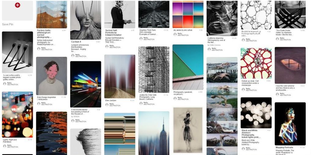
Click the image to go to the Pinterest board.
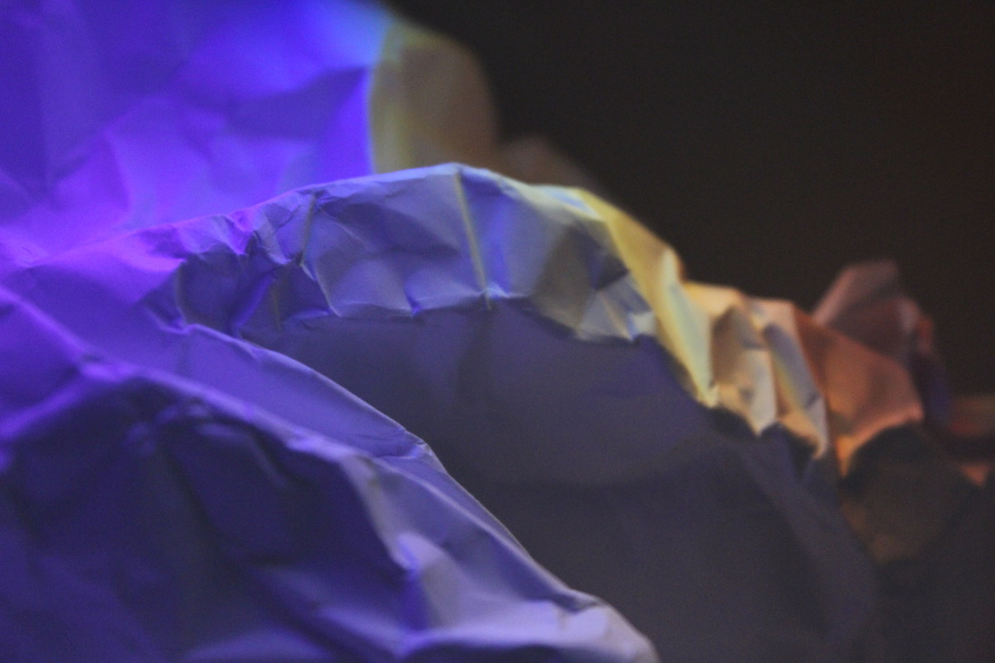
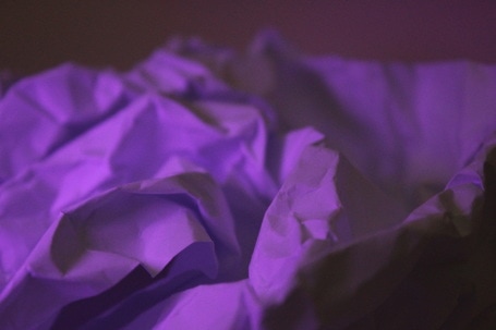
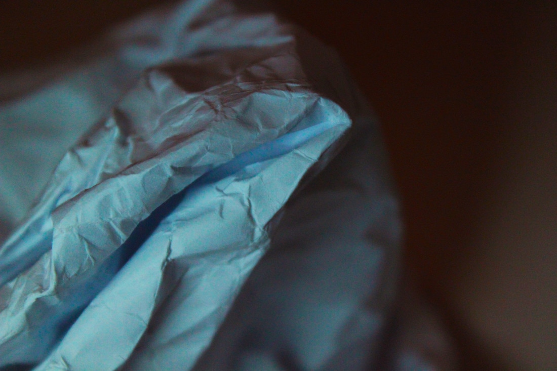
TASK 1 - WHITE PAPER TEST
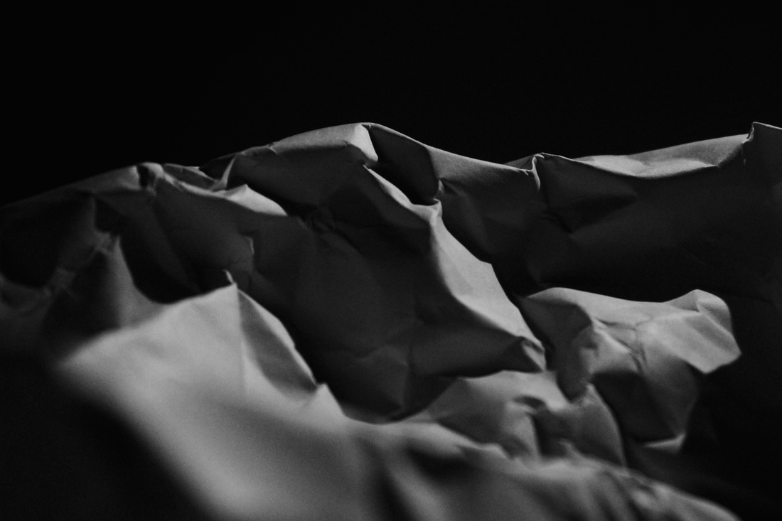
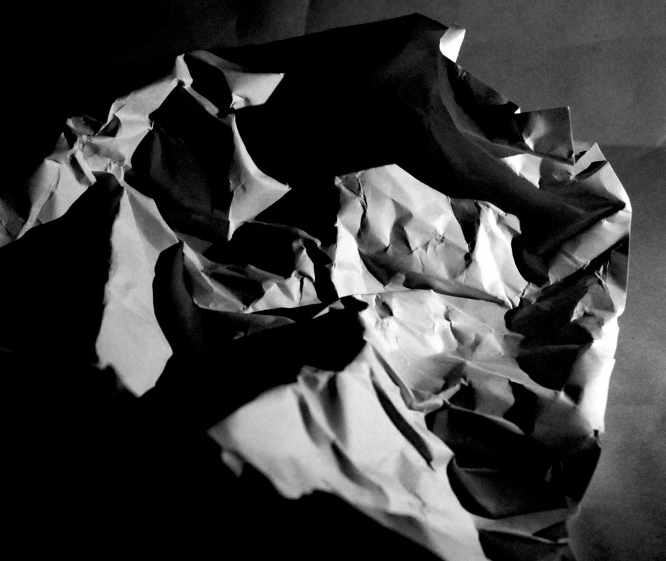
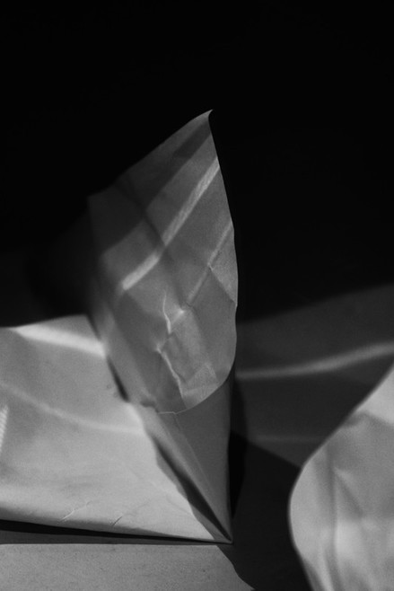
For this task we were asked to take a piece of white paper and make it abstract. I decided to crumple up the paper into many random shapes, then light it to create contrast, varied tones, add texture and planes that would alter the image. I then edited a couple of my most successful images in Photoshop like the one below. I heavily increased the contrast and made it black and white so the shadows would become darker thus making the image more dramatic and eerie. I really like the first image as its treatment has softened its look, more like fabric.
In my first three images I used the same effect of crumpling up the paper and shining the light to emphasise the creases and folds in the paper to make it unrecognisable. The black background in those photographs worked well at contrasting with the white paper that was illuminated.
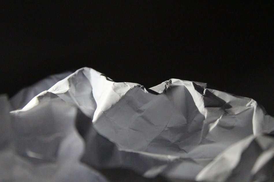
In my final photograph I used a mirror to reflect the light onto the paper. This created light reflections on the paper. I think this is the most successful in that this treatment has managed to make the paper unrecognisable and so more abstract.
In my first three images I used the same effect of crumpling up the paper and shining the light to emphasise the creases and folds in the paper to make it unrecognisable. The black background in those photographs worked well at contrasting with the white paper that was illuminated.
In my final photograph I used a mirror to reflect the light onto the paper. This created light reflections on the paper. I think this is the most successful in that this treatment has managed to make the paper unrecognisable and so more abstract.
|
|
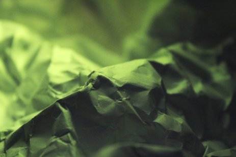
TASK 2 - abstract development
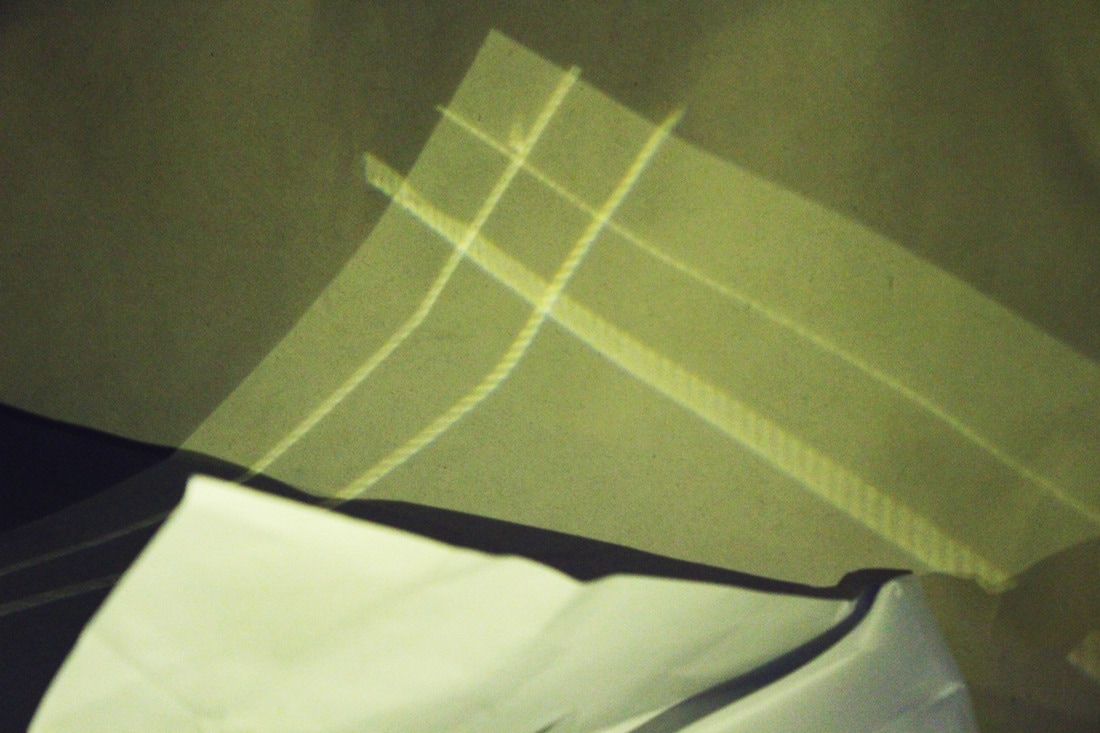
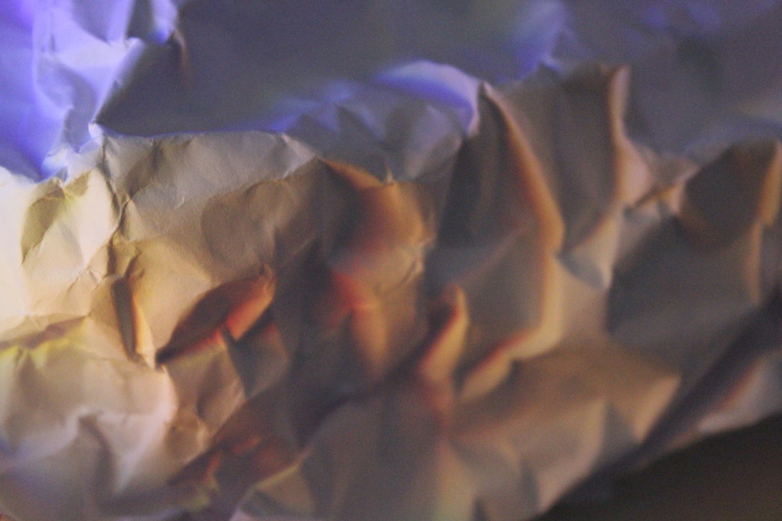
I used colour to develop the task further. I changed the colour of the light by putting coloured acetate in front of it, creating more abstract shapes with the paper. I also used a mirror to add light streaks onto the paper again.
I think I showed a variety of creations in my photographs. Each photograph is different and gives off a different feeling/atmosphere because of the lighting colour changes and the shapes created when crushing/folding the paper. I also zoomed in more on the paper. In contrast with the first task (black and white images), these images with colour seemed more fun and vibrant, different to the eerie atmosphere created in the first task.
I think I showed a variety of creations in my photographs. Each photograph is different and gives off a different feeling/atmosphere because of the lighting colour changes and the shapes created when crushing/folding the paper. I also zoomed in more on the paper. In contrast with the first task (black and white images), these images with colour seemed more fun and vibrant, different to the eerie atmosphere created in the first task.
|
|
|
|
task 3 - abstract experiment
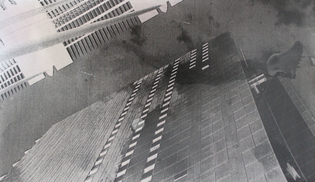
For this task I wanted to experiment with different methods of making a photograph more abstract. I chose one of my own images (of a building in central London) and printed it onto acetate and paper.
For the first image I developed a copy of it in the darkroom and tried to bleach the developed image. This did not work out as well as I had hoped as the bleach was not strong enough so it just created black smudges on the photo.
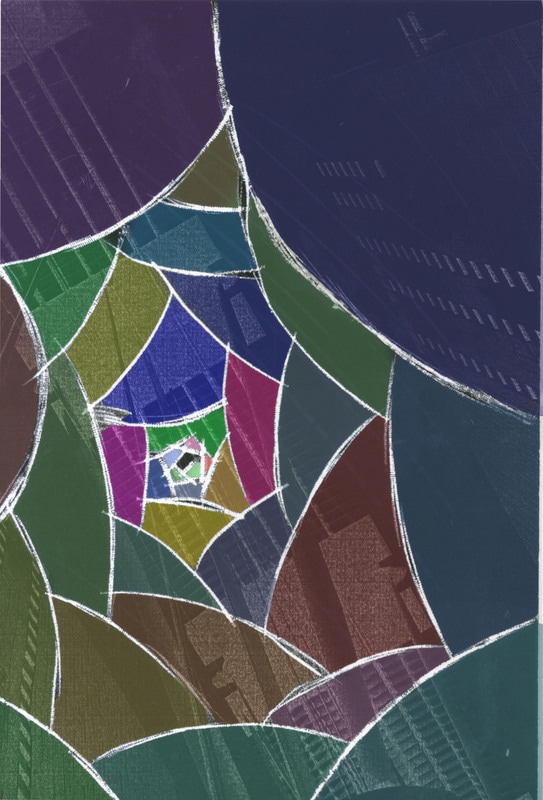
I then created another image in the darkroom and by using a scalpel, scratch curved lines into the image, getting smaller toward the centre, a little like an aperture. I then scanned my image and opened it up in Photoshop. Using the lines I had drawn as guides, I filled in each section with a colour using the brush tool and reducing the opacity.
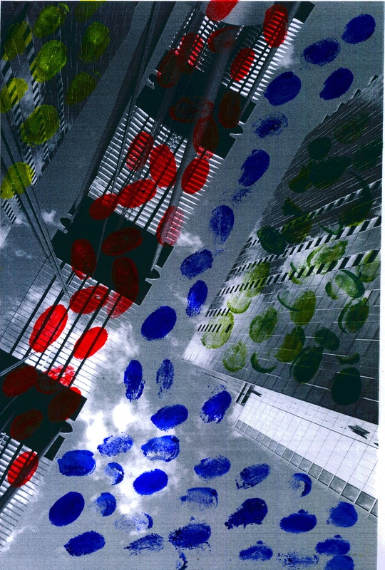
For my third experiment I printed out my image onto paper and used paint to create fingerprints all over the paper. The bright primary colours are very bold and a bit jarring for me.
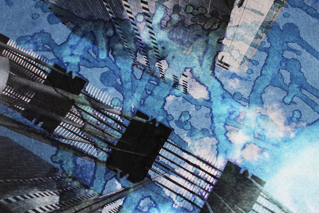
My final creation was made using bleach on paper. This definitely worked better than my other bleach attempt. I used normal paper instead of photographic paper and less diluted bleach and it created a cool effect. Keeping the colour of the image also helped as the blue colour was emphasised. In this last image I think the effect has blended well with the original so it becomes part of it.
For the first image I developed a copy of it in the darkroom and tried to bleach the developed image. This did not work out as well as I had hoped as the bleach was not strong enough so it just created black smudges on the photo.
I then created another image in the darkroom and by using a scalpel, scratch curved lines into the image, getting smaller toward the centre, a little like an aperture. I then scanned my image and opened it up in Photoshop. Using the lines I had drawn as guides, I filled in each section with a colour using the brush tool and reducing the opacity.
For my third experiment I printed out my image onto paper and used paint to create fingerprints all over the paper. The bright primary colours are very bold and a bit jarring for me.
My final creation was made using bleach on paper. This definitely worked better than my other bleach attempt. I used normal paper instead of photographic paper and less diluted bleach and it created a cool effect. Keeping the colour of the image also helped as the blue colour was emphasised. In this last image I think the effect has blended well with the original so it becomes part of it.
|
|
task 4 - bill jacobson
|
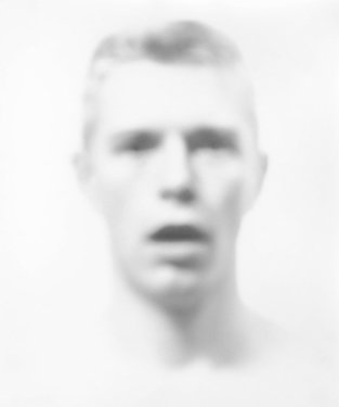
Bill Jacobson's 'Interim Portraits' is a series of photographs of a blurred man's face and shoulders. The image is out of focus so that no features are particularly distinguishable, and his skin is pale and ghost-like. Set against a white background the blurred image looks like the face is fading away.
In addition, his expression seems to be one of disbelief, or shock, with the slightly open mouth and intense stare. The reason behind this series was to show the loss people experienced during the AIDS epidemic. In the beginning people living with AIDS were often shunned due to it being a new, unknown disease. |
my response
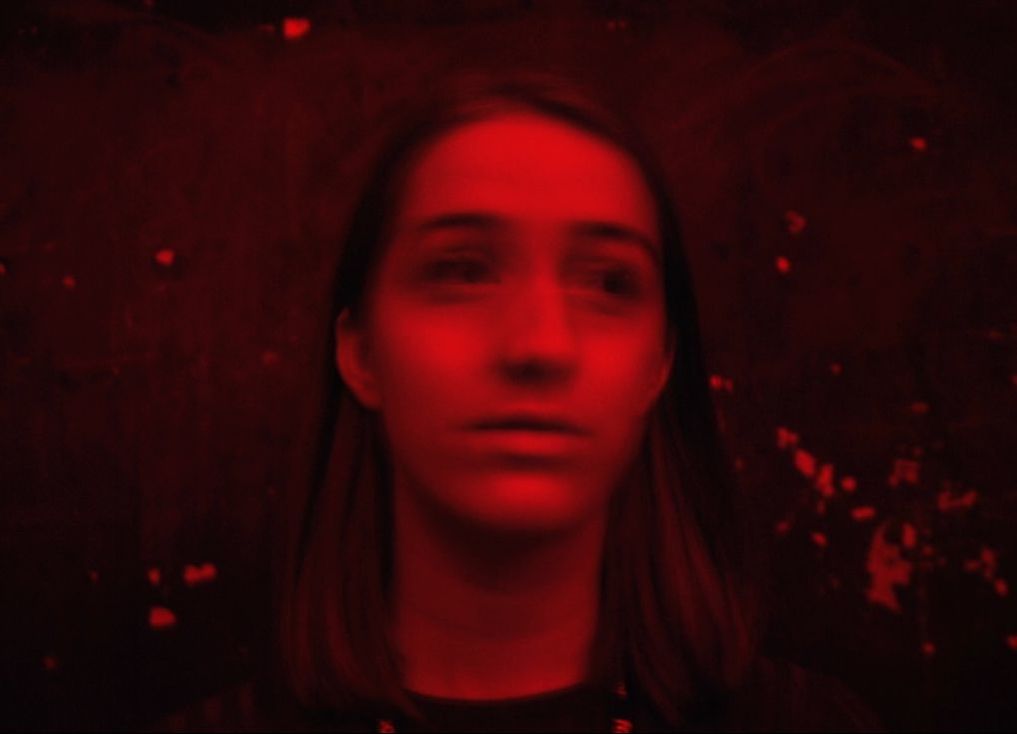
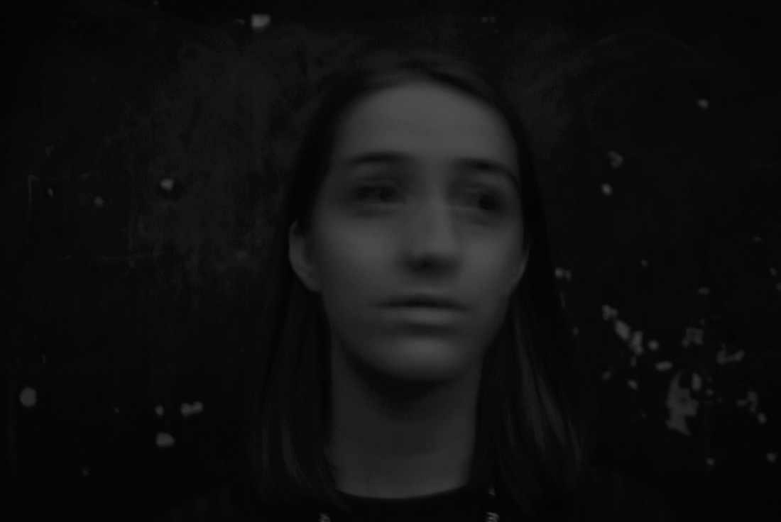
My response to this was to hold glass in front of the camera to blur the face or get the person to literally shake their head to achieve the same result. I felt that my first and second images worked best.
In the first image, I asked someone to shake their head as I took the photo which made their face slightly blurry. The eyes changed the most as they turned into black smudges, creating a lifelessness in the face. The red hue reflects her mood to me she looks mournful.
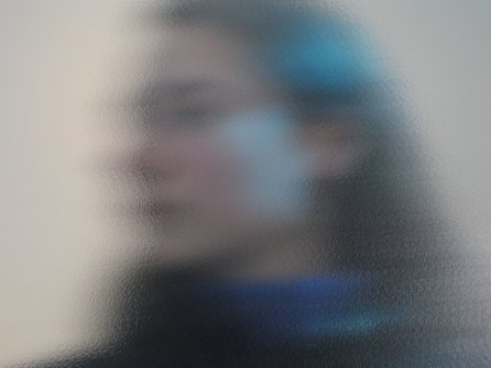
In the second image the glass did most of the work by blurring the face but I used Photoshop to duplicate and move layers and reduced the opacity to create a gradient effect. This effect blurred the image better than just getting them to shake their head. The face actually seems like it's dissolving or fading away and seems like a fleeting moment captured.
In the first image, I asked someone to shake their head as I took the photo which made their face slightly blurry. The eyes changed the most as they turned into black smudges, creating a lifelessness in the face. The red hue reflects her mood to me she looks mournful.
In the second image the glass did most of the work by blurring the face but I used Photoshop to duplicate and move layers and reduced the opacity to create a gradient effect. This effect blurred the image better than just getting them to shake their head. The face actually seems like it's dissolving or fading away and seems like a fleeting moment captured.
|
|
|
|
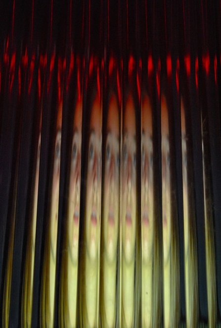
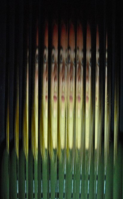
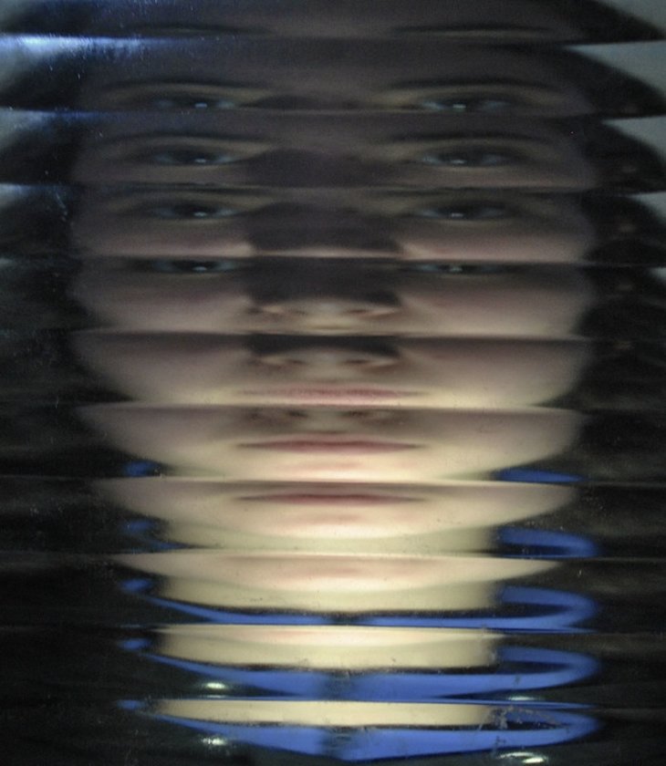
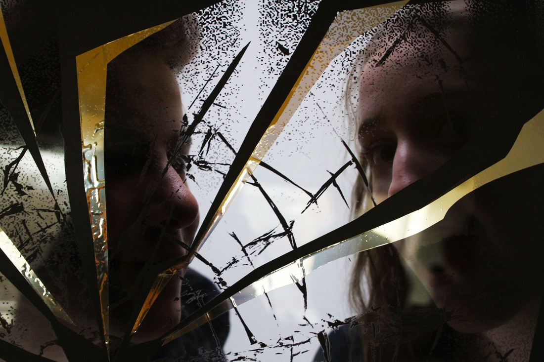
task 5 - erwin blumenfeld
Erwin Blumenfeld was a German photographer, born in 1897 but later settled in the USA. He was an innovative and experimental photographer, mainly of portraits, fashion and nude photography. He also worked for famous fashion magazines like Vogue, creating the cover images.
my response
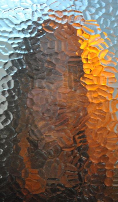
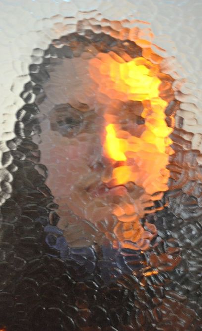
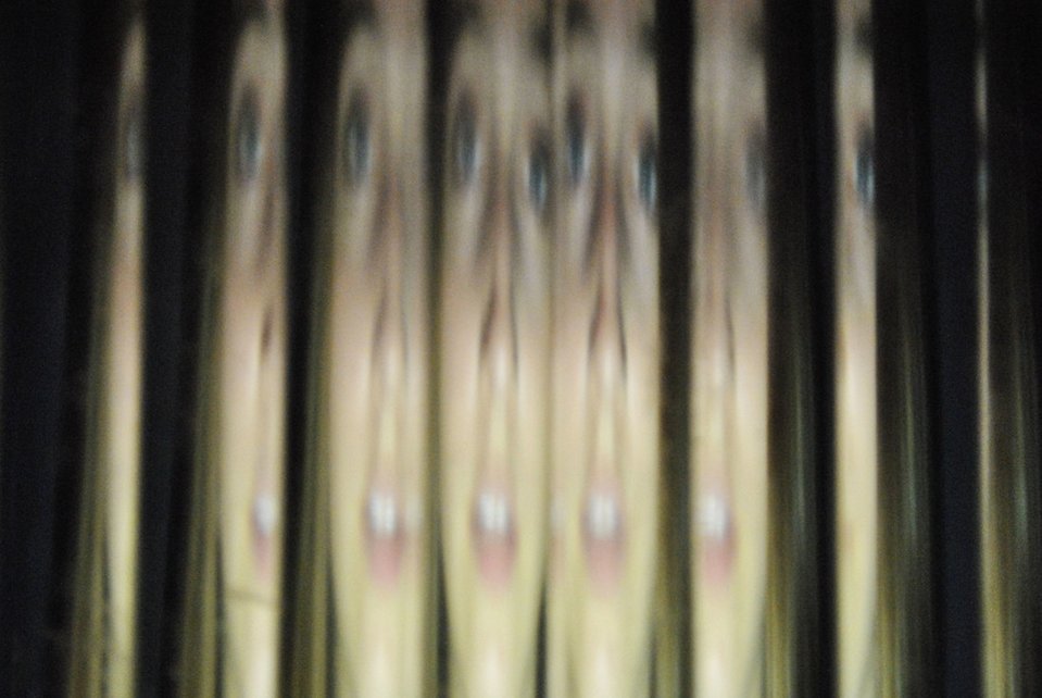
For this response I placed someone in front of a black background and shone the studio lights on them. I used a piece of ridged glass to create a similar effect that Erwin Blumenfeld created. I found that my images for this task turned out how I wanted them to, and was pleased with the effects.
I like how the light fell on the faces, clearly illuminating them. The glass created multiple faces in one image invoking a sense of confusion and disillusion. The fact that the faces behind are blurred slightly as well also adds to the dramatic, distorted effect.
I think the first image works the best as you can clearly see the multiple faces. Her expression is also blank which adds to the abstract effect. I also like the second and third images because the colours are stronger and, at a glance, it might not appear to be a face, so is more abstract.
|
|
task 6 - saul leiter
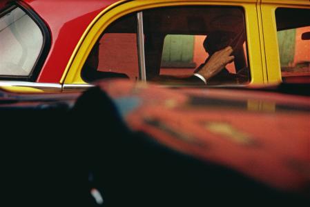
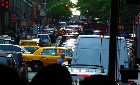
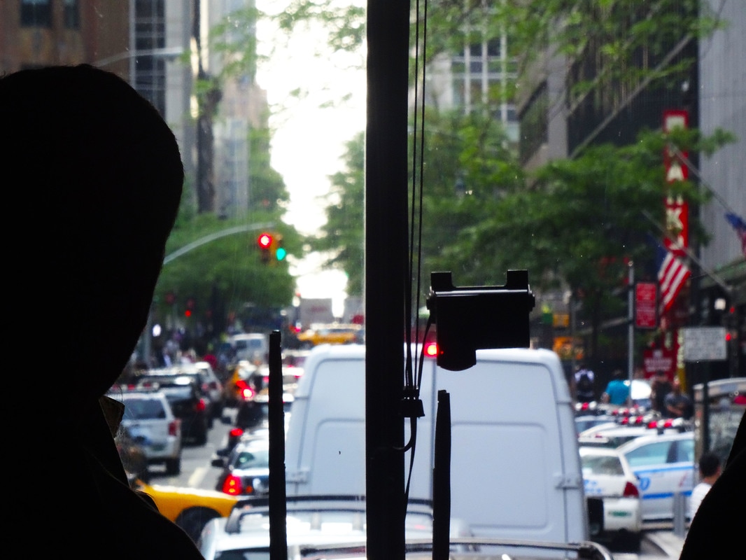
Saul Leiter explores the abstract world within hidden portraits. His images are usually very bright and are taken from angles that you would not expect - as if you are peeking through something to see them.
In this photograph on the left for example, we can see he was focusing the camera on the man in the car beside him. The use of vivid colour in his images and the close cropping so there is less context, helps make them at first sight appear more abstract.
In this photograph on the left for example, we can see he was focusing the camera on the man in the car beside him. The use of vivid colour in his images and the close cropping so there is less context, helps make them at first sight appear more abstract.
My response
For my response I didn't want to solely focus on portraits. I liked the idea of taking photos as if you are looking through something or using something as a frame for what you want the viewer to focus on.
My first three images are very much like that. They were taken from the inside of a coach so I used the windows of the coach as a frame to the busy traffic or greenery I could see. I enhanced the colours in each photo as well to make them more vivid. I particularly like the third image.
My first three images are very much like that. They were taken from the inside of a coach so I used the windows of the coach as a frame to the busy traffic or greenery I could see. I enhanced the colours in each photo as well to make them more vivid. I particularly like the third image.
|
|
STRANDS
STRAND 1 - night lights
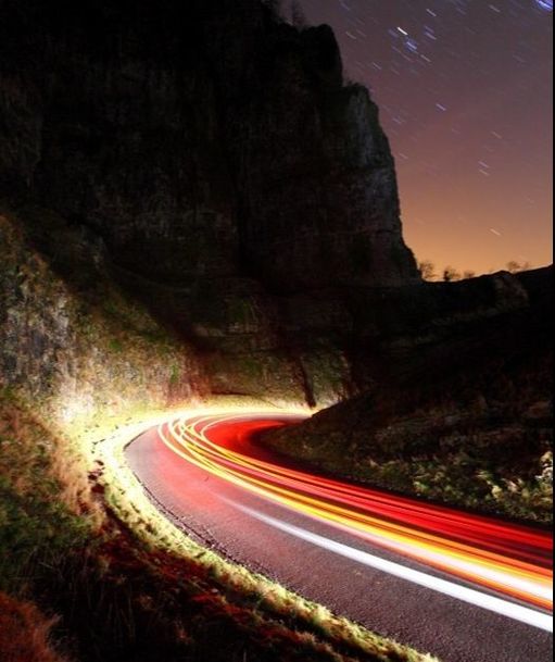
For this strand I looked at the work of Michael Bosanko who describes himself as a 'light artist'. I specifically looked at his 'Night Trails' series.
His images capture the light trails of cars as they drive past him. In his images he also captures part of the sky which blurs some of the stars which I thought was very intriguing.
In the image on the left, the lights from the cars have lit up the rocky mountainside beside the road. This made it seem like the lights were alive in a way, lighting up a path.
my response
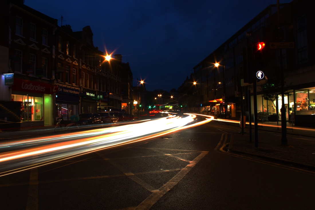
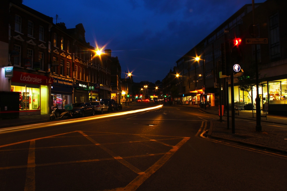
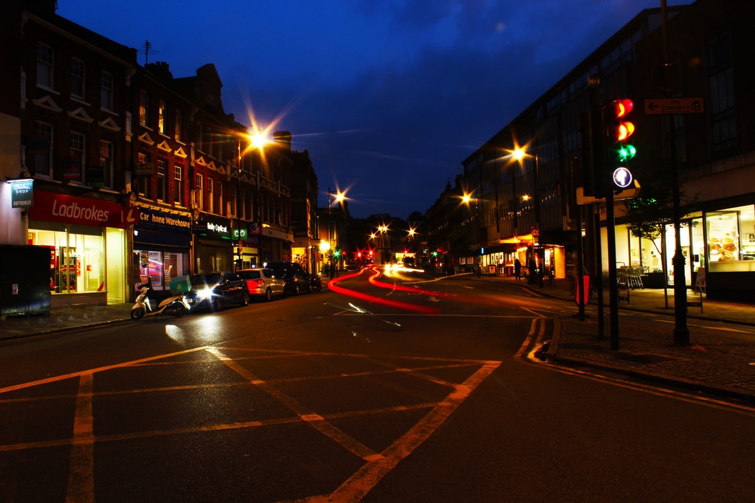
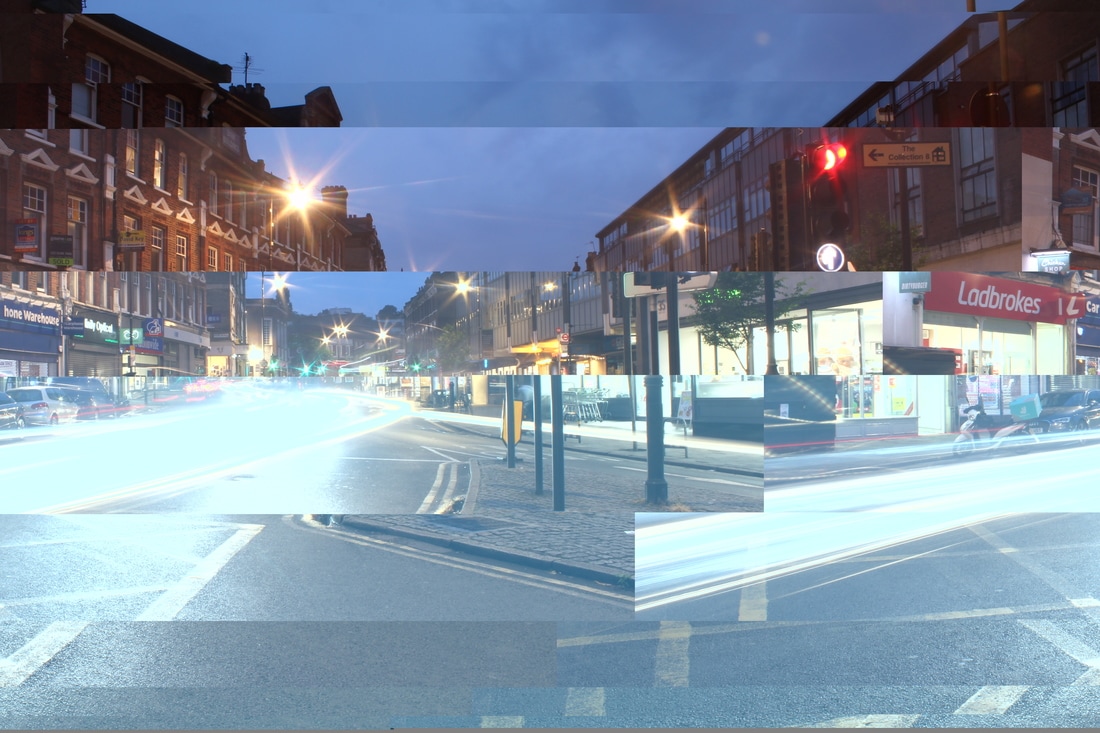
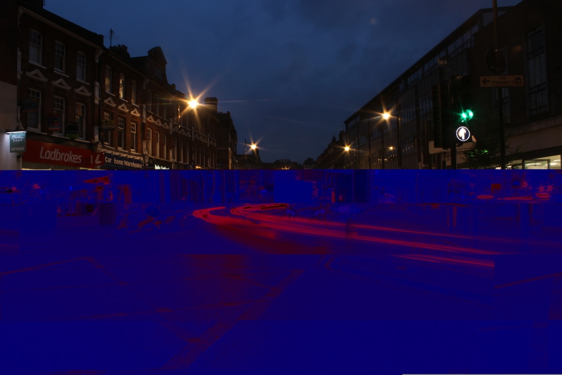
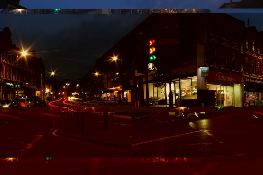
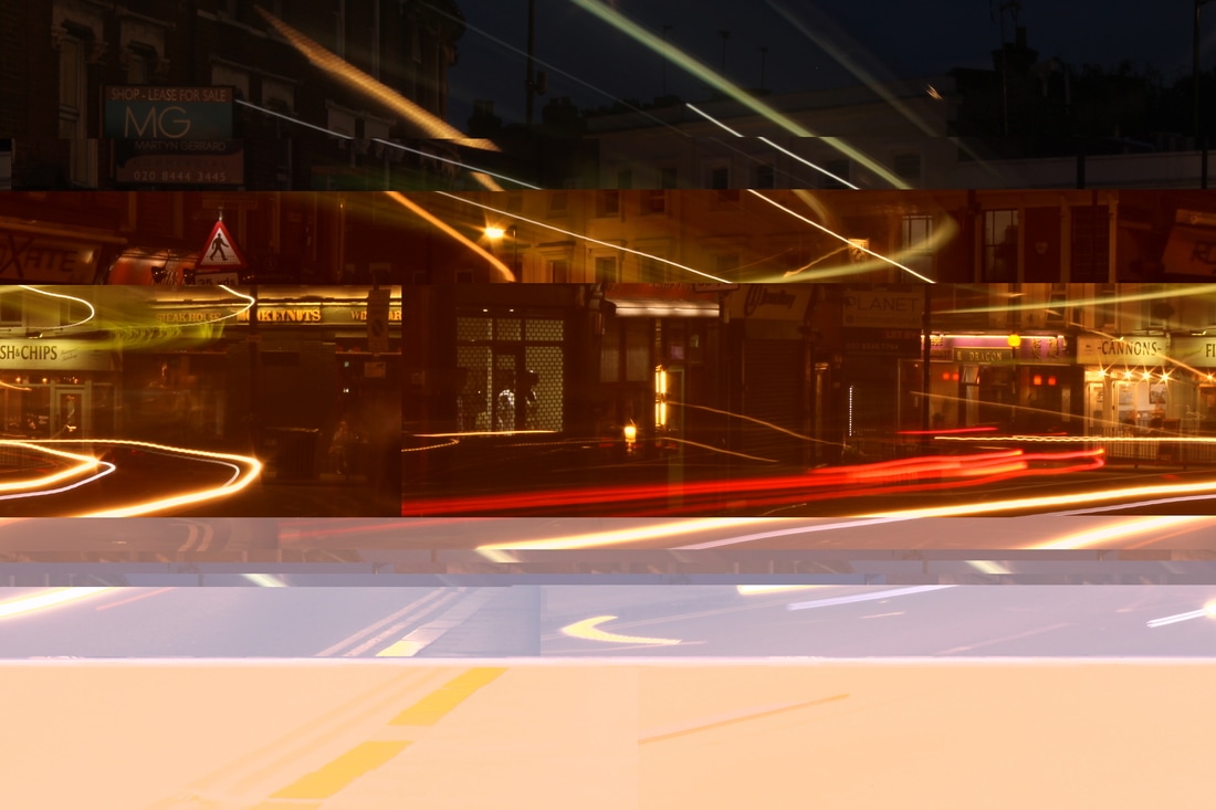
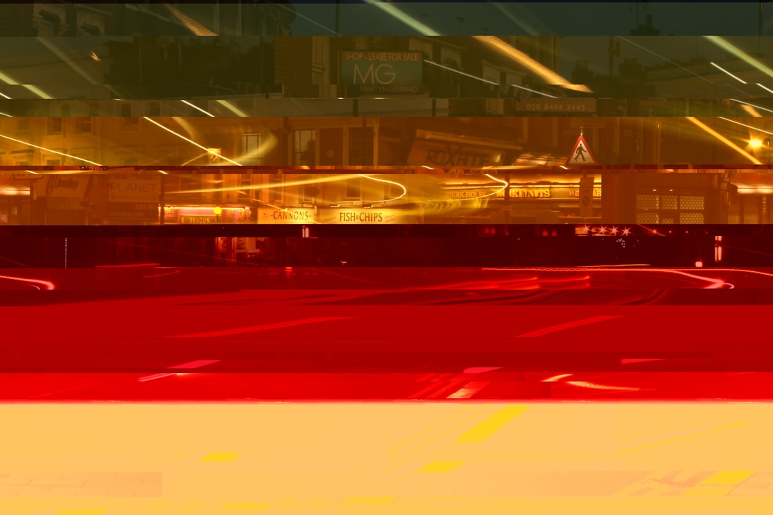
For my response I visited Crouch End in London and set up my camera in the middle of three roads joining together at the main junction. I set the shutter speed of my camera to between 8 and 15 seconds depending on how long I wanted the light trails to be. I also changed the iso to 200 so my images wouldn't be over exposed.
Using Photoshop, I increased the vibrance, saturation, brightness and contrast to make the lights more luminous and the buildings darker to contrast. I loved the curve of the lights that were created when the cars went round the bend in the road. They create a sensation of speed because the buildings are still sharp and unmoving, so the lights appear to be fast streaks.
I think the colour combinations in the images are beautiful, especially with the plain deep blue, inky sky in the middle top. The yellow criss-cross box painted on the road at the junction is an additional pattern that enhances the scene by reflecting the light. In the first four images the perspective in the scene is emphasised by the colours and particularly the blackened buildings and blue sky all leading to the central vanishing point.
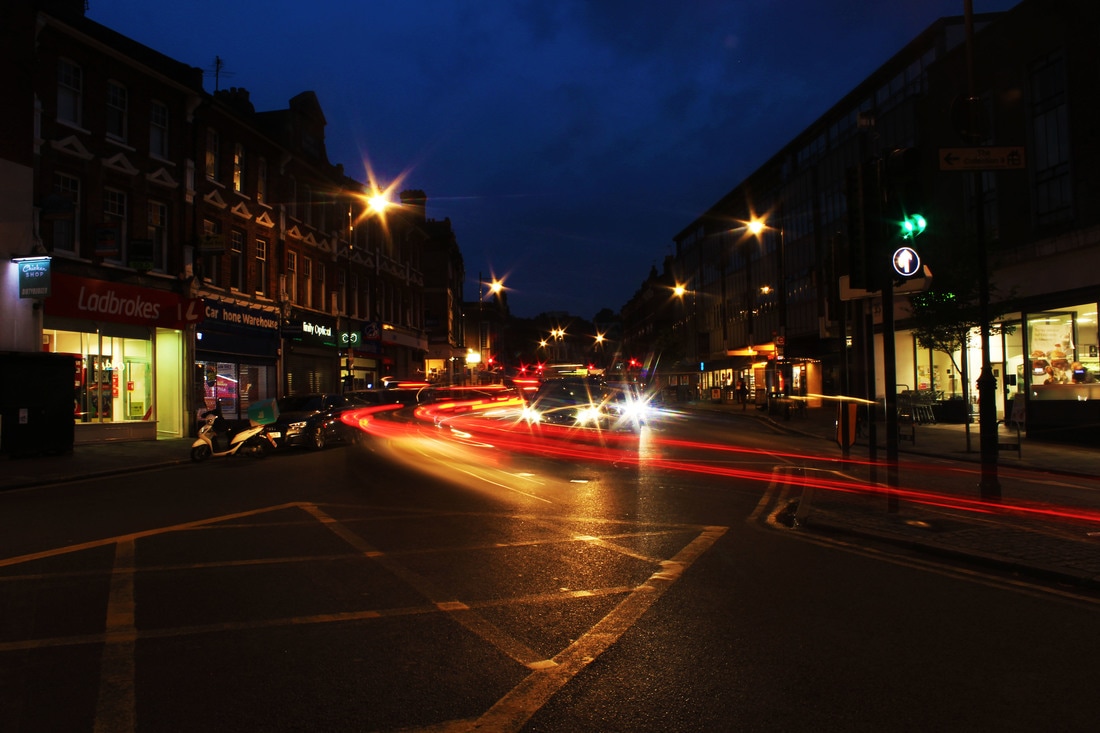
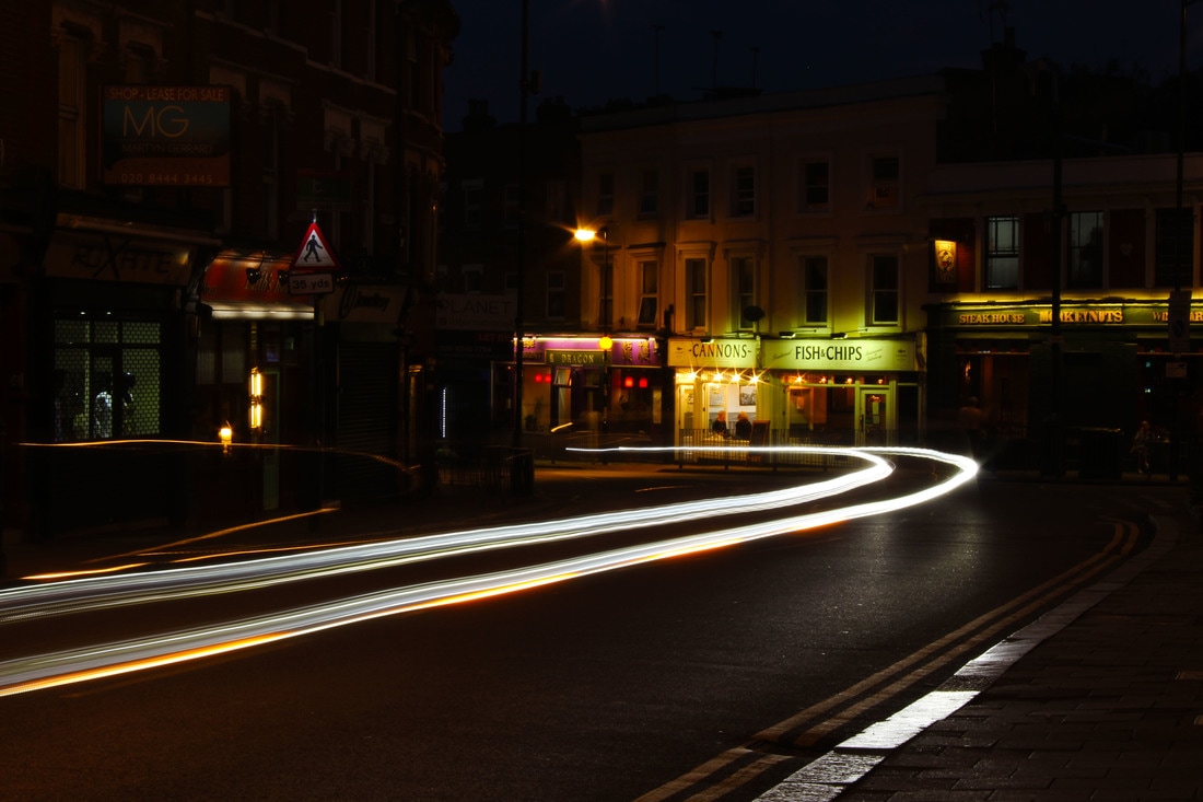
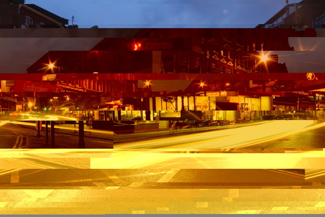
However, my favourite image I created is the last one in the series below. As I took it when a bus went past, it created different levels of lights, high and low, making the image more abstract. The ground was wet so even the kerb is reflecting the bus lights which is very pleasing. The floating, trailing streaks of light inject some dynamism and in this image you can't tell where the lights have come from, and seem to float more, it's very ambiguous.
Using Photoshop, I increased the vibrance, saturation, brightness and contrast to make the lights more luminous and the buildings darker to contrast. I loved the curve of the lights that were created when the cars went round the bend in the road. They create a sensation of speed because the buildings are still sharp and unmoving, so the lights appear to be fast streaks.
I think the colour combinations in the images are beautiful, especially with the plain deep blue, inky sky in the middle top. The yellow criss-cross box painted on the road at the junction is an additional pattern that enhances the scene by reflecting the light. In the first four images the perspective in the scene is emphasised by the colours and particularly the blackened buildings and blue sky all leading to the central vanishing point.
However, my favourite image I created is the last one in the series below. As I took it when a bus went past, it created different levels of lights, high and low, making the image more abstract. The ground was wet so even the kerb is reflecting the bus lights which is very pleasing. The floating, trailing streaks of light inject some dynamism and in this image you can't tell where the lights have come from, and seem to float more, it's very ambiguous.
|
|
|
|
STRAND 2 - ABSTRACT PORTRAITS
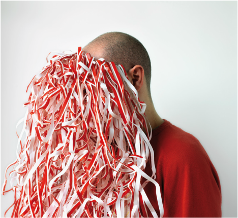
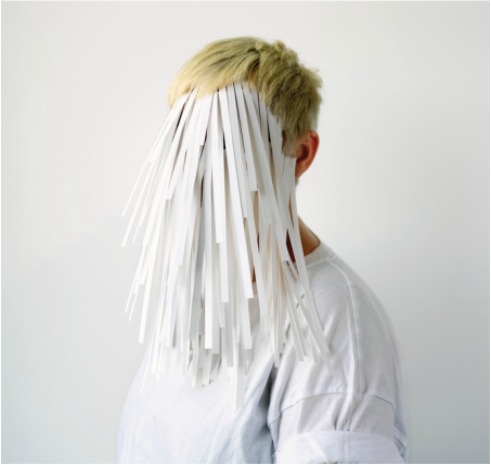
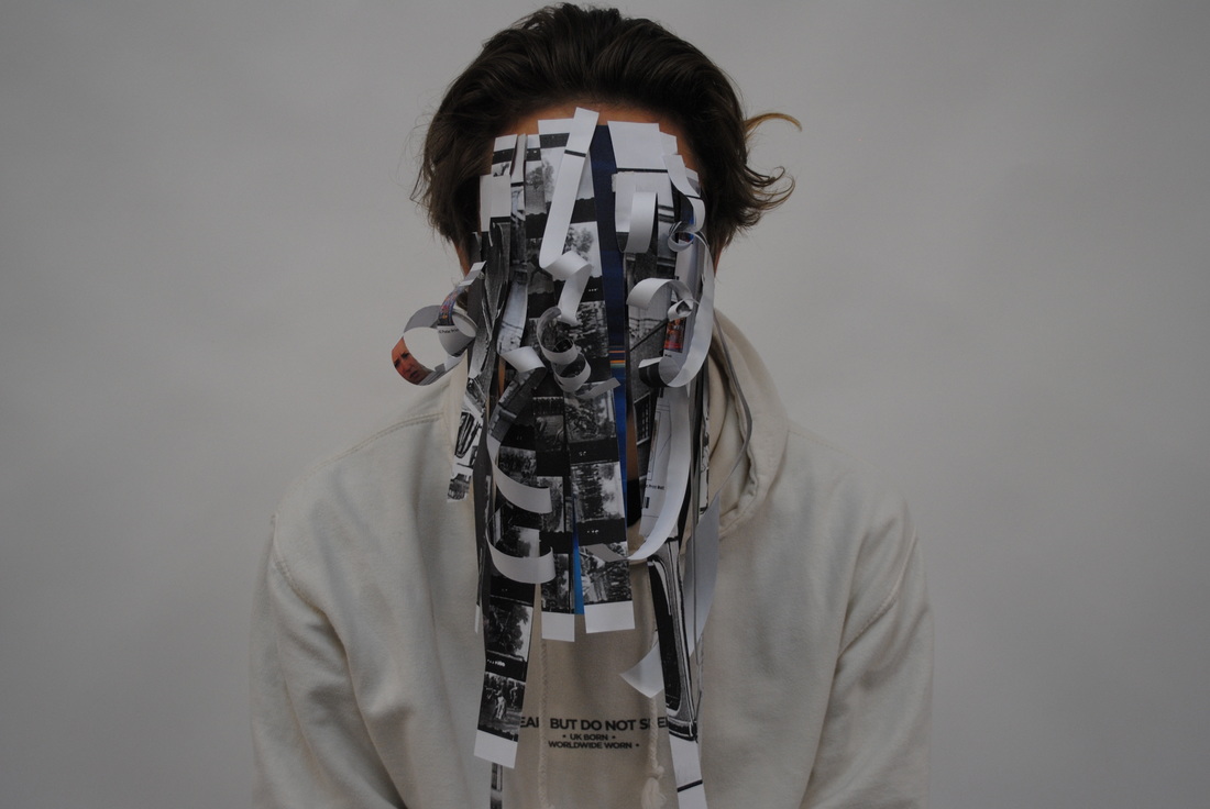
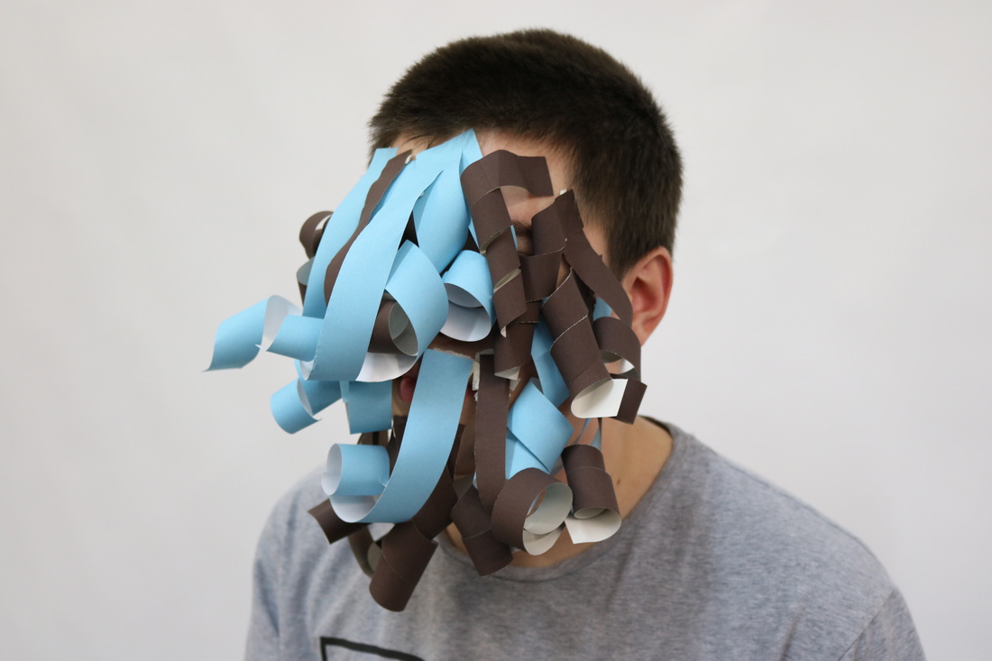
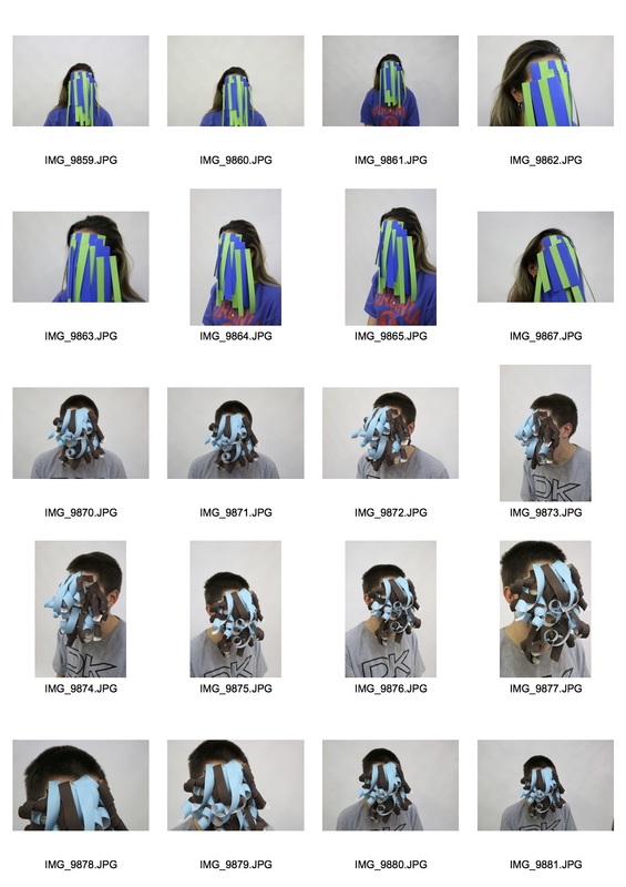
Héctor created this project as a promotion for a paper company. However my interpretation of this is that as the paper covers the face, it stops people from understanding what emotions the person is conveying. It prevents us from understanding who the person is and what they are thinking. It's a barrier between us and them. I think mine may have worked a little better with stronger lighting.
|
|
My response
|
|
STRAND 3 - ABSTRACT LANDSCAPES
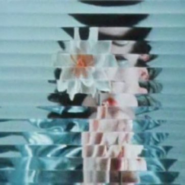
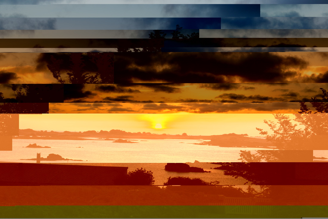
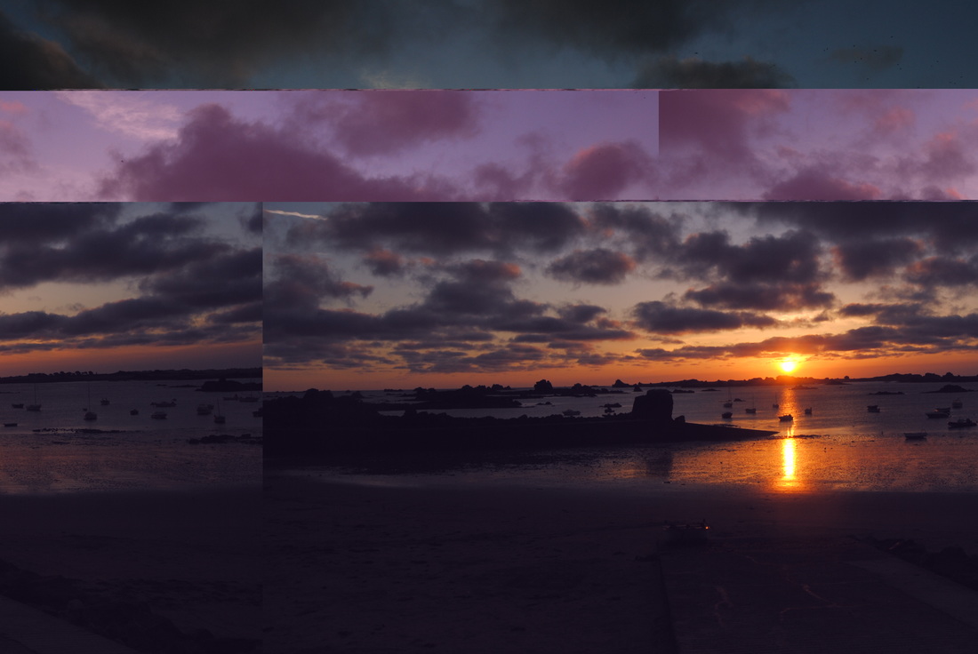
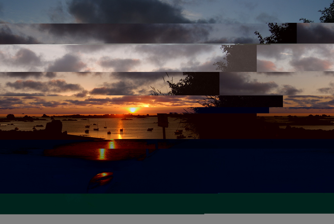
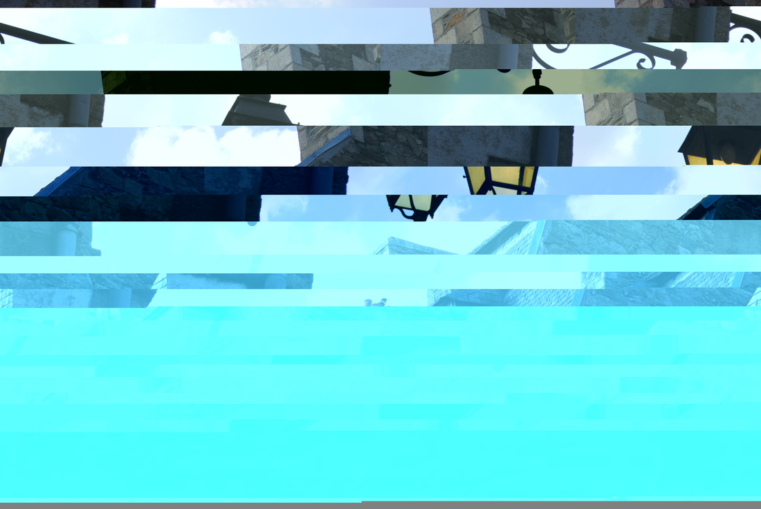
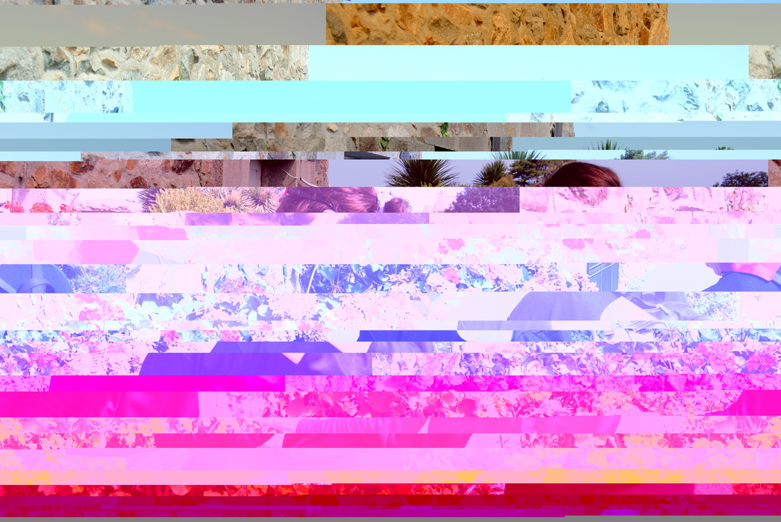
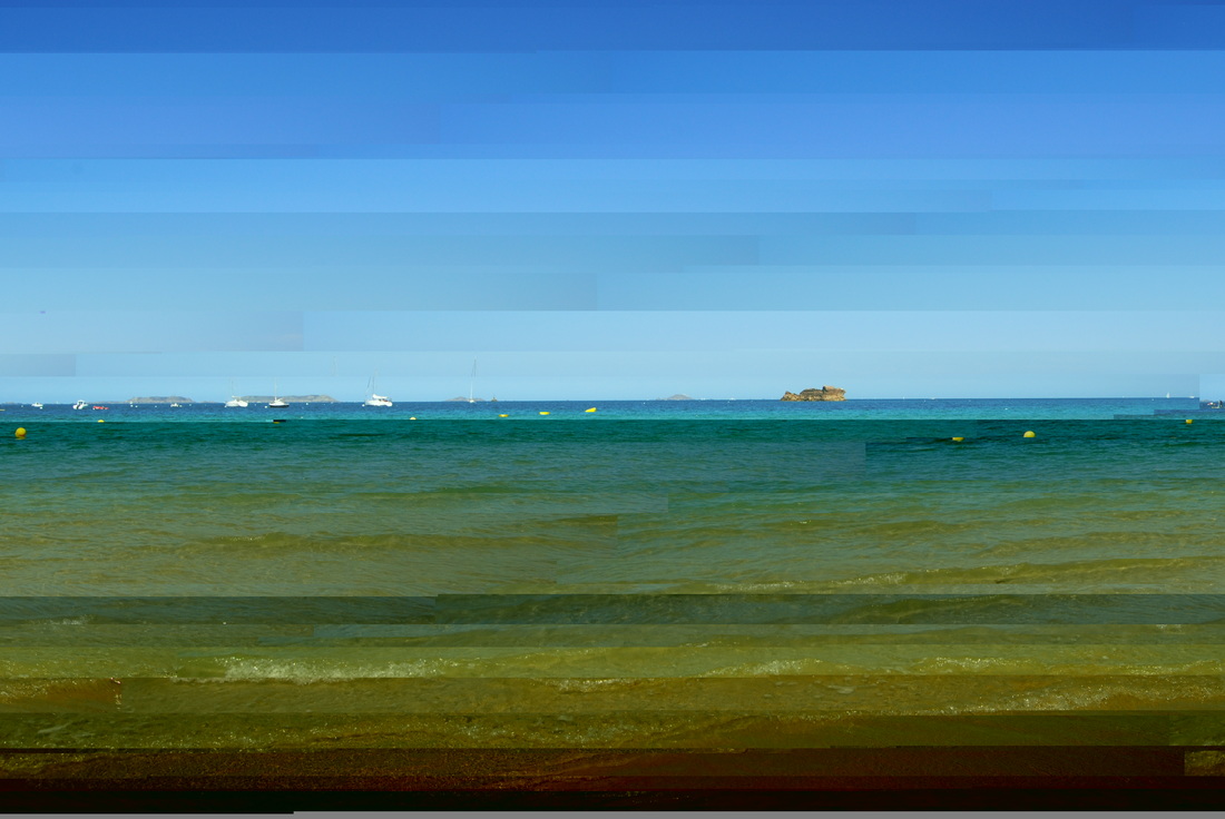
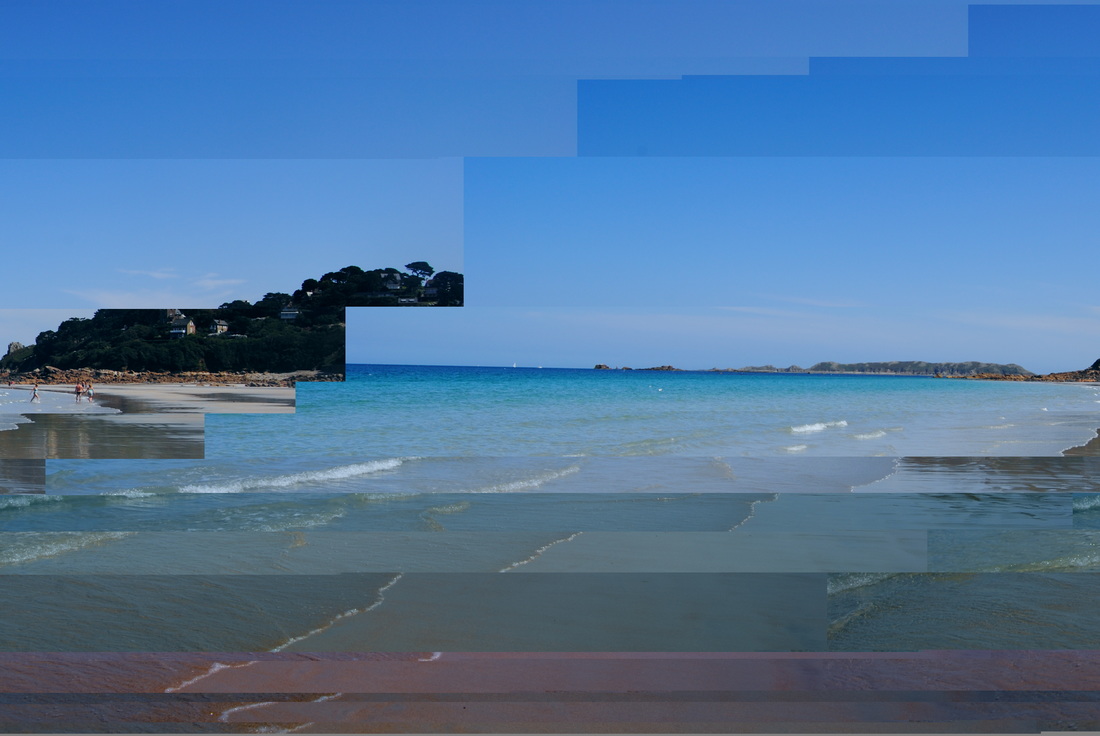
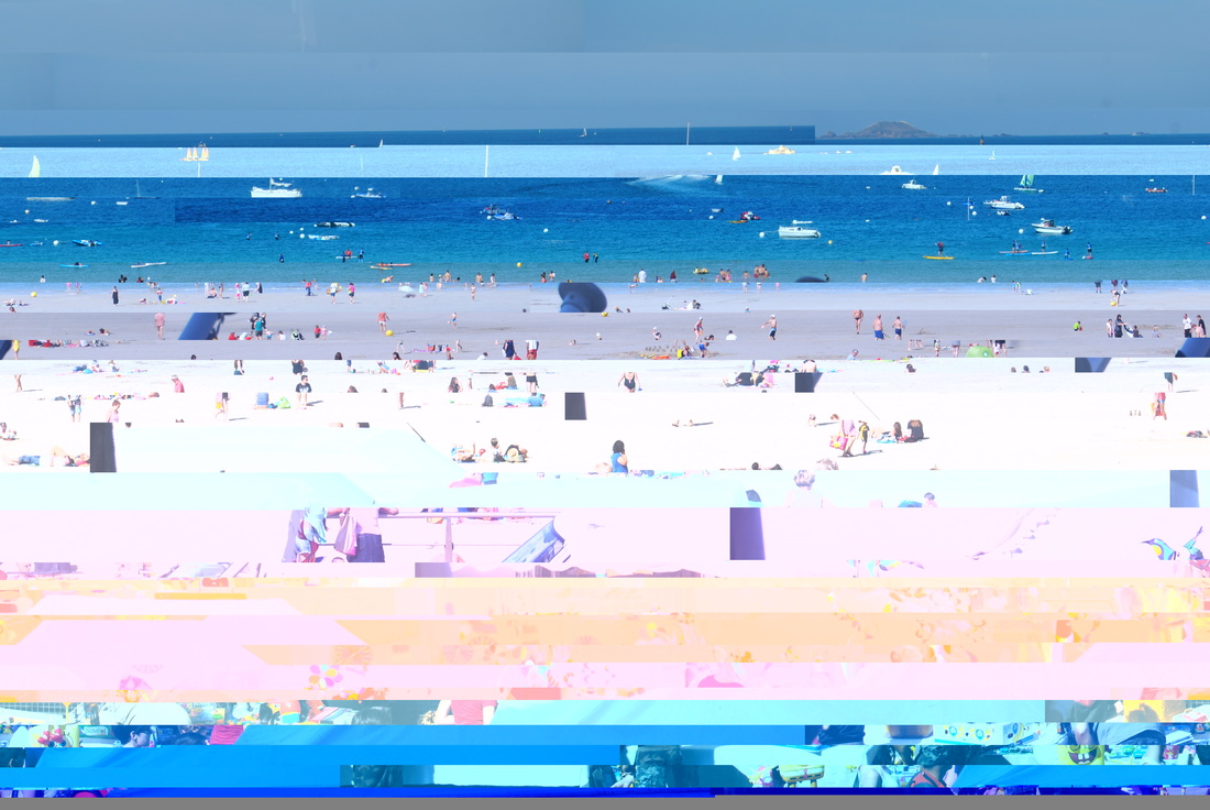
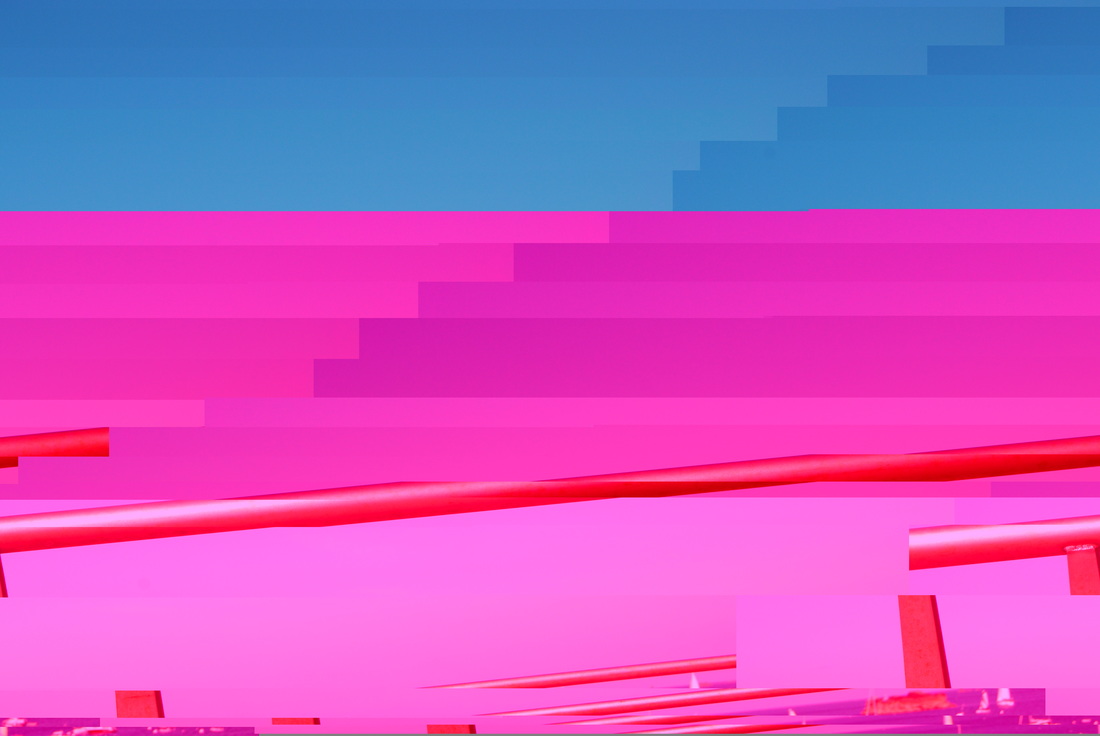
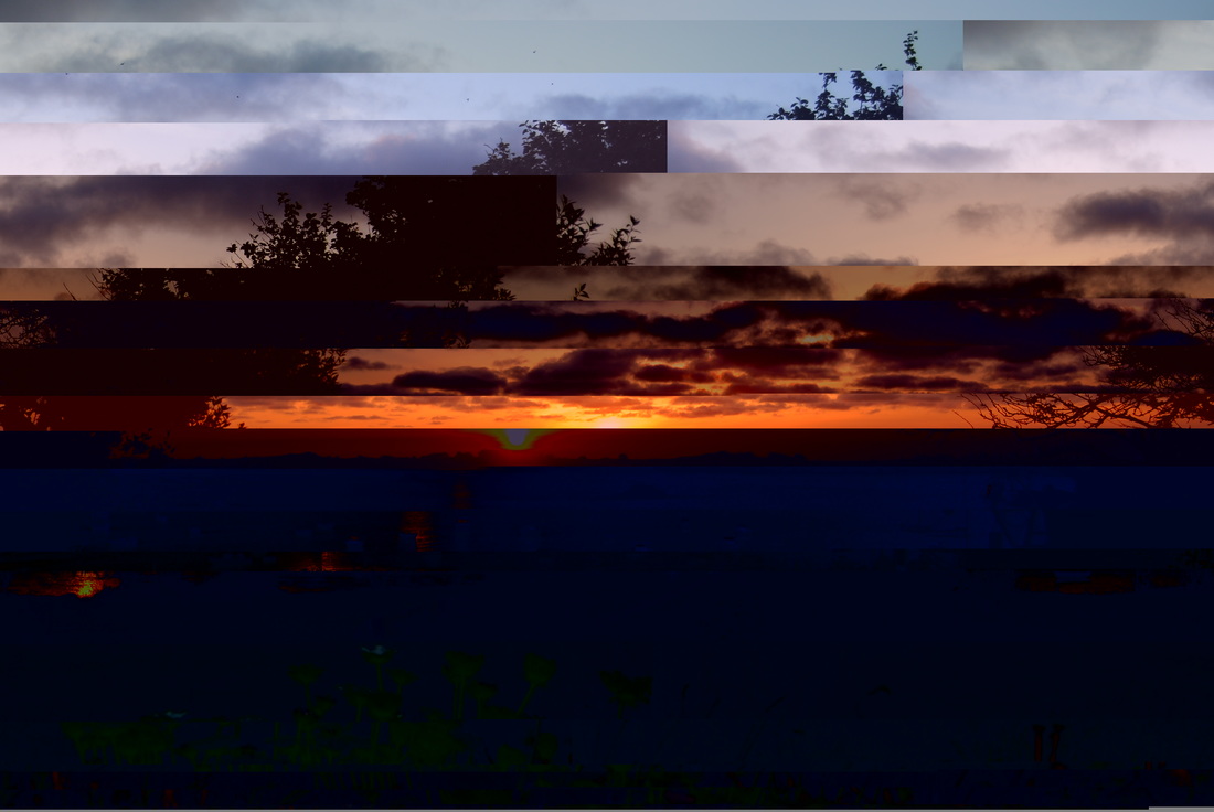
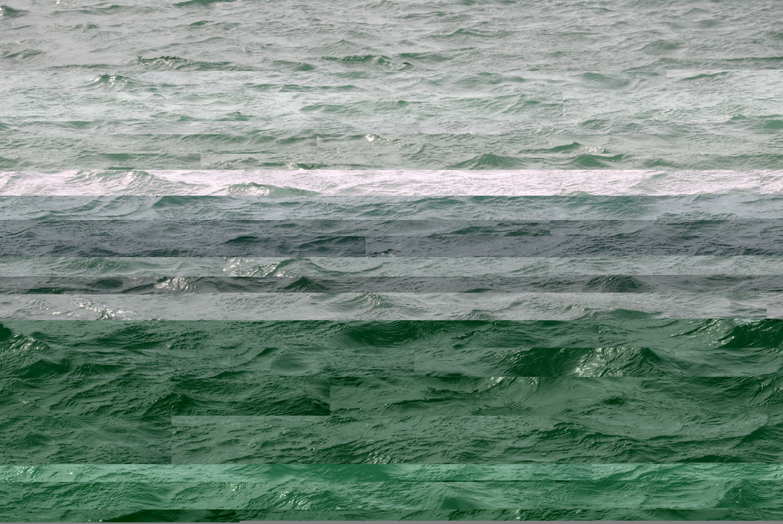
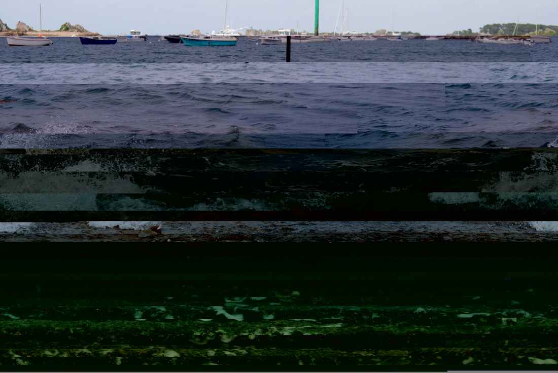
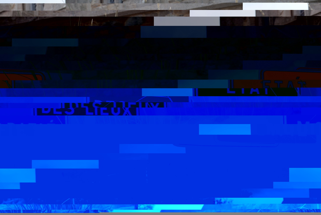
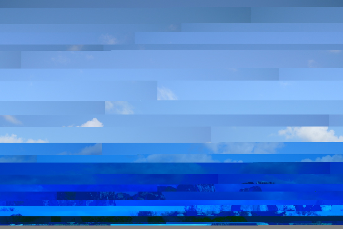
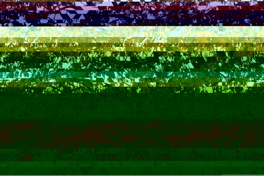
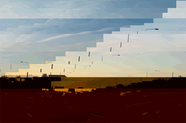
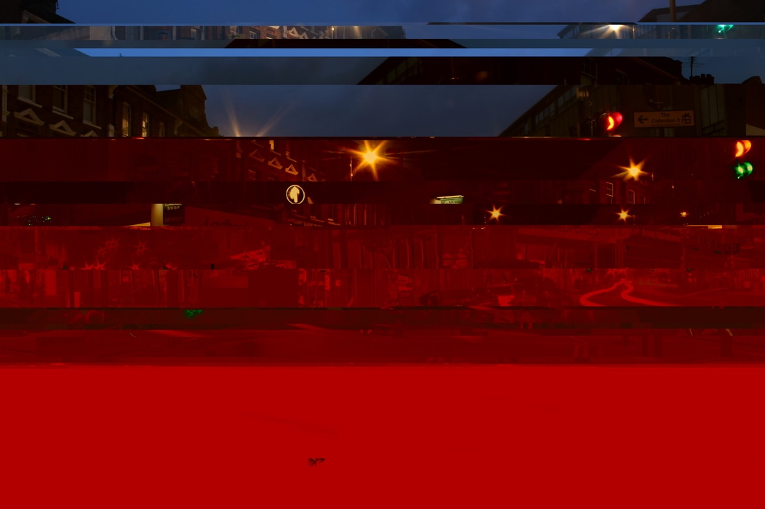
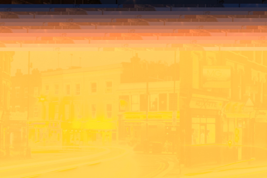
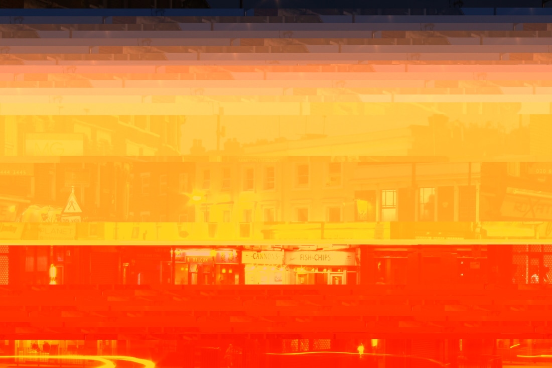
For this strand I used photographs I took of different skies and seas and made them abstract by experimenting with TextEdit to change the image. As you drag the image into TextEdit it brings up the underlying code that makes up the image. By deleting random lines of code it destroys parts of the image and so makes the image very different to how it was before - in fact it appears glitched.
I loved this series of images I created. Each one is so different from the other, and you can never tell how the images will turn out. As a set I think each image really goes well with each other, however they are all unique and can stand out on their own.
I see them as 'interrupted' images as they look a little like when TV broadcasts have interference. I enjoyed the fact that in this process you can't know how the image will appear as you edit the code. You have little control so it is an exciting moment to see the result.


http://www.sabatobox.com/delaunay-triangulation
strand 4 - Maurizio Anzeri
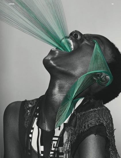
I looked at the work of Maurizio Anzeri who uses thread on portraits. Using the colourful thread against the plain black and white portraits it projects a sense of their hidden personality.
The thread streaming out of the mouth in the first image and the pained expression of her face go well together as it looks like she is screaming. And the thread running from her eye down her cheek makes her seem like she is crying which again, adds another layer, literally, to the emotion being conveyed. The colour strikes me in the photo. The bright green adds life to the images.
The photographer says:
'I work with sewing, embroidery and drawing to explore the essence of signs in their physical manifestation. I take inspiration from my own personal experience and observation of how, in other cultures, bodies themselves are treated as living graphic symbols. I then use sewing and embroidery in a further attempt to re-signify, and mark the space with a man-made sign, a trace. The intimate human action of embroidery is a ritual of making and reshaping stories and history of these people. I am interested in the relation between intimacy and the outer world'
my response
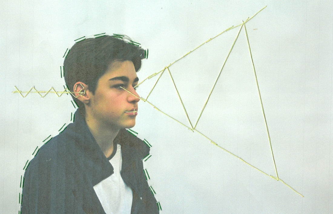
In the image above I experimented with embroidering onto an image of a person. I am not happy with the result but the experiment taught me that I need to start with a strong image to begin with and then enhance it. The embroidery can't do all the work.
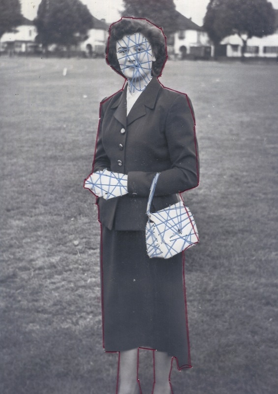
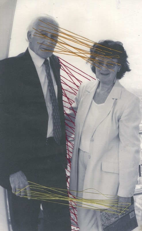
I next decided to work with two old images of my grandparents when they were young. I chose to do this because I thought editing the images would build a connection between me and their younger selves.
The first image, of my grandmother, shows her dressed quite formally, posing for the camera. I added blue stitching over her face, bag and posed hands to imply that she appears quite contained, a bit unreadable, and even a bit closed off to anyone else as she sometimes hides her emotions. The red embroidery around her body however is a hint that she is actually very warm and vivacious at home.
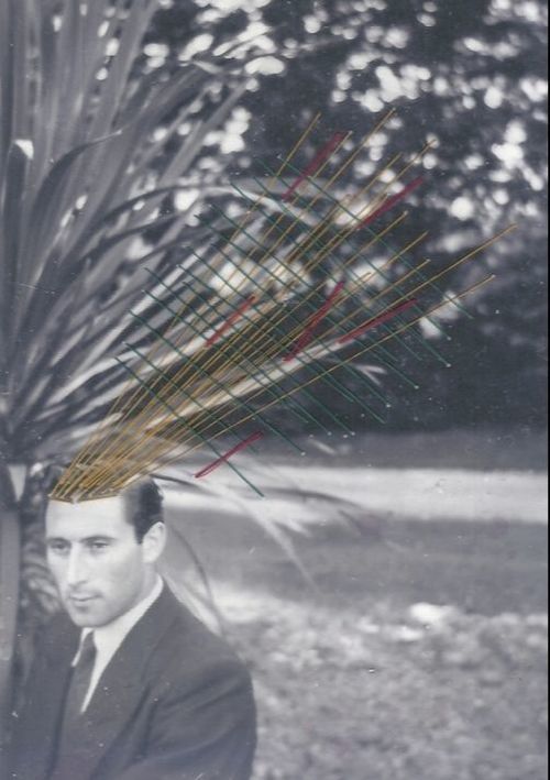
The second image shows my grandfather. I hope the embroidery suggests that he is full of emotions, ideas and thoughts that he shares with anyone. He is very expressive (he was an artist).
I next decided to work with two old images of my grandparents when they were young. I chose to do this because I thought editing the images would build a connection between me and their younger selves.
The first image, of my grandmother, shows her dressed quite formally, posing for the camera. I added blue stitching over her face, bag and posed hands to imply that she appears quite contained, a bit unreadable, and even a bit closed off to anyone else as she sometimes hides her emotions. The red embroidery around her body however is a hint that she is actually very warm and vivacious at home.
The second image shows my grandfather. I hope the embroidery suggests that he is full of emotions, ideas and thoughts that he shares with anyone. He is very expressive (he was an artist).
|
|
|
After that I decided to explore the relationship between these two people instead of single portraits.
In this image I tried to show how two people can be completely connected to each other when they are in a relationship, especially after many years together. I used the red thread connecting them as it is a very warm relationship. They are both very thoughtful and work together very well, so the yellow thread connects their minds and their hands. They are both very creative. I wanted to convey that they are connected by the 'mind, body and soul'. |
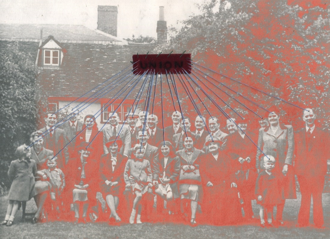
Finally, I used two images of my family and their friends from over 60 years ago. This time I wanted to have multiple people in one image to show how they are connected.
In the first image the group are from a workers' union plus some family. My great grandfather was a baker and a union representative and arranged this outing from London. I decided to connect all their minds visually by embroidering a connection to a vivid piece of fabric I added, flagging up that they were members of a union. By using the thread I am showing they are all 'one' and that each individual person commits to the group and so makes up the union.
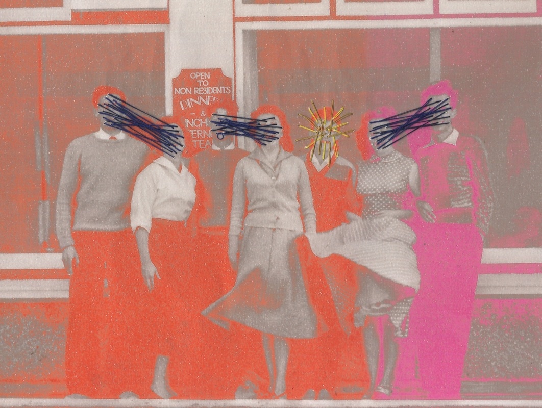
In the second image, like my last development, I chose an image of a group of friends on an outing. I connected the minds of each pair by thread. The one person that wasn't in a pair only had thread coming out from their face. I wanted to show that a person can be so intertwined in a relationship that they are invisibly joined, and - for someone not in a relationship - show how their mind is focussed on themselves and/or outward.
The colour I added to the photographs was to make the image more abstract and infuse colour into the then sepia toned images.
STRand developments
first development
For my first development I wanted to develop my third strand. After I had created the glitched images, I found an artist called Sabato Vinsconti. He is a Brazilian multimedia artist based in the USA. He makes short gifs of abstract things. I wanted to do a similar thing with my glitched images.
I took one of my images of lights on a long exposure and 'glitched' it. I then duplicated that image but only deleted a few lines of code in TextEdit. I then did the same thing again 4 or 5 times. Opening all those images into Photoshop, I created a gif of my glitched images. Doing this I hoped to make my images even more abstract and unrecognisable and of course add movement.
I took one of my images of lights on a long exposure and 'glitched' it. I then duplicated that image but only deleted a few lines of code in TextEdit. I then did the same thing again 4 or 5 times. Opening all those images into Photoshop, I created a gif of my glitched images. Doing this I hoped to make my images even more abstract and unrecognisable and of course add movement.
second development
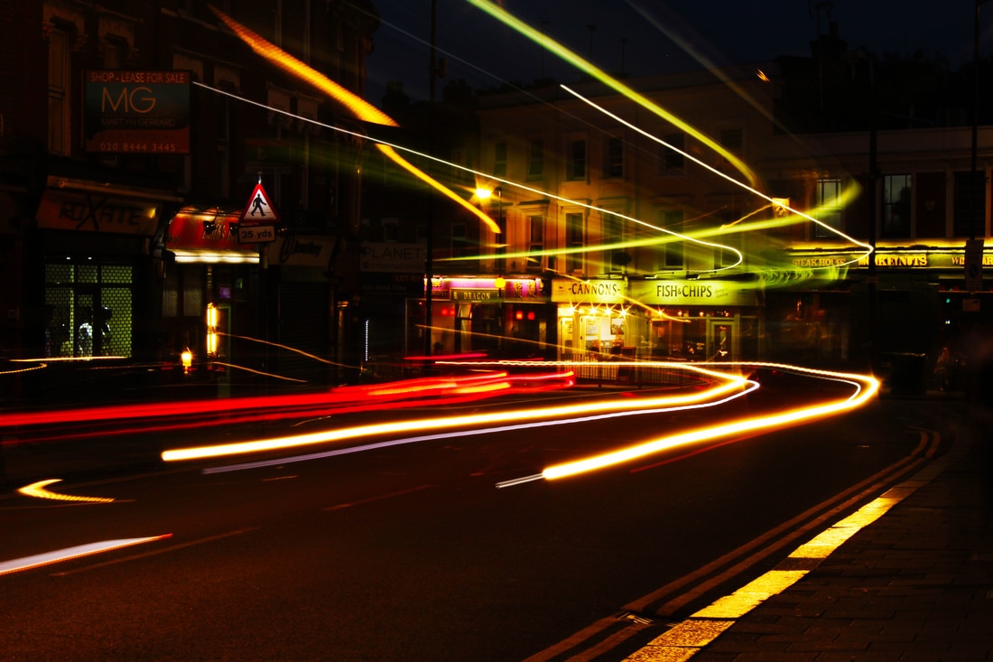
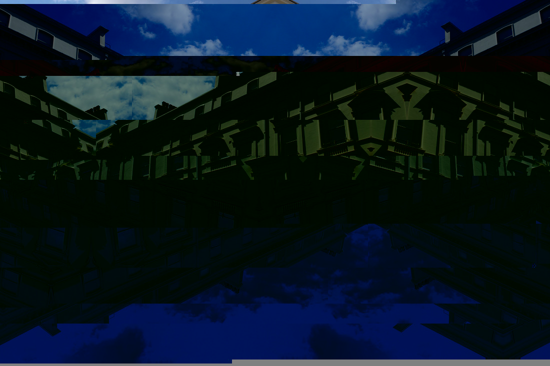
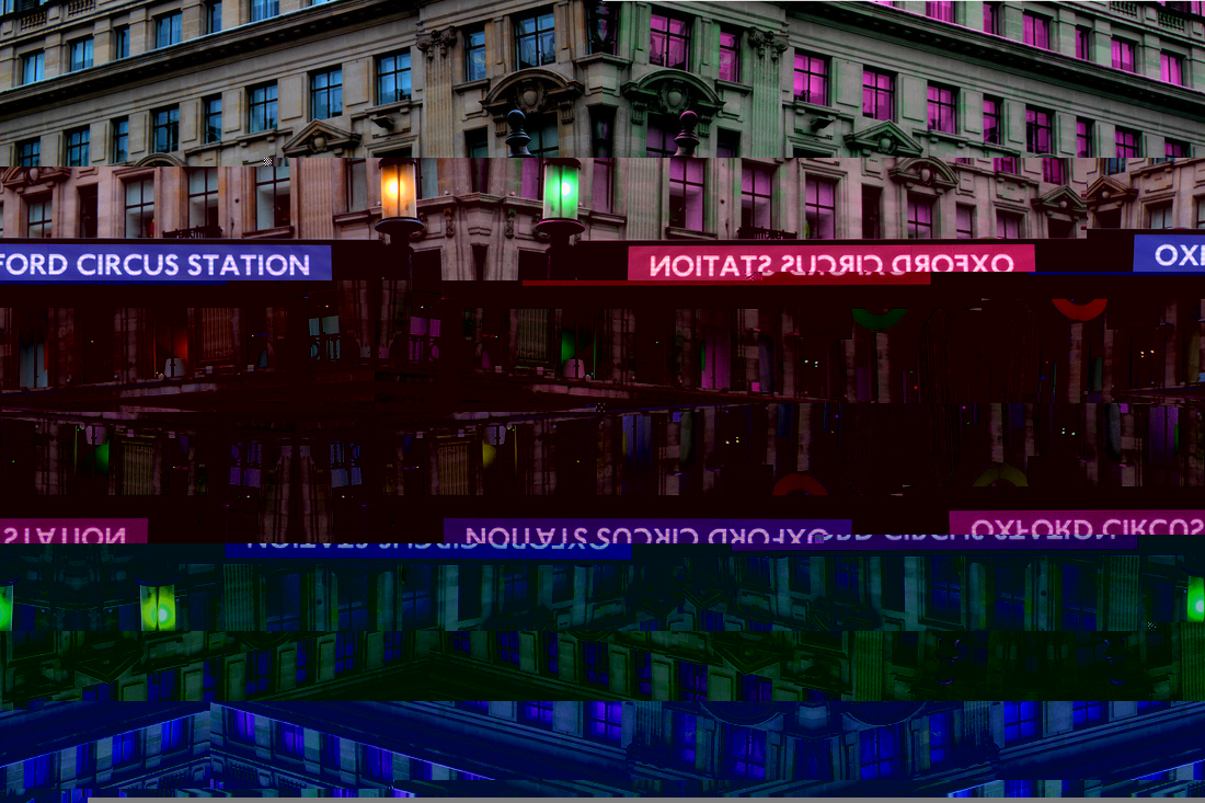
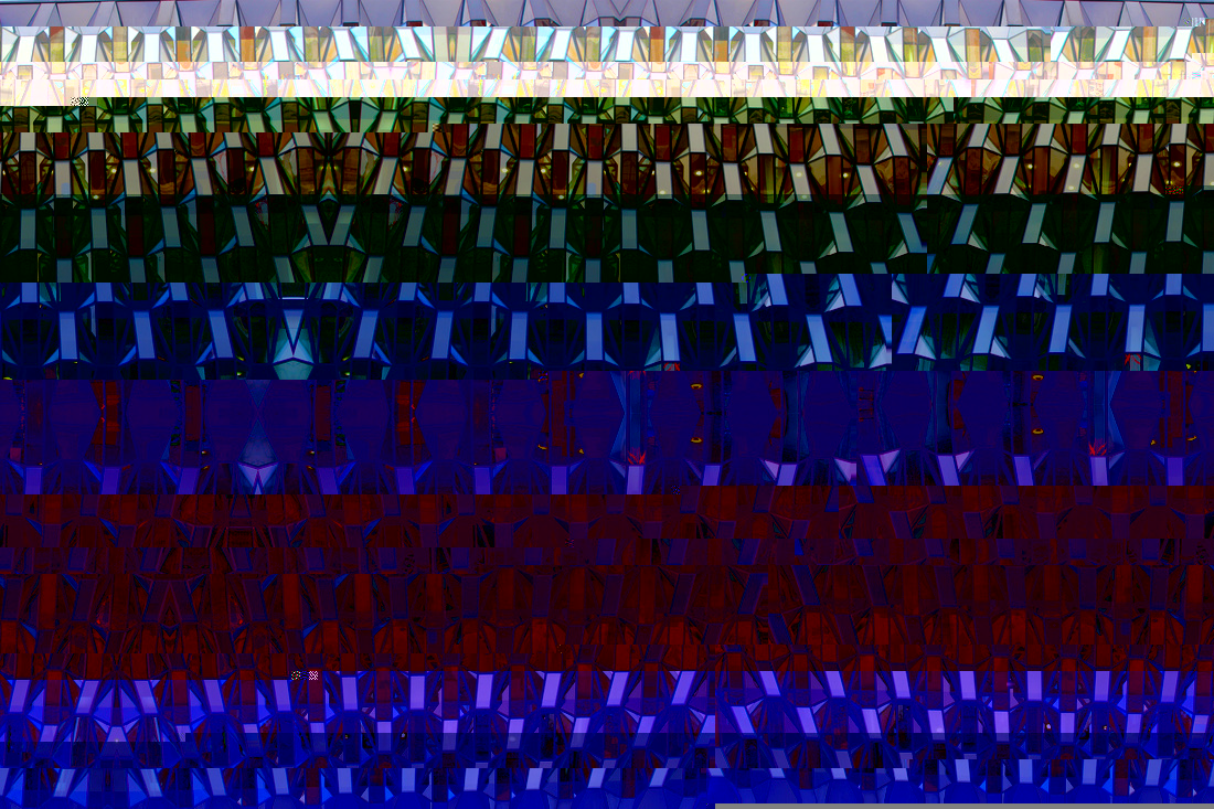
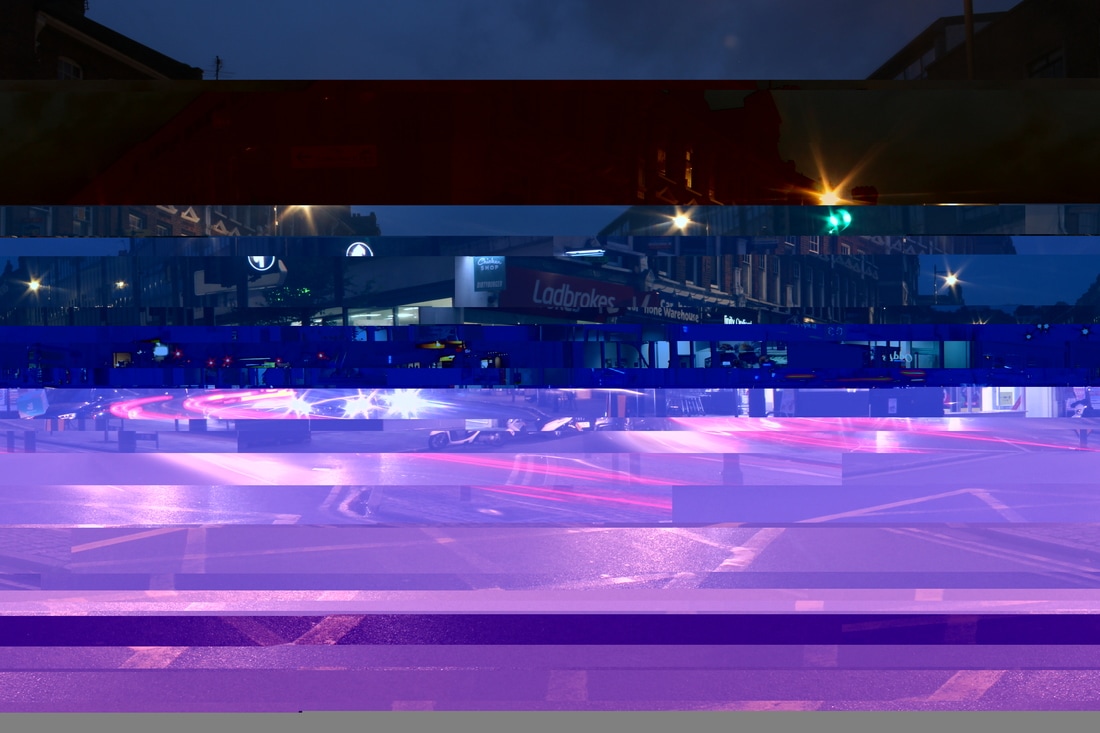
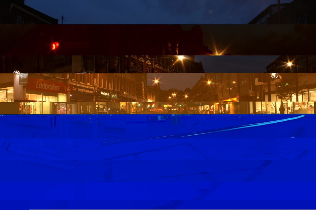
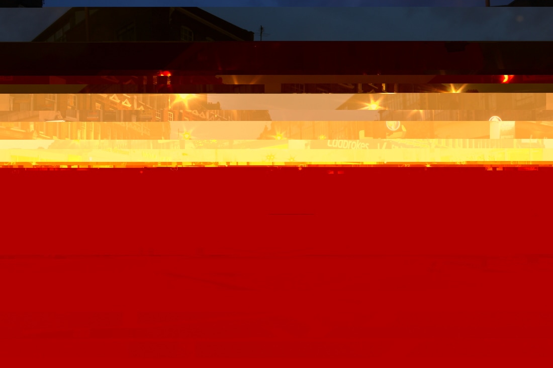
I felt that after my first development I couldn't really continue that much further - it was as developed as far as it could be. So I returned to my first strand and combined that with the glitch effect. I used my images of the night trails and glitched them to see what effect this would create. I decided to glitch the image multiple times to show how random each glitch can be. Even if I'm using the same photo and glitching it again, each time is completely different and more abstract. What I liked about this series of photographs is seeing the changes between the same image, showing how random and abstract each glitch is.
|
FIRST GLITCH
|
FINAL GLITCH
|
|
|
|
|
|
|
|
|
|
|
third development
For my third development I wanted to explore the car light idea more. I went to Archway bridge and Crouch End and filmed car lights out of focus. I thought the effect created was very peaceful. The lights filmed were very pretty and I found that you couldn't tell what the blobs of colour were until you had the sound of cars in the video.
To do this development I used the manual focus and made sure that the subject I was filming was out of focus. This created the circles of light you see below in the videos. Some parts of the video almost seem like the glare you get when a camera faces the sun.
Ideally the videos should be viewed first without sound and context.
ABSTRACT 4 from Nadia Essoulami-Bellamy on Vimeo.
ABSTRACT 5 from Nadia Essoulami-Bellamy on Vimeo.
ABSTRACT 6 from Nadia Essoulami-Bellamy on Vimeo.
ABSTRACT 7 from Nadia Essoulami-Bellamy on Vimeo.
final piece
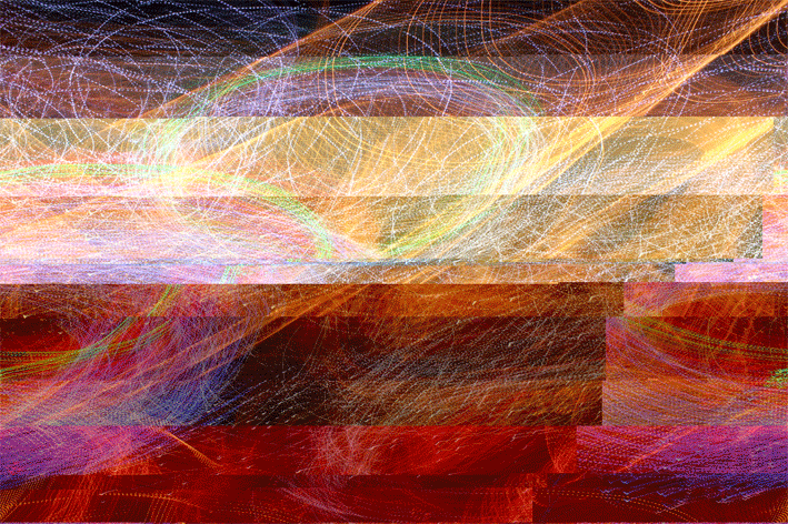
For my final piece I then had the idea of combining more than one video to create a completely abstract 'light show' of colours and movements. I did this using Photoshop by opening up multiple videos and layering them on top of each other. I then reduced the opacity of each layer so they all showed.
The effect of layering each video was one that made it more abstract. The multiple videos interweave with each other and blend together nicely.
Again, ideally, these should be viewed first without sound and so no context.
The effect of layering each video was one that made it more abstract. The multiple videos interweave with each other and blend together nicely.
Again, ideally, these should be viewed first without sound and so no context.
ABSTRACT 1 from Nadia Essoulami-Bellamy on Vimeo.
ABSTRACT 2 from Nadia Essoulami-Bellamy on Vimeo.
